


TYPE OF PROJECT:
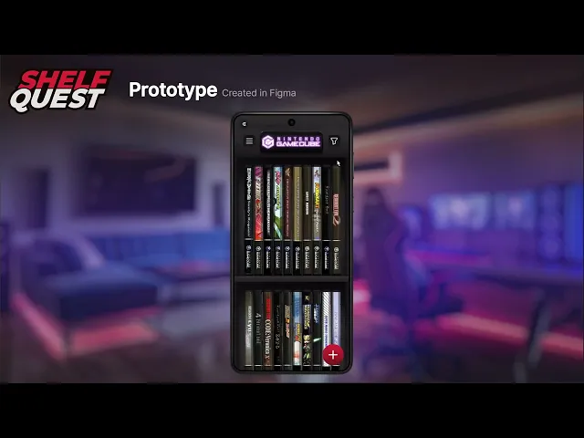
UX/UI Design for a Video Game Collection application
PROJECT LENGTH:
1
MONTH
ROLE:
UX/UI DESIGNER
PROJECT MANAGER
TOOLS UTILIZED:

PHOTOSHOP

ILLUSTRATOR

FIGMA
OVERVIEW: WHAT IS SHELF QUEST?
The Problem: Many game collectors struggle to track large collections using existing apps that suffer from poor UX, unappealing interfaces, or expensive subscriptions.
The Solution: A dedicated collection-tracking app that combines intuitive UX with a high-fidelity, skeuomorphic design, offering collectors a premium, affordable alternative.
Target: Video game collectors seeking a "digital shelf" experience that matches the aesthetic of their physical "man caves."
DESIGN DIRECTION: NOSTALGIA & SKEUOMORPHISM
Aesthetic: Inspired by 6th-generation console (2000s) design trends and old iOS interfaces, the UI uses skeuomorphism to evoke nostalgia.
Visual Pillars: High-contrast color palettes (Red/Black) and realistic textures (wood, plastic) designed to resemble a collector’s physical display shelves.
Typography: Utilized the Inter typeface for its clean, modern legibility, providing a functional contrast to the ornate, skeuomorphic environment.


EXPLORATION & SITEMAP
Planning: To manage the app’s complexity, I developed a comprehensive sitemap in FigJam to define the user journey before sketching.
Wireframing: Moved from rough paper doodles to low-fidelity digital wireframes in Figma, focusing on core navigation and screen hierarchy.


CONCEPTS: FROM ART TO UI
Photoshop Pipeline: Leveraging my background in game/animation art, I painted high-fidelity, static concepts in Photoshop. This allowed me to "pre-viz" the final lighting and materials before building assets.
3D Integration: Used Blender to create 3/4 perspective game case mockups. This 3D-to-2D workflow allowed for rapid, high-quality assets generation for thousands of potential game titles.


DESIGN SYSTEM & ASSETS
Atomic Design: Built a robust component library in Figma, including atoms, molecules, and organisms, to ensure the interface remained scalable and responsive.
Smart Components: Created custom "Instance Swap" game case components. By sandwiching cover art between hand-painted plastic layers in Photoshop, I built a system where designers can swap game titles instantly while maintaining realistic textures.


MULTI-PLATFORM DESIGN
Desktop Strategy: Adapted the mobile-first design into a 3-column desktop layout:
Platform Navigation (Left)
The "Digital Shelf" (Center)
Game Details/Metadata (Right)
Efficiency: This layout reduces clicks, allowing users to browse and view deep statistics without breaking their navigation flow.


TAKEAWAYS
Mobile-First is Mandatory: Designing for the smallest screen first ensured the core experience was tight and focused, making the expansion to Desktop and Tablet seamless.
Technical Growth: This project marked my transition from "Figma novice" to a component-driven designer, proving that production-friendly, responsive assets save hundreds of hours in the iteration phase.


TYPE OF PROJECT:
UX/UI Design for a Video Game Collection application
PROJECT LENGTH:
1 MONTH
ROLE:
UX/UI DESIGNER
PROJECT MANAGER
TOOLS UTILIZED:
OVERVIEW: WHAT IS SHELF QUEST?
The Problem: Many game collectors struggle to track large collections using existing apps that suffer from poor UX, unappealing interfaces, or expensive subscriptions.
The Solution: A dedicated collection-tracking app that combines intuitive UX with a high-fidelity, skeuomorphic design, offering collectors a premium, affordable alternative.
Target: Video game collectors seeking a "digital shelf" experience that matches the aesthetic of their physical "man caves."
DESIGN DIRECTION: NOSTALGIA & SKEUOMORPHISM
Aesthetic: Inspired by 6th-generation console (2000s) design trends and old iOS interfaces, the UI uses skeuomorphism to evoke nostalgia.
Visual Pillars: High-contrast color palettes (Red/Black) and realistic textures (wood, plastic) designed to resemble a collector’s physical display shelves.
Typography: Utilized the Inter typeface for its clean, modern legibility, providing a functional contrast to the ornate, skeuomorphic environment.
EXPLORATION & SITEMAP
Planning: To manage the app’s complexity, I developed a comprehensive sitemap in FigJam to define the user journey before sketching.
Wireframing: Moved from rough paper doodles to low-fidelity digital wireframes in Figma, focusing on core navigation and screen hierarchy.
CONCEPTS: FROM ART TO UI
Photoshop Pipeline: Leveraging my background in game/animation art, I painted high-fidelity, static concepts in Photoshop. This allowed me to "pre-viz" the final lighting and materials before building assets.
3D Integration: Used Blender to create 3/4 perspective game case mockups. This 3D-to-2D workflow allowed for rapid, high-quality assets generation for thousands of potential game titles.
DESIGN SYSTEM & ASSETS
Atomic Design: Built a robust component library in Figma, including atoms, molecules, and organisms, to ensure the interface remained scalable and responsive.
Smart Components: Created custom "Instance Swap" game case components. By sandwiching cover art between hand-painted plastic layers in Photoshop, I built a system where designers can swap game titles instantly while maintaining realistic textures.
MULTI-PLATFORM DESIGN
Desktop Strategy: Adapted the mobile-first design into a 3-column desktop layout:
Platform Navigation (Left)
The "Digital Shelf" (Center)
Game Details/Metadata (Right)
Efficiency: This layout reduces clicks, allowing users to browse and view deep statistics without breaking their navigation flow.
TAKEAWAYS
Mobile-First is Mandatory: Designing for the smallest screen first ensured the core experience was tight and focused, making the expansion to Desktop and Tablet seamless.
Technical Growth: This project marked my transition from "Figma novice" to a component-driven designer, proving that production-friendly, responsive assets save hundreds of hours in the iteration phase.