Type of Project:
UI/UX Design of Game Collection App
UI/UX Design of Game Collection App
Project Duration:
~1 month
~1 month
Tools Used:
- Adobe Photoshop (Skeuomorphic Asset Creation)
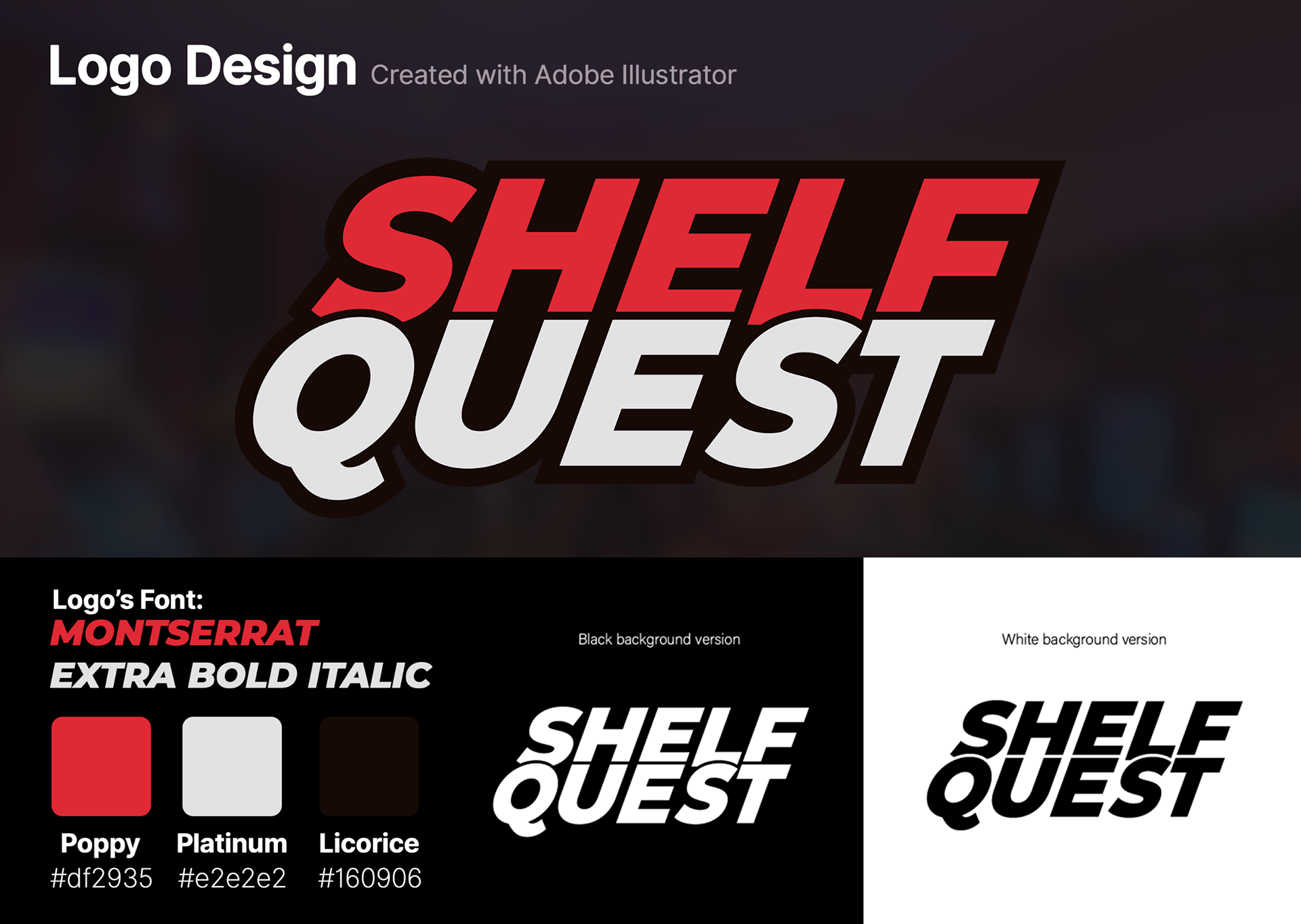
- Adobe Illustrator (Logo Design)
- Blender (Mock-up Images, Game Cases)
- Figma (Sitemap, User Flow, Wireframing, UI Design, Prototyping)
- UX Tweak (Testing and Evaluation)
- Adobe Photoshop (Skeuomorphic Asset Creation)
- Adobe Illustrator (Logo Design)
- Blender (Mock-up Images, Game Cases)
- Figma (Sitemap, User Flow, Wireframing, UI Design, Prototyping)
- UX Tweak (Testing and Evaluation)
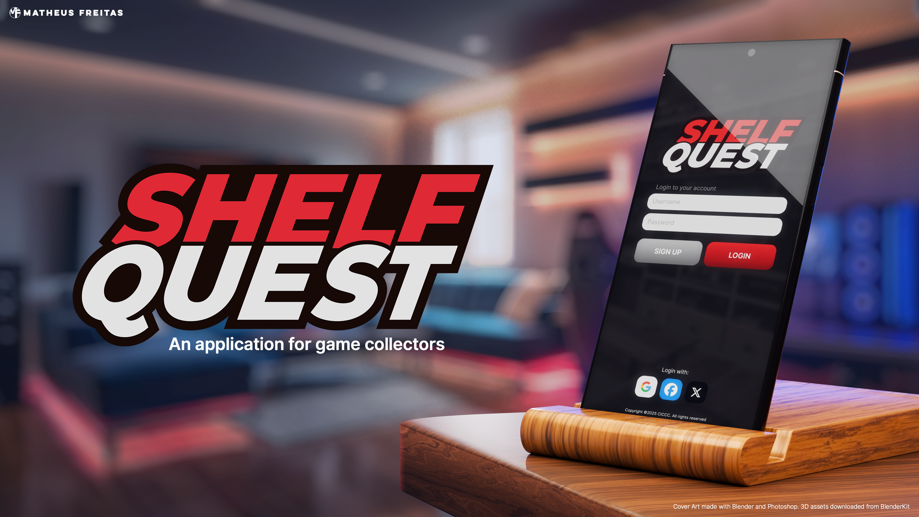
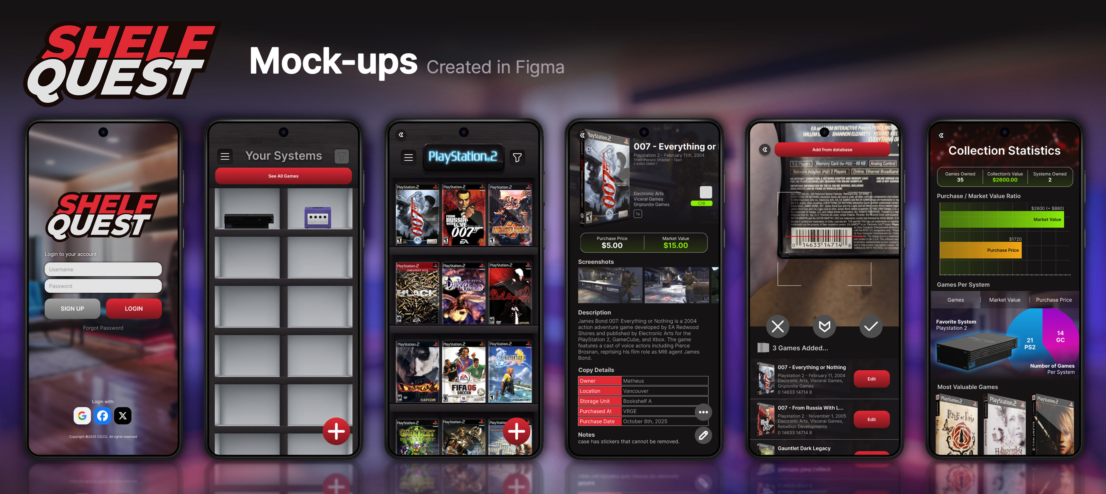
What is Shelf Quest?
Shelf Quest is an application designed for video game collectors to track and catalogue their video game collections.
Shelf Quest is an application designed for video game collectors to track and catalogue their video game collections.
Many collectors own large amounts of video game titles, so large that it becomes difficult to remember what they have, where their games are stored, and how much they're worth in the retro gaming market. Other applications that are currently available in the market either offer poor UX and unappealing UI or are locked behind a paid subscription.
Shelf Quest's goal is to be an alternative to those applications, offering good UX, appealing UI, and an affordable single-time purchase. Further development would be supported by the community via platforms such as Patreon.
Design Direction
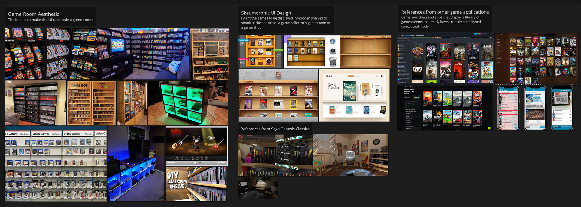
Since most game collectors engage in this hobby due to nostalgic feelings about the past, I decided to incorporate skeuomorphic elements into the UI. With an aging Gen Z audience experiencing increasing feelings of nostalgia towards the 6th generation of consoles - those released in the 2000s - a skeuomorphic approach seemed ideal, as it pays homage to the design trends of the time.
Since most game collectors engage in this hobby due to nostalgic feelings about the past, I decided to incorporate skeuomorphic elements into the UI. With an aging Gen Z audience experiencing increasing feelings of nostalgia towards the 6th generation of consoles - those released in the 2000s - a skeuomorphic approach seemed ideal, as it pays homage to the design trends of the time.
The idea was to create an app that resembles the user's own shelves, storing their video game collection. For that, "Game Rooms" and "Man Caves" were a huge aesthetic inspiration for this project, along with skeuomorphic UI designs from old IOS versions, plus some additional inspirations here and there from the gaming world.
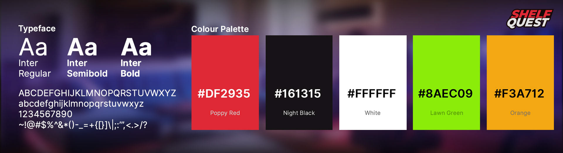
The Colour Palette was created to match popular colour schemes in game rooms. Popular combinations are often bold and high-contrast, such as an additive primary with black. More feminine game rooms include brighter palettes such as whites and pinks, but since the target audience for Shelf Quest is predominantly male, we prioritized the use of mostly red and black for the time being.
The typeface utilized across the application is a very standard Inter, which worked very well for this application's interface.
Exploration
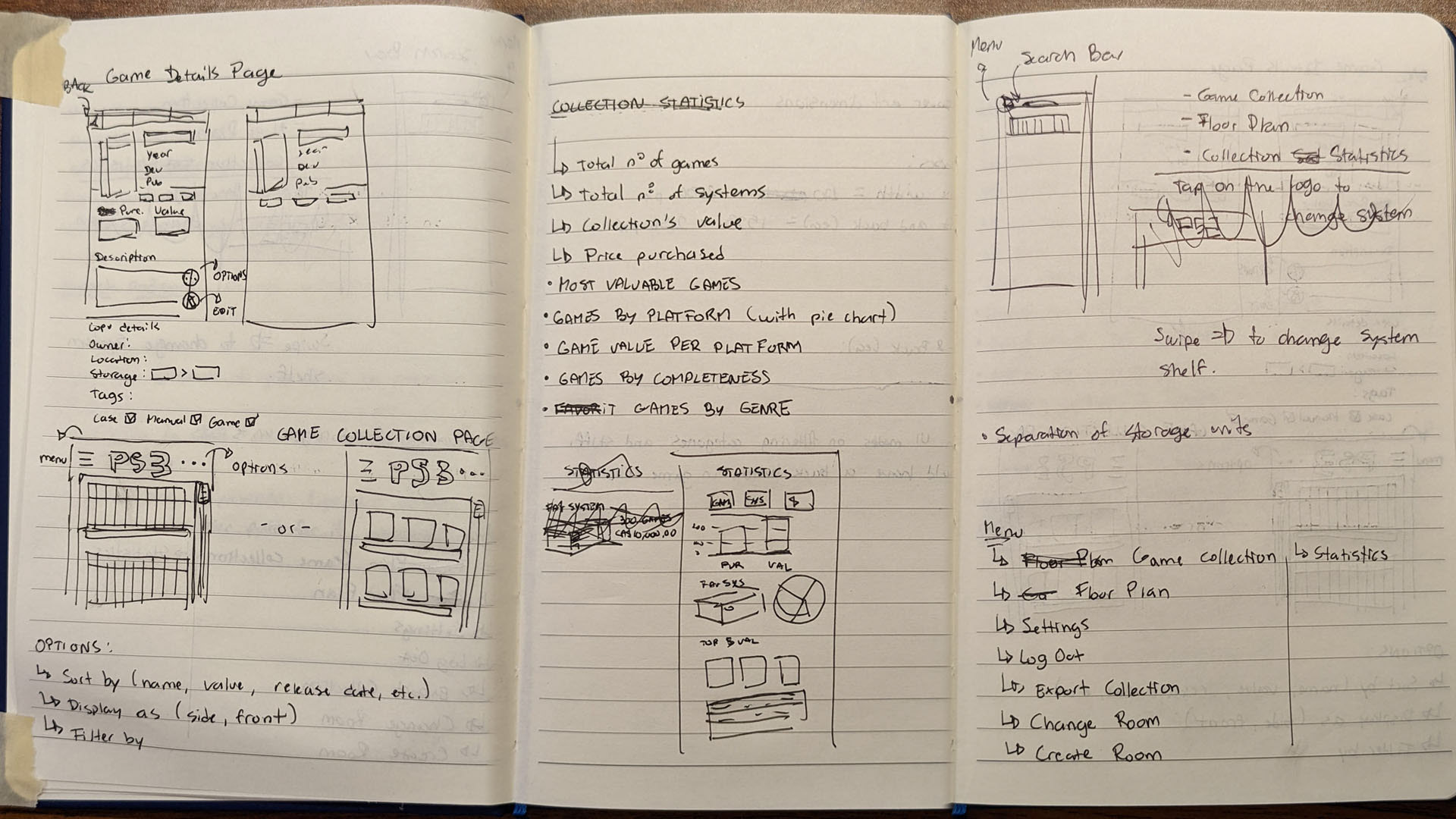
With a solid design direction, I began exploring some ideas by creating very rough doodles in my notebook, testing some layouts before creating a low-wireframe in Figma.
With a solid design direction, I began exploring some ideas by creating very rough doodles in my notebook, testing some layouts before creating a low-wireframe in Figma.
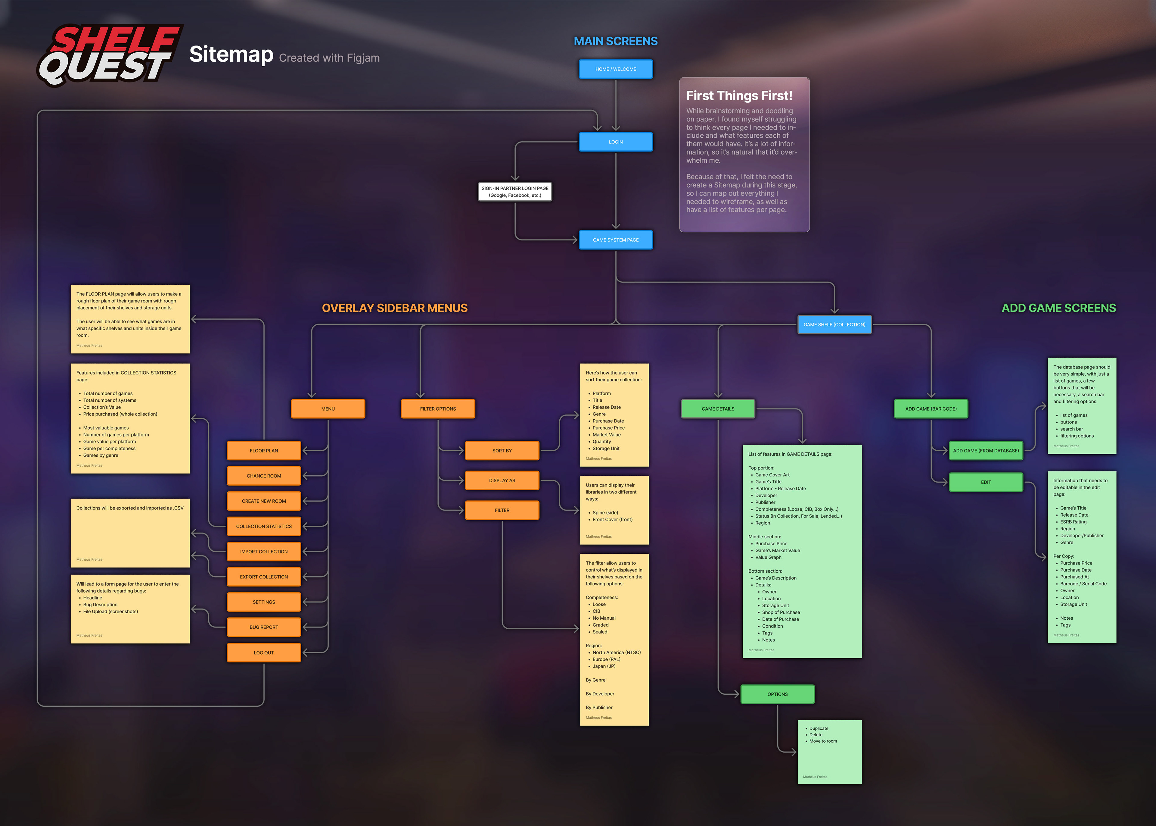
During my paper sketch stage, I started struggling with remembering what pages I wanted to create for this application. To mitigate that, I prioritized putting together a sitemap in Figjam listing all the pages I envisioned for Shelf Quest at first. That helped organize my tasks and what pages needed to be designed.
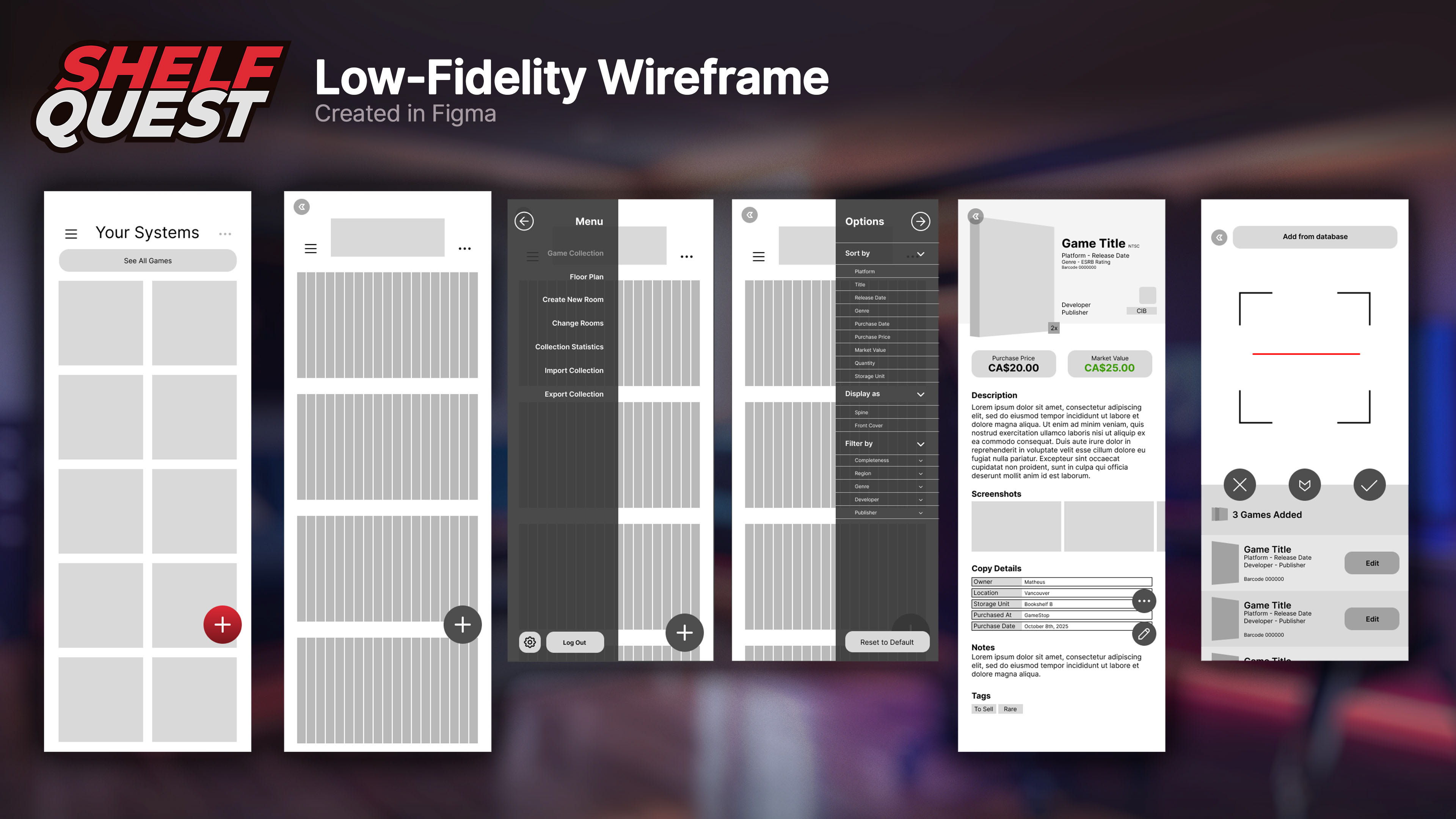
Once the sitemap was done and I had a solid idea of how to arrange the elements of each page, I began creating the low-fidelity wireframe in Figma. At this stage, I only wireframed the main pages, as later on, it became easier to create them with the assets that were created during the process.
Concepts
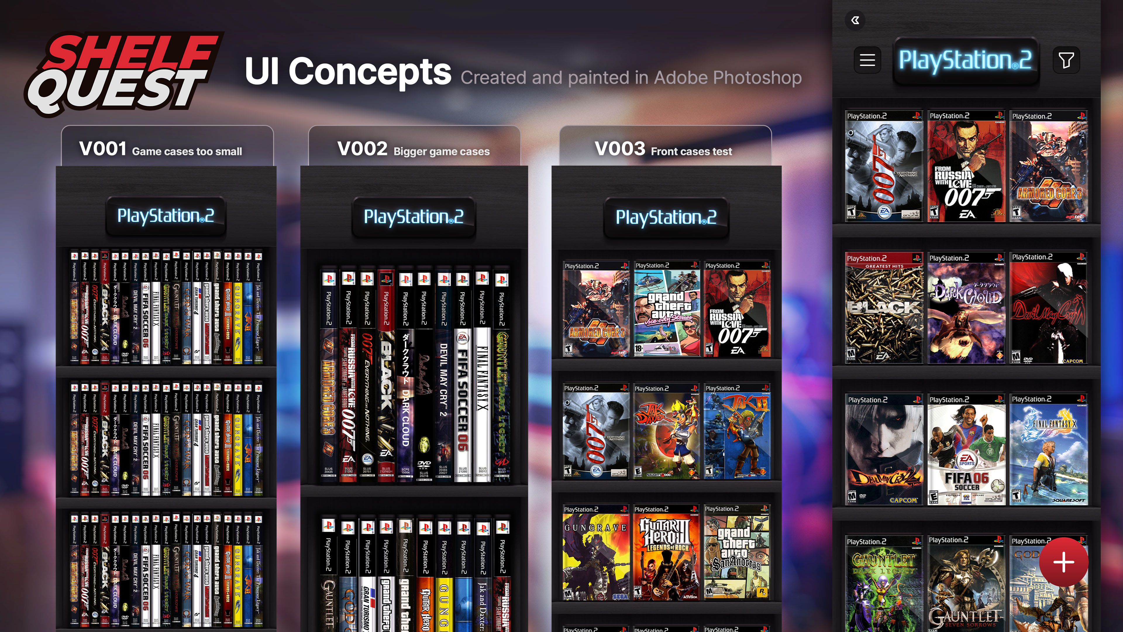
As Shelf Quest has a considerable amount of skeuomorphic elements, I decided to use my background as an artist in animation and games to create some UI concepts in Photoshop. I created static, high-fidelity representations of the final screens entirely in that software as a way of quickly visualizing whether or not the ideas I had in my mind were working or not, and what needed to be changed.
As Shelf Quest has a considerable amount of skeuomorphic elements, I decided to use my background as an artist in animation and games to create some UI concepts in Photoshop. I created static, high-fidelity representations of the final screens entirely in that software as a way of quickly visualizing whether or not the ideas I had in my mind were working or not, and what needed to be changed.
By ensuring we had a solid UI design in Photoshop before exporting assets and assembling a high-fidelity wireframe in Figma, we eliminated a time-consuming back-and-forth that agilized the entire process. The concepts were mostly successful, except for a thing or two that had to be changed in Figma directly.
To paint the shelves, I started with a wooden texture as a base, painting the lights and shadows on top by hand to achieve the desired effect.
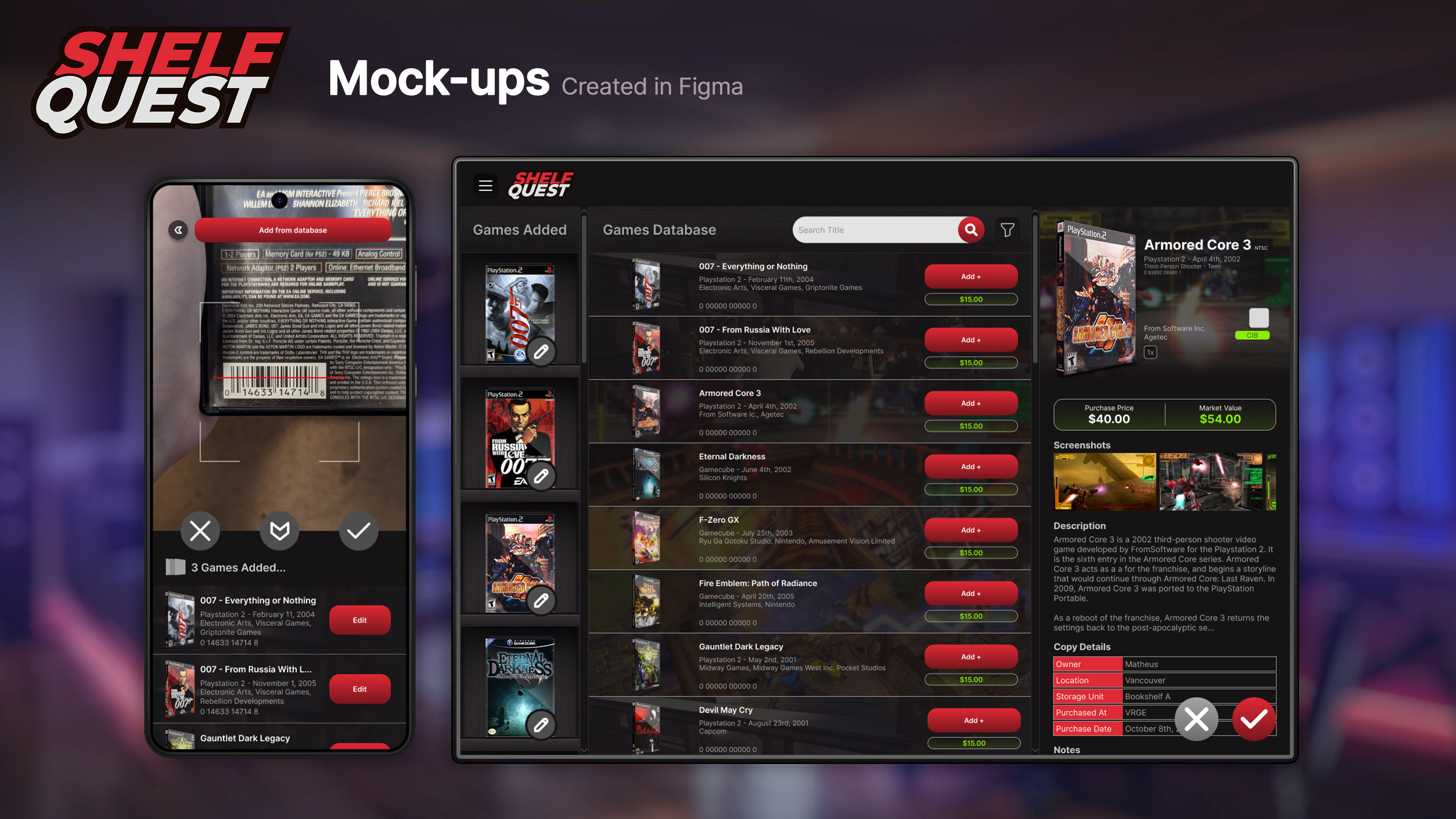
Although most of Shelf Quest's UI is composed of 2D assets created either in Photoshop or Figma, for the Game Details page, I created a 3D setup in Blender to easily create 3/4 front views of game cases to be displayed in the header. The goal was to make the process of creating those assets quick and easy.
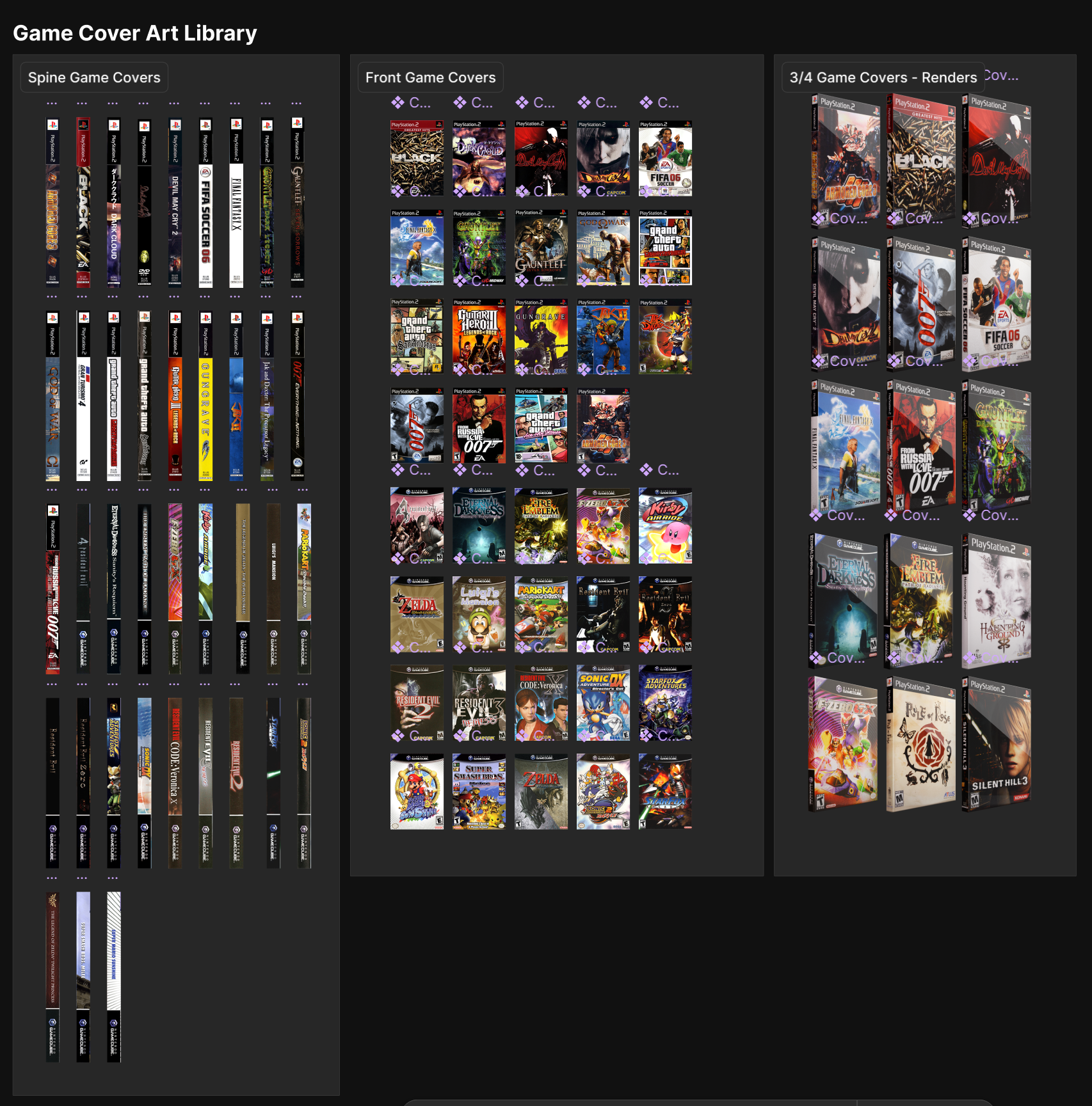
This setup simply requires replacing the texture image with a flat game cover art for any game released on DVD format. Those cover arts were acquired from The Cover Project, which archived cover arts for thousands of games for different platforms. I really appreciate their existence and all their work in preserving these covers and making them available for those wishing to use them in their own projects, be it an app or the creation of a reproduction case.

High-FIDELITY wIREFRAME
With the concepts done and approved, the bitmap assets were exported and brought over to Figma to begin work on the high-fidelity wireframe and the app's prototype. Pages that were not skeuomorphic were entirely designed in Figma.
With the concepts done and approved, the bitmap assets were exported and brought over to Figma to begin work on the high-fidelity wireframe and the app's prototype. Pages that were not skeuomorphic were entirely designed in Figma.
At this moment, many elements were still static, and some of the components were still in a rough state. While the design of the pages was mostly figured out, their assets needed to be polished, and they needed to work well in a prototype. From this point forward, I began supervising a small team of 2 people to assist me with this project: Alice Brito and Gabriela Stecanella.
UI KIT
With the assistance of my newly assembled team, we went back to the project's files to turn existing designs into polished, interactive components. While I worked on many of the components myself, my team assisted with several others, creating input fields, search bars, functional buttons, dropdown lists, and many more things.
My team was essential in helping me convert existing elements into responsive ones, which proved to be more of a challenge than we originally envisioned. When I began this project, I hadn't yet mastered auto-layout and the tools that enable the creation of responsive layouts, meaning that many assets had to be fundamentally reworked, and some of them even recreated from scratch.
Upon updating old assets and creating new ones, we were able to create templates according to the principles of Atomic Design, labelling them accordingly as Atoms, Molecules, Organisms, and Templates. The creation of this library truly made our work in this project easier.
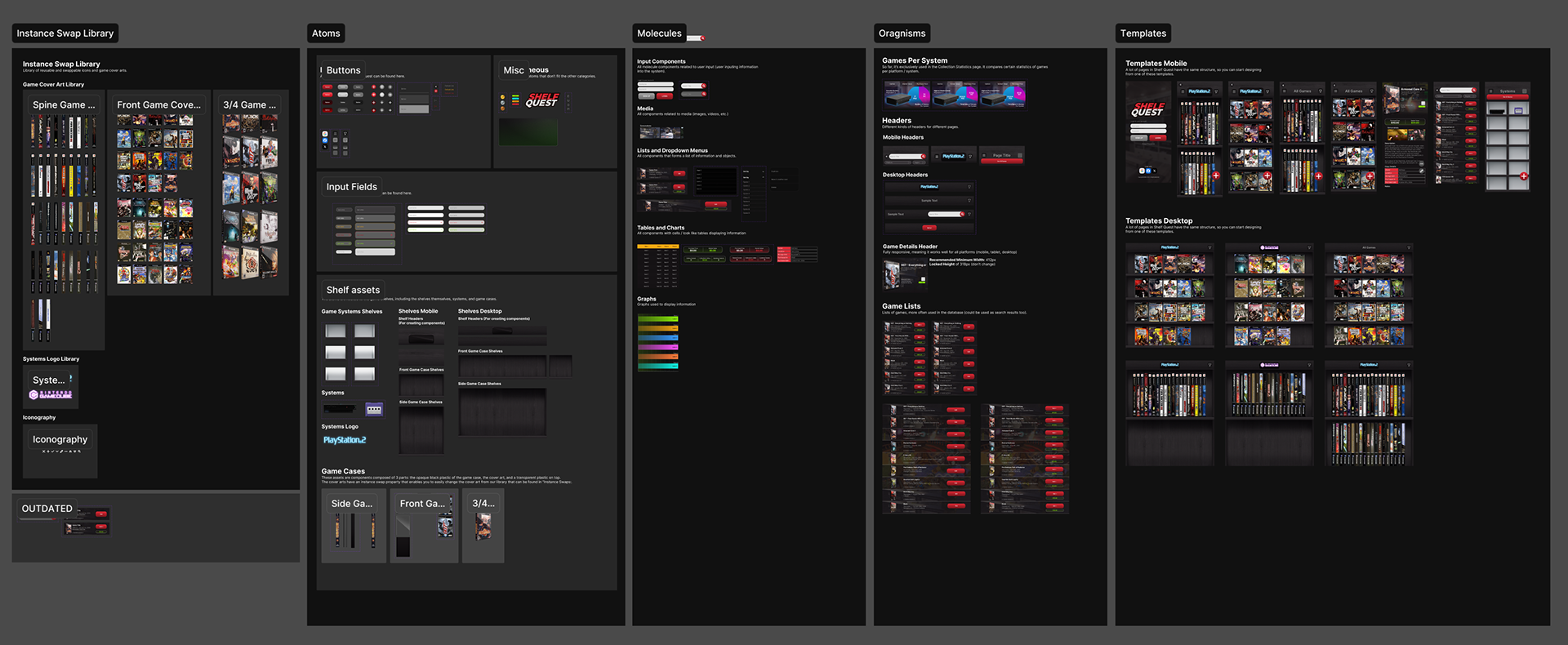
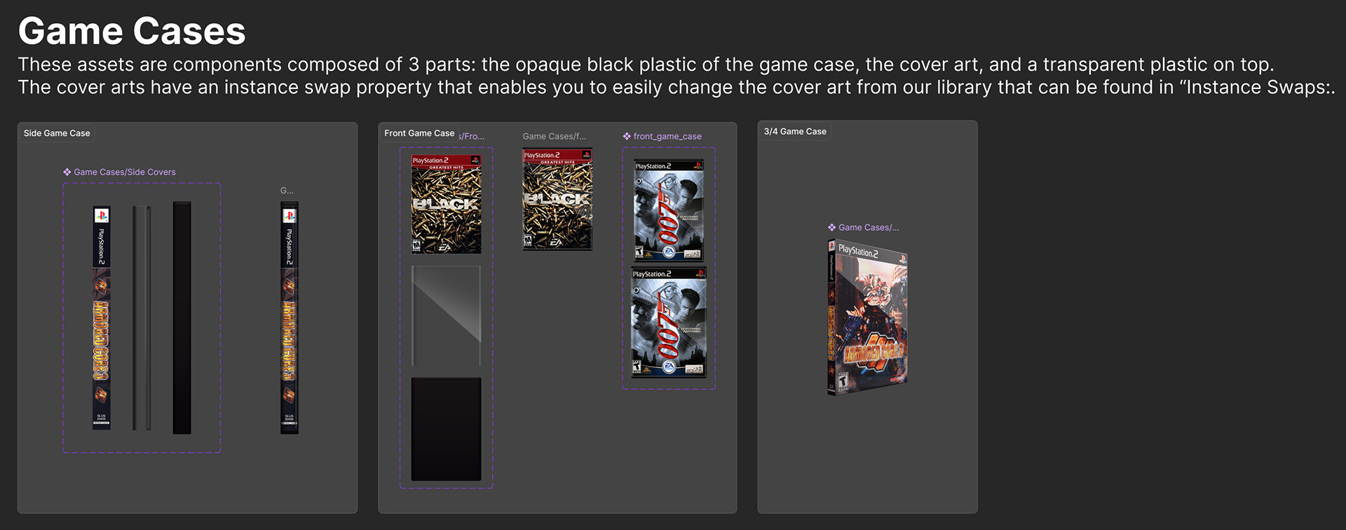
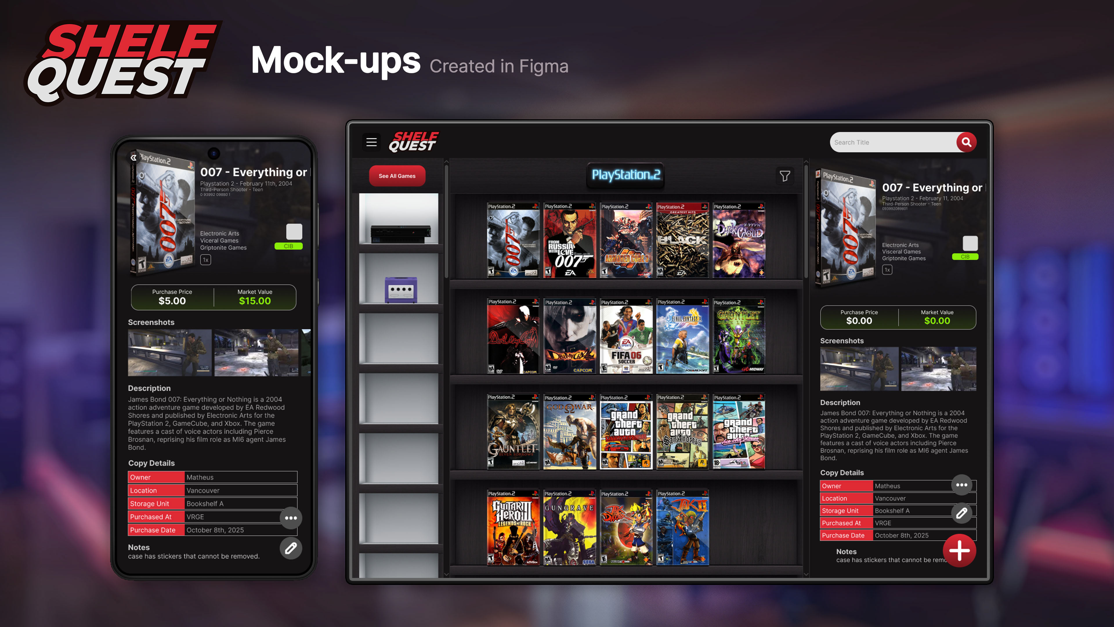
I wanted to draw attention to the components created for the game cases, as they're an important part of Shelf Quest. Except for the 3/4 Game Case, the others were entirely created in Photoshop, where I painted the opaque, black plastic case and the transparent plastic on top. Then, I sandwiched the cover art between those two layers and created a production-friendly component that allows designers to quickly change the cover art and create multiple game cases with the use of an Instance Swap property in Figma's component.
Designers can change the cover art to any one imported into the Figma file's Cover Art Library.
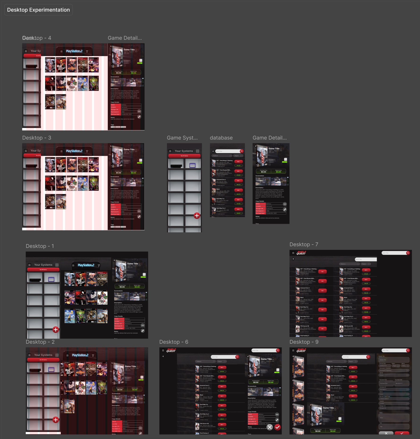
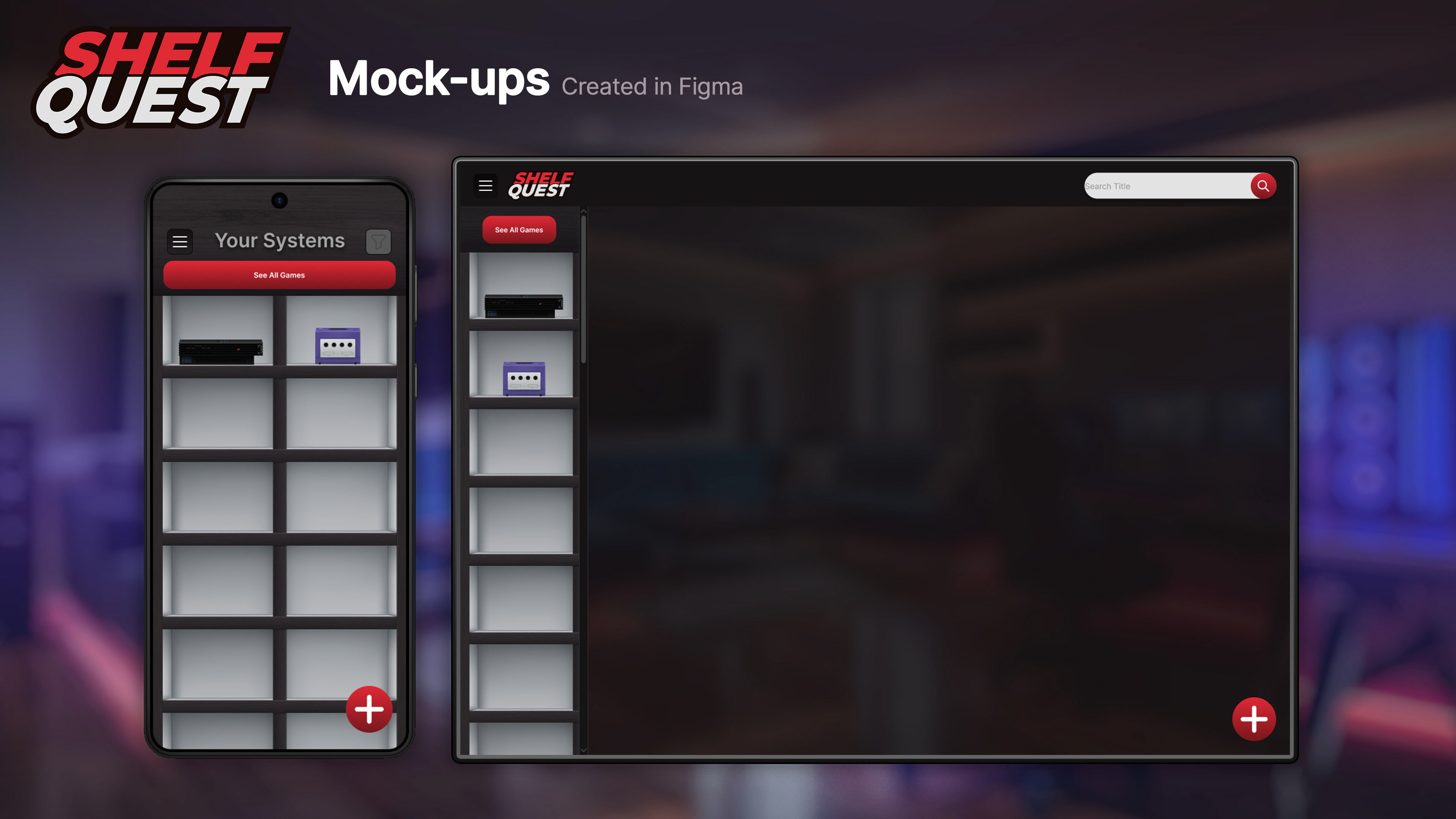
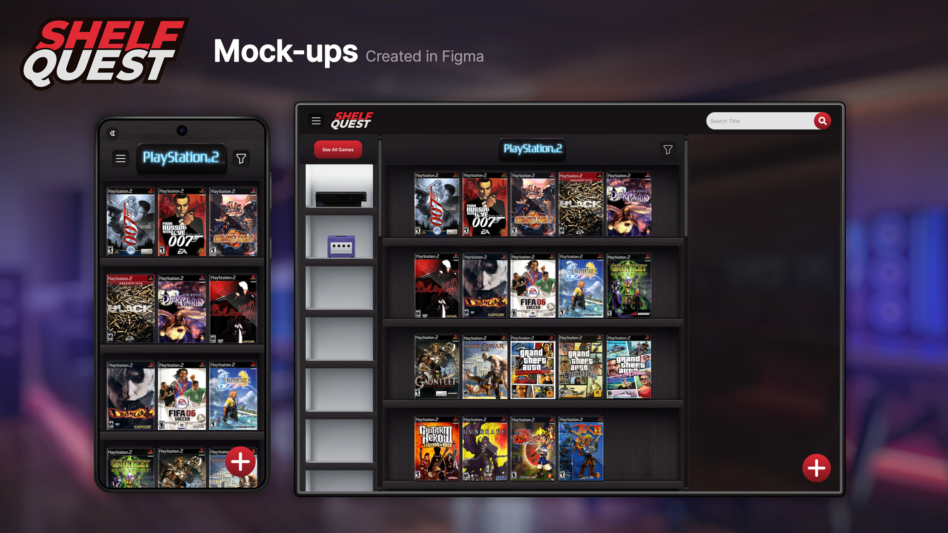
Multi-Platform Design
At this point, the mobile version was essentially completed! We were now moving towards adapting this design to other platforms. Our main focus was on the desktop, which Alice and I fully designed and prototyped in a joint effort. Gabriella was tasked with creating an initial wireframe of the tablet version, which was not a priority due to time constraints, but still something we wanted to have initiated, considering users could use tablets in kiosks or in a dedicated spot in their game rooms to search their collections digitally.
At this point, the mobile version was essentially completed! We were now moving towards adapting this design to other platforms. Our main focus was on the desktop, which Alice and I fully designed and prototyped in a joint effort. Gabriella was tasked with creating an initial wireframe of the tablet version, which was not a priority due to time constraints, but still something we wanted to have initiated, considering users could use tablets in kiosks or in a dedicated spot in their game rooms to search their collections digitally.
Thanks to our efforts in polishing and adapting existing templates and components to be responsive, the process was actually pretty quick. Our low-fidelity wireframes looked more polished than the initial ones created for the mobile version.
The idea behind the desktop design is to enable users to use the application fast and efficiently, with limited changes of pages that break the flow of use. We went with a columns design, where we divided the main page into three columns: a narrow one for the game platforms, a bigger middle one for the game shelves, and a responsive right one with the game details.
This way, we were hoping to reduce the number of steps the user needed to take to find the game they were looking for and access its details. The extra screen real estate that computer monitors provide allowed us to show more information at once, but designed in a way that doesn't feel overwhelming.
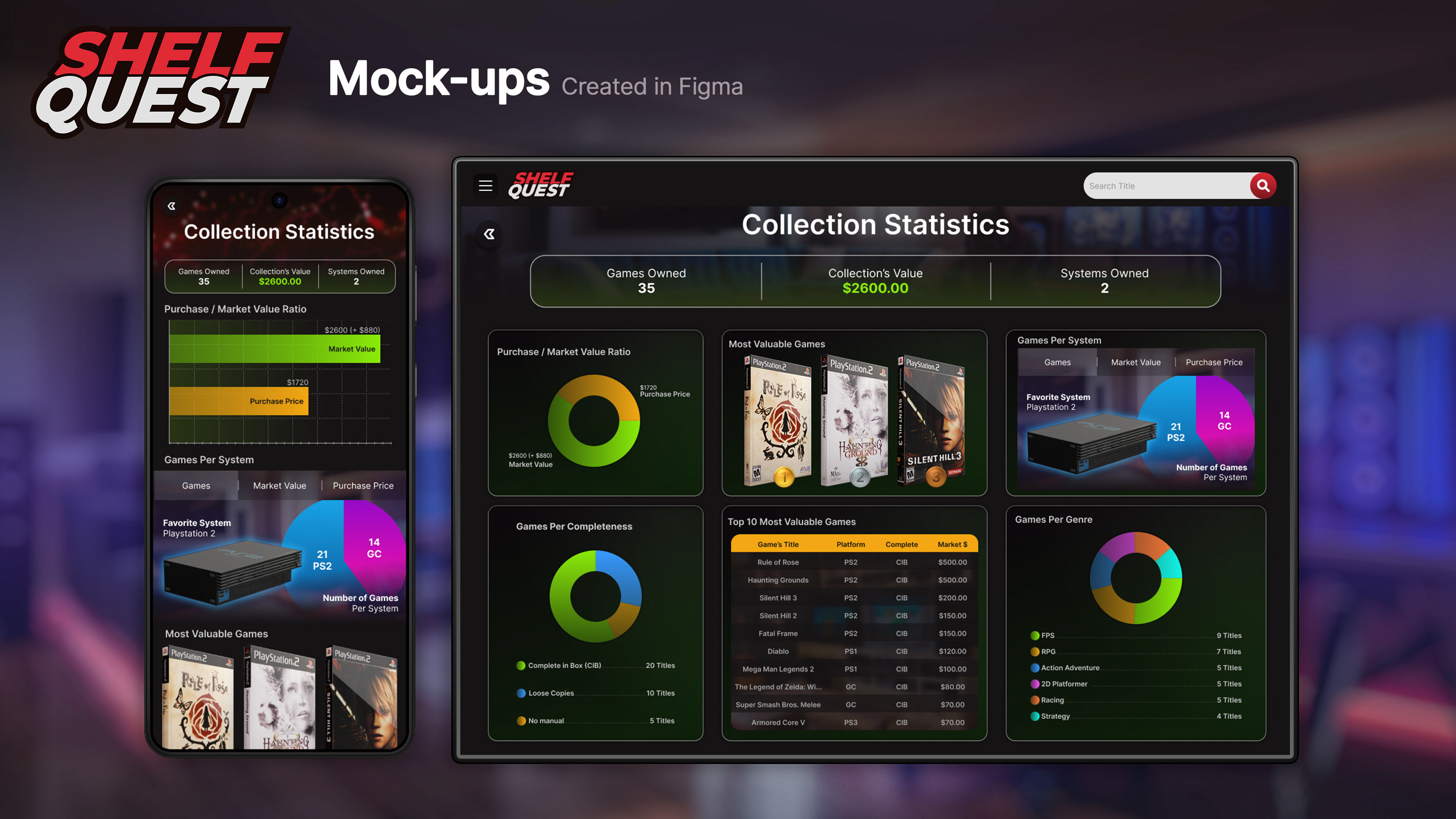
Desktop Collection Statistics Page Design by Alice Brito
TAKEAWAYS
As the project Shelf Quest approaches its completion, I look back and think about how much I learned during the process of its creation. It was a very joyous experience, one that relates closely to me, as I also enjoy collecting games. Carrying this project from early research and concepting stages all the way to its final prototypes left me with several important lessons that I will bring to my future UI/UX Design projects.
As the project Shelf Quest approaches its completion, I look back and think about how much I learned during the process of its creation. It was a very joyous experience, one that relates closely to me, as I also enjoy collecting games. Carrying this project from early research and concepting stages all the way to its final prototypes left me with several important lessons that I will bring to my future UI/UX Design projects.
When I started working on Shelf Quest, I was a Figma noob! It was my first time using the tool, and while I learned it very quickly, my team and I had to rework assets over and over again until we got them right. This back-and-forth is something that I could totally avoid if I had then the knowledge I have now. Creating assets with non-destructible, production-friendly, responsive components and templates makes a huge difference, and with the knowledge on how to achieve that that I've acquired as I worked on this app, my next projects will go much smoother.
Designing mobile first was the way to go. Smartphones have one of the smallest screens in the market, and they're the most widely used type of device. Designing Shelf Quest for phones before adapting it to other devices ensured that the mobile version was well thought-out and not an afterthought, and adapting components and assets to bigger screens was much easier than it would be the other way around.