Type of Project:
UI Redesign and Suggestions for the video game "Hytale"
UI Redesign and Suggestions for the video game "Hytale"
Project Duration:
1 week
1 week
Tools Used:
- Figma (UI Design, Mockups, Prototype)
- Adobe Photoshop (Editing & Creating Assets)
- Figma (UI Design, Mockups, Prototype)
- Adobe Photoshop (Editing & Creating Assets)
Introduction
Hytale — resurrected from the dead after being cancelled by Riot Games and reacquired by Simon Collins Laflamme — was released just a couple of weeks ago, and I already purchased it to play with a friend of mine. The purchase was worth it, since we spent dozens of hours playing it together over the weekend.
Hytale — resurrected from the dead after being cancelled by Riot Games and reacquired by Simon Collins Laflamme — was released just a couple of weeks ago, and I already purchased it to play with a friend of mine. The purchase was worth it, since we spent dozens of hours playing it together over the weekend.
Hytale is very fun, and even though it's still raw in its early access stages, already managed to hook me. The game's UI is not bad either! However, being more observant and explorative with video game interfaces recently, I saw things that could improve (or just be different for the sake of it).
It's expected for a game in early access to be a bit raw, rough around the edges, and have issues (and in that regard, Hytale is already doing fantastically well), so this case study will serve more the purpose of proposing suggestions and ideas to improve the game's interface and user experience by:
- Addressing issues that affect gameplay
- Proposing ideas to improve gameplay
- Redesigning pages and components to be more visually appealing.
- Proposing ideas to improve gameplay
- Redesigning pages and components to be more visually appealing.
The HUD
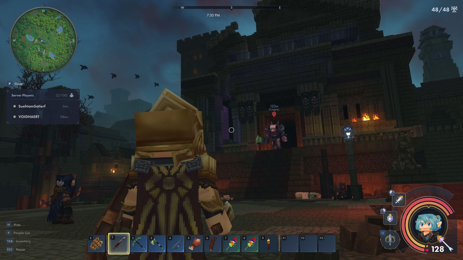
Hytale's original HUD is very simplistic and elegant, keeping the number of components on screen to a minimum so players can be more immersed in the gameplay. It's effective and appealing, but there were a few elements I wish were included in the HUD for easier, quicker access.
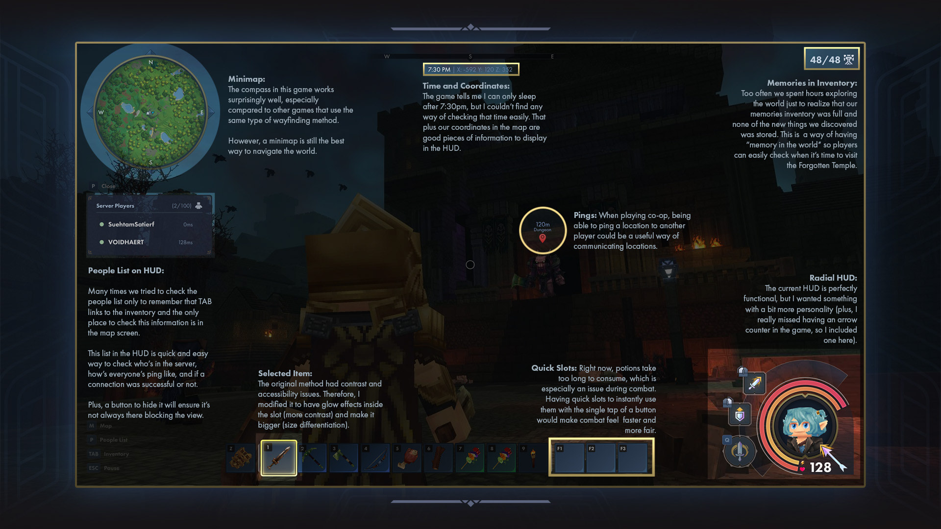
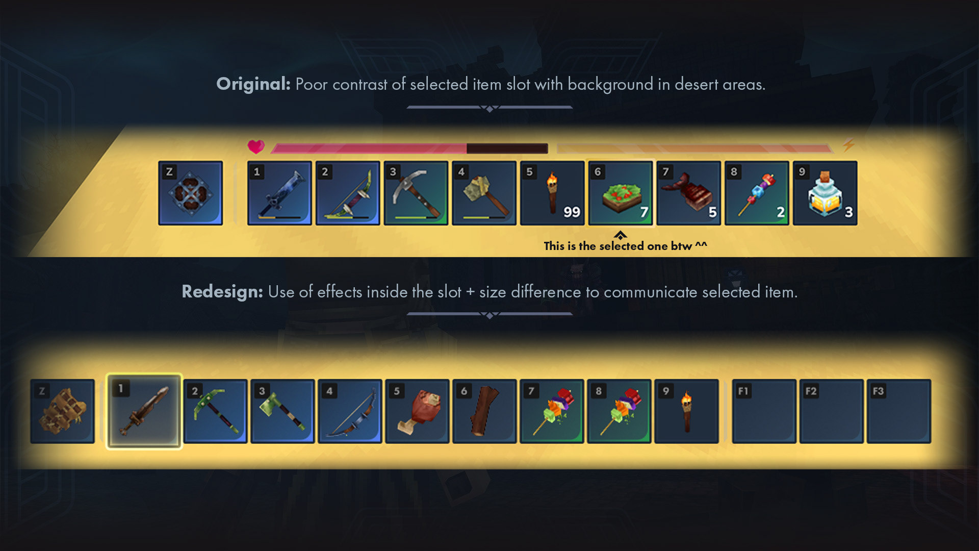
Selected Item in the hotbar: The outline of the original UI, while simple and elegant, gave me a lot of trouble when I reached the desert biome in the game. As the colours were very close, I couldn't see which item I had currently in my hands!
The issue lied on relying solely on the outline to communicate to the player which item was selected. With the diversity of colours in Hytale's environment, it's a very unreliable approach, as the odds of it blending with the background are very high (hence it happens).
My solution was to create contrast in a much more reliable area: inside the slot! Item slots will always have very similar and subtle gradients, meaning it's predictable and easy to control.
To make sure this information is very clear, though, I also made the selected slot bigger as another differentiation method. That way, it's more likely for people with visual impairments like colour blindness to be able to identify what they're holding.
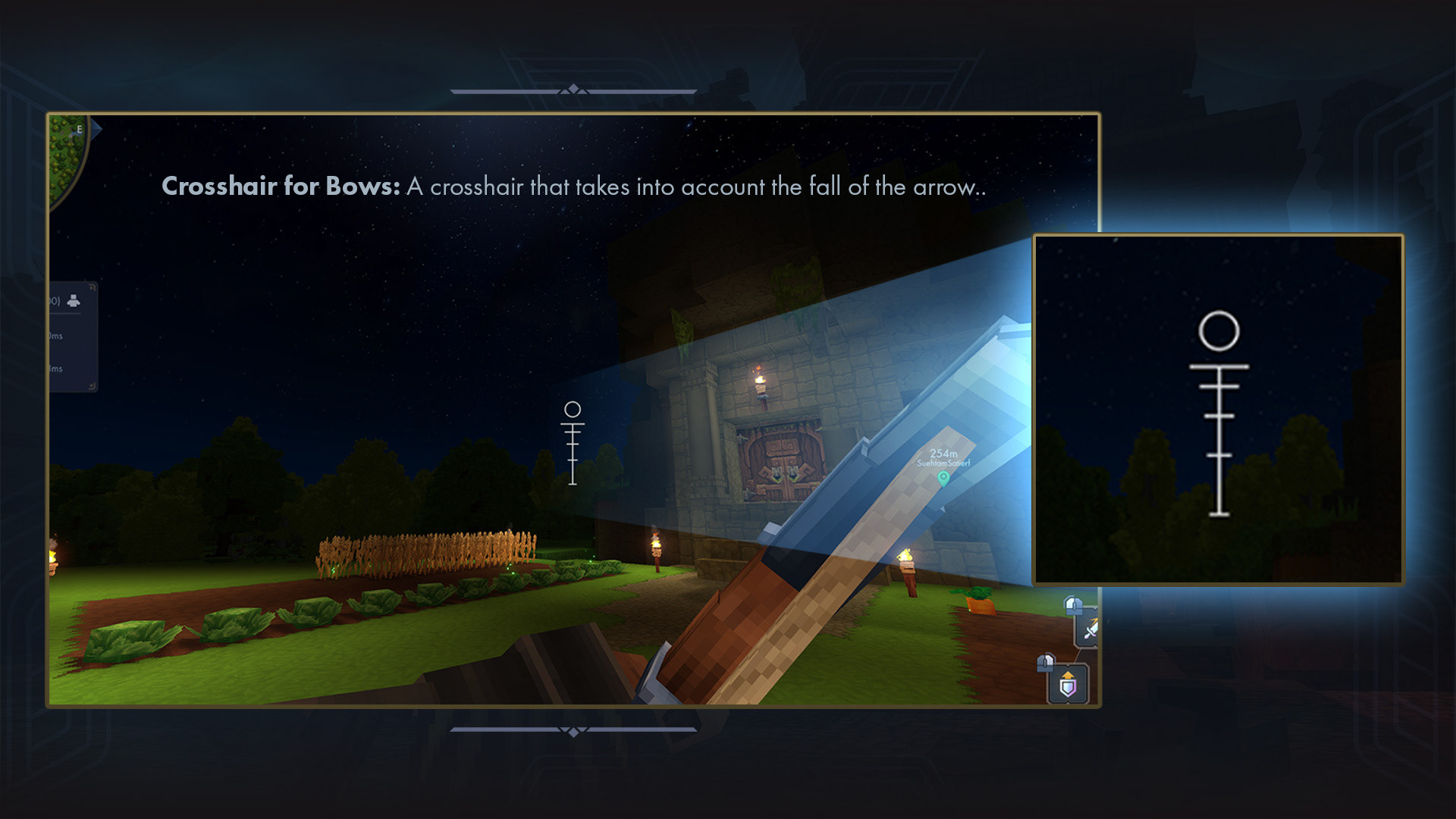
Different Crosshair for Bows: It can be fun to learn the arc at which an arrow loses altitude with distance, but for some players, it'd also be great to give them a crosshair that gives them that information straight up. Very commonly used in FPS games, I think it'd be a welcome addition to Hytale.
The Inventory
Inventory Screen Redesign
Hytale's official inventory screen (as well as some other menus) is arranged by windows by what I like to call a 3-column layout. The inventory is effective: it's clear with the information it provides and looks good. However, I felt like it didn't make the best use of screen space, and some usability aspects could be improved.
Let's address the obvious first: I've redesigned the inventory completely, intending to take advantage of the whole screen space and make it look more visually appealing.
Let's address the obvious first: I've redesigned the inventory completely, intending to take advantage of the whole screen space and make it look more visually appealing.
2-Column Layout:
The original had a whole 1/3 of the screen dedicated to displaying a small amount of information, such as workbench tier upgrade requirements and, frequently, small icons of chests that are currently being utilized.
For that purpose, I converted the inventory into a 2-column layout, which allowed me to give more emphasis to the character and her equipment.
Usability Improvements:
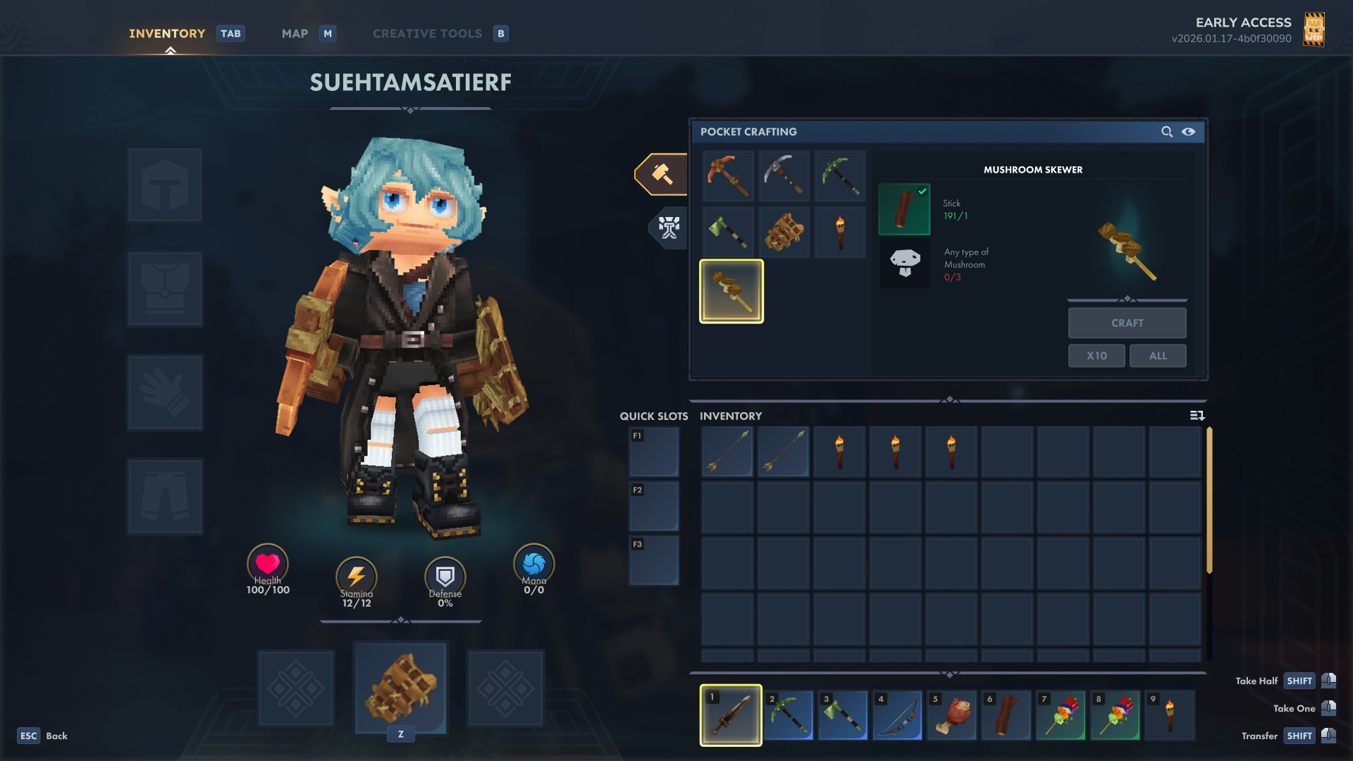
The backpack in Hytale is a bit annoying to use. It works as a completely different inventory from the default one we have, with the difference that you cannot manage items and access them while using chests and workbenches as easily. It made me question the purpose of having basically two different inventories, where one is slightly worse to use.
The backpack in Hytale is a bit annoying to use. It works as a completely different inventory from the default one we have, with the difference that you cannot manage items and access them while using chests and workbenches as easily. It made me question the purpose of having basically two different inventories, where one is slightly worse to use.
My solution was to change the way the backpack works. When crafting and upgrading the backpack, instead of creating a secondary inventory, it just expands the original one. The more you upgrade, the more slots you unlock for your main inventory. With that change, the backpack tab became obsolete, so it was removed. Also, as the player's inventory expands, the lower slot row is partially visible, and a scroll bar was added to the right, signifying that there are more items than what's initially visible.
Demonstration on how renaming chests would work.
Renaming Chests:
Perhaps the feature I'd like the most in the game is the ability of renaming the chests. After a couple of hours into the game, the player will have so many chests that it'll become hard to track what is what. While there are solutions to this issue, such as creating signs and placing chests strategically in the base, being able to rename them would facilitate item management dramatically, consequently improving the user experience as well.
Perhaps the feature I'd like the most in the game is the ability of renaming the chests. After a couple of hours into the game, the player will have so many chests that it'll become hard to track what is what. While there are solutions to this issue, such as creating signs and placing chests strategically in the base, being able to rename them would facilitate item management dramatically, consequently improving the user experience as well.
The picture below shows how this feature would facilitate item management. The name of the chest will appear next to the input prompt that instructs the player on how to open it, eliminating the need of opening one by one until they find the correct one.
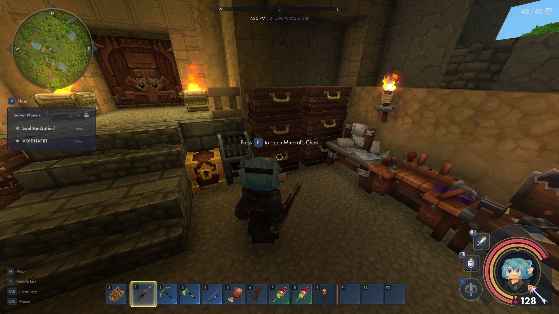
The input prompt would include the name of the chest. No more opening one by one until the right one is found.
Avatar Customization
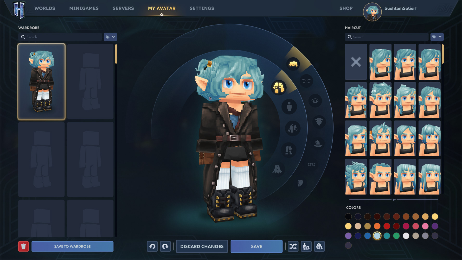
Visually speaking, a lot of changes occurred in the avatar customization screen. In this screen, especially, I wanted to give a lot of emphasis to the character, hence I scaled her up and centralized her. This is all about her! Inspired by The Sims (once again), I changed the categories menu to a radial one, which worked well as a framing device for the avatar.
While the inventory screen has been stripped down from a 3-column layout to a 2-column one, the opposite happened to the character customization screen. I added one extra column to the left for a new feature that I really missed in the game.
Wardrobe:
I like customizing my avatar, especially when it's an adorable low-poly model like the ones in Hytale. I wish I could play around more with this feature, but unfortunately, I don't want to lose my current avatar's style either. My solution was to add a wardrobe, which saves entire avatars, consequently enabling me to experiment with different styles with an easy way to return to older ones.
I like customizing my avatar, especially when it's an adorable low-poly model like the ones in Hytale. I wish I could play around more with this feature, but unfortunately, I don't want to lose my current avatar's style either. My solution was to add a wardrobe, which saves entire avatars, consequently enabling me to experiment with different styles with an easy way to return to older ones.
A Few Changes to the Map
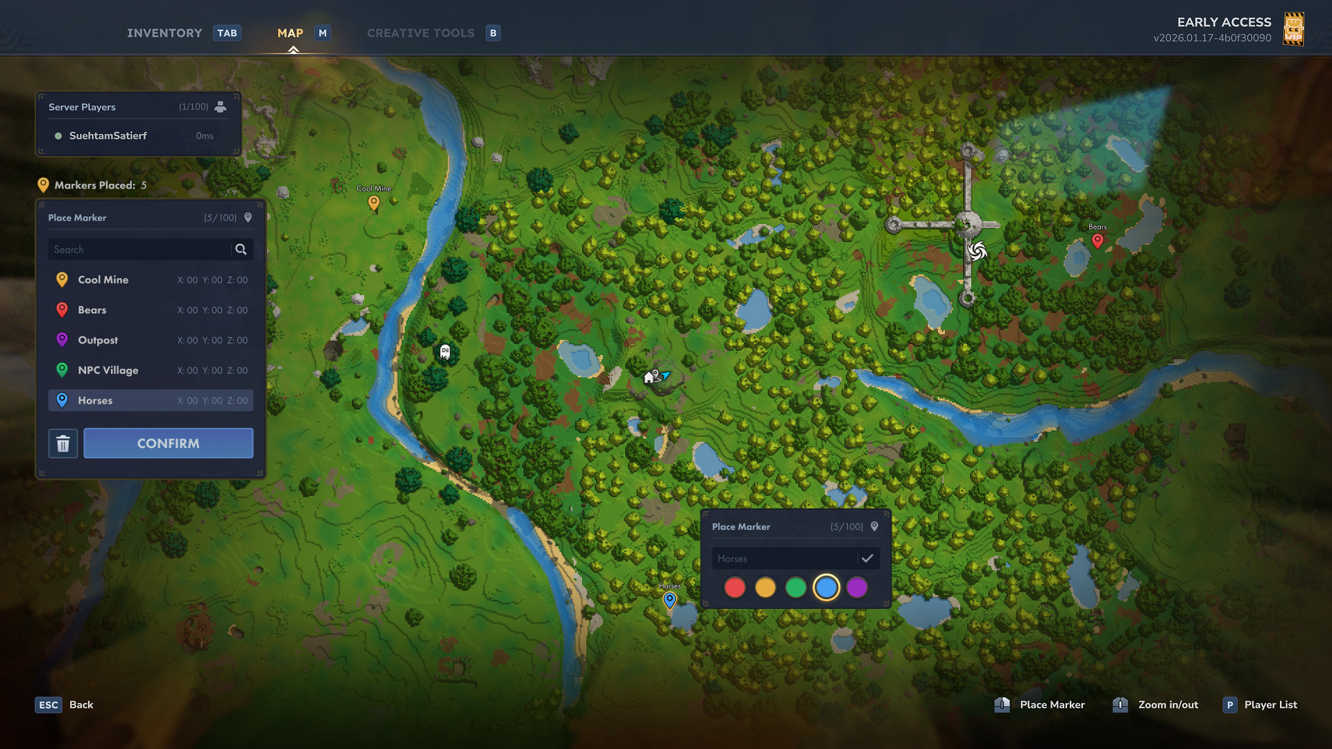
I think the map screen in Hytale is great! Hence, I only did one small modification to the marker-placing feature.
Even though Hytale has a very strong base-building foundation to it, I'm an explorative player who likes to wander around the world, raid outposts, and loot. Not only am I sure I'm not the only one, but the game actively encourages you to explore with the memories system.
Even though Hytale has a very strong base-building foundation to it, I'm an explorative player who likes to wander around the world, raid outposts, and loot. Not only am I sure I'm not the only one, but the game actively encourages you to explore with the memories system.
During my journeys, I frequently find places that I want to revisit later. Unfortunately, the game only allows you to place one marker at a time. Therefore, I redesigned the system to allow multiple markers to be placed for players who want to revisit locations they found on their way.
Markers can have different colours and custom labels. They'll also be listed on the new markers list on the left, along with their coordinates.
Below is a demonstration on how that would work.
Demonstration of revised marker-placing system
Conclusion
I'm having a blast with Hytale, and I'm glad that it was revived by the original developers, who are carrying on with development now. My goal with this case study was to explore some ideas on how to improve upon a game that is already doing a great job.
I don't know if this case study will ever be read by anybody at Hypixel Studios, but if it ends up being the case, I hope this helps to make the game even better. If it ends up being read by anybody in the modding community, too, I hope it sparks the interest of somebody to make it a reality. I'd be totally on board to contribute to that!
With all that being said, I wish nothing but tons of success to Hytale and the Hypixel team! I'll be following their path here, from the player's perspective, sharing ideas and feedback now and then when ideas come to my head. If they ever help in any way, shape, or form, I'll feel fulfilled and glad.