Project Duration:
1.5 months
1.5 months
Tools used:
Adobe Photoshop (graphics creation)
Adobe After Effects (animation of UI elements, motion concepts)
Construct 3 (implementation)
Adobe Photoshop (graphics creation)
Adobe After Effects (animation of UI elements, motion concepts)
Construct 3 (implementation)
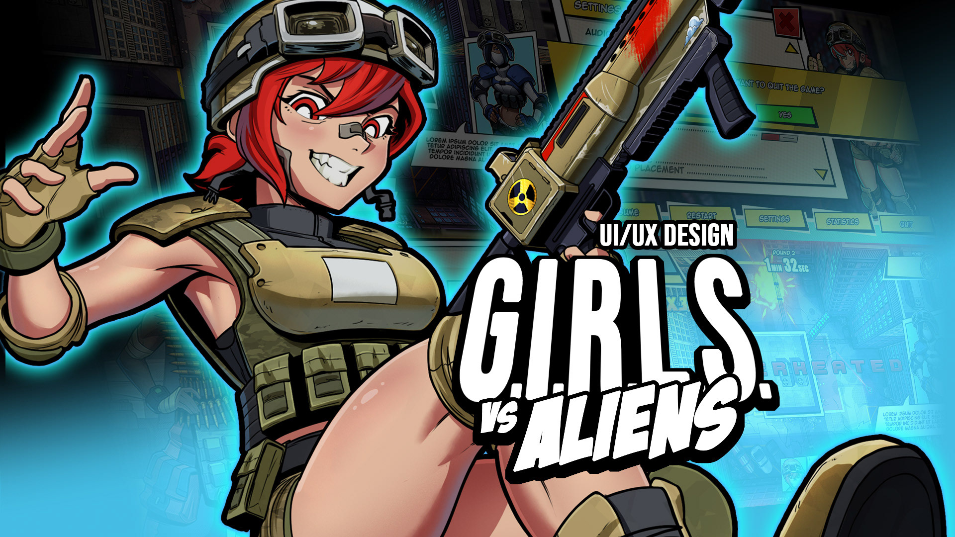
iNTRODUCTION
G.I.R.L.S. vs Aliens is a personal solo development video game project entirely designed and programmed by me. This project page will focus on the UI/UX Design aspect of the project, detailing my creative process, how the project evolved, and the steps that led it to its current state. It will also explain the reasoning behind my design decisions and share some lessons learned from testing.
G.I.R.L.S. vs Aliens is a work-in-progress project that's still expanding. Therefore, all you see here may be updated and improved upon in the future.
PROJECT TANK
Initially, G.I.R.L.S. vs Aliens was known as Project TANK, a game with a completely different concept. Project TANK was a multiplayer twin-stick shooter where players controlled war tanks and battled each other. The game was local multiplayer only, and all tanks were controlled on the same screen. Since the game was a different genre back then, the problems that needed to be solved were slightly different.
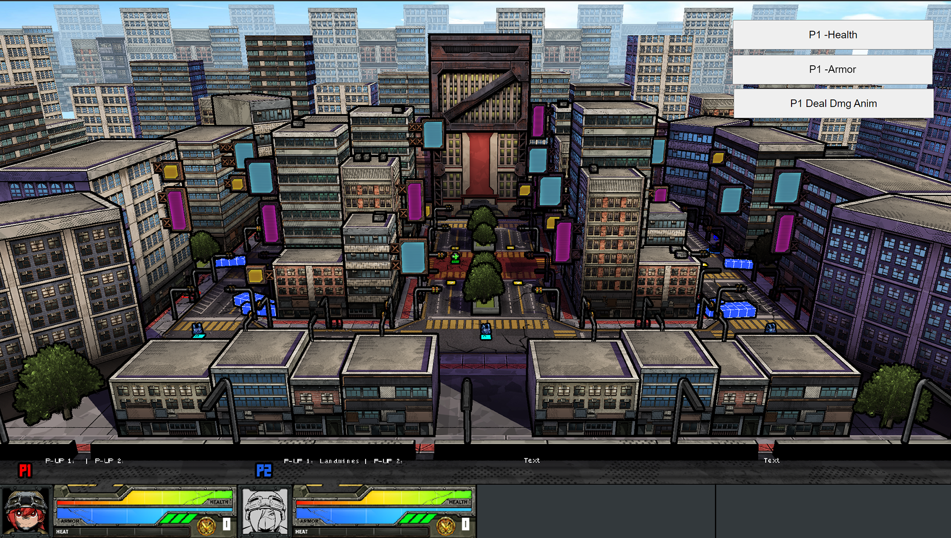
One of the main challenges for that version was to display several vital information for 4 players simultaneously on the same screen. It needed to be accessible and easy to read, even during combat. Additionally, as all players would share the same screen, I needed to make sure they knew where they were in the game world at all times.
One of the main challenges for that version was to display several vital information for 4 players simultaneously on the same screen. It needed to be accessible and easy to read, even during combat. Additionally, as all players would share the same screen, I needed to make sure they knew where they were in the game world at all times.
Lastly, since the player would only control tanks in that version of the game, I wanted to include representations of the characters piloting those tanks in the UI to create a connection between the players and the characters they're controlling, even if it's more superficially.
Screenshot of the latest version of Project Tank (with some debug features)
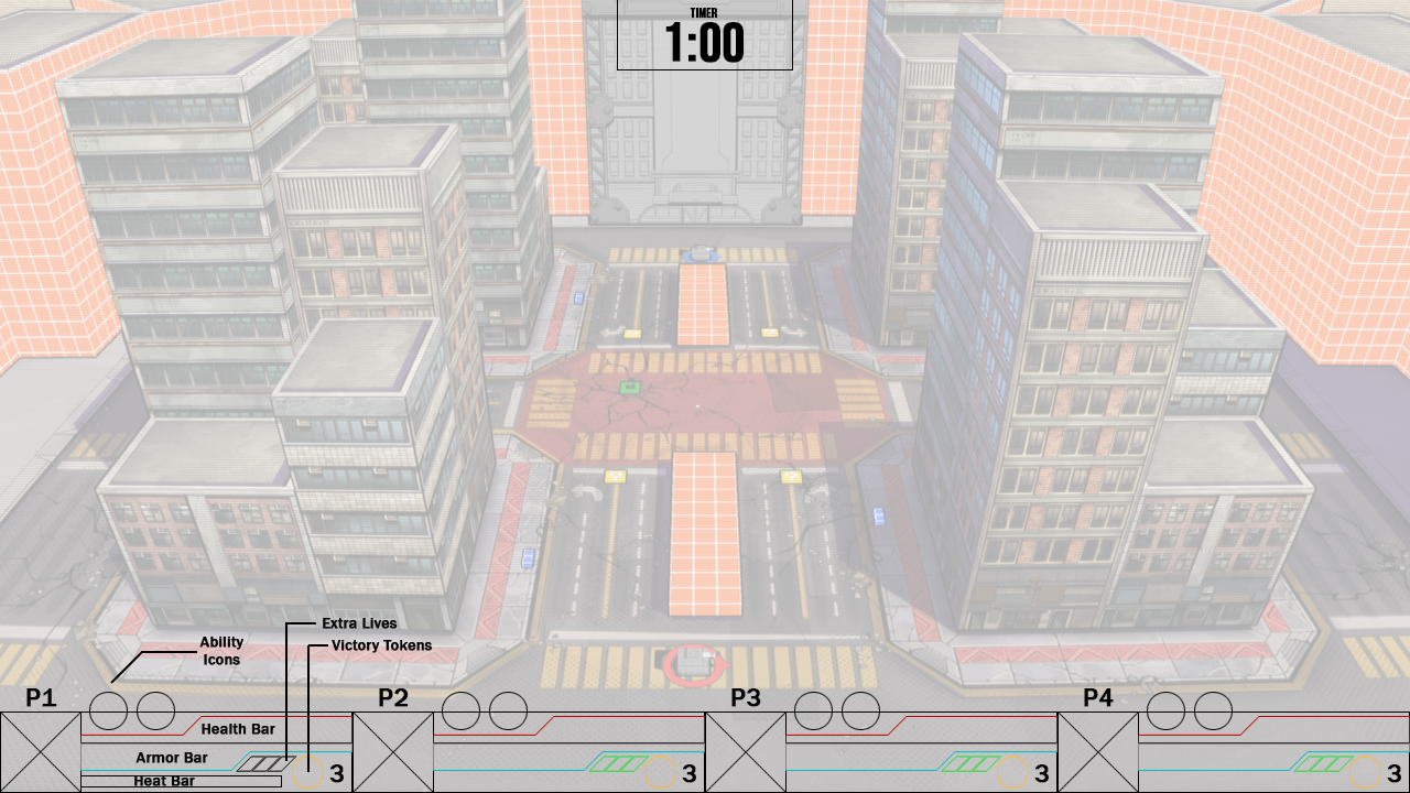
Low-fidelity wireframe for Project Tank's HUD
LOW-FIDELITY WIREFRAME
To display all the information necessary for all players that share the screen, I took inspiration from classic arcade games such as Gauntlet Legends and modern indie titles like Hammerwatch. These titles deal with similar issues as Project TANK, as they're co-op games that support up to 4 players sharing the same screen when played locally.
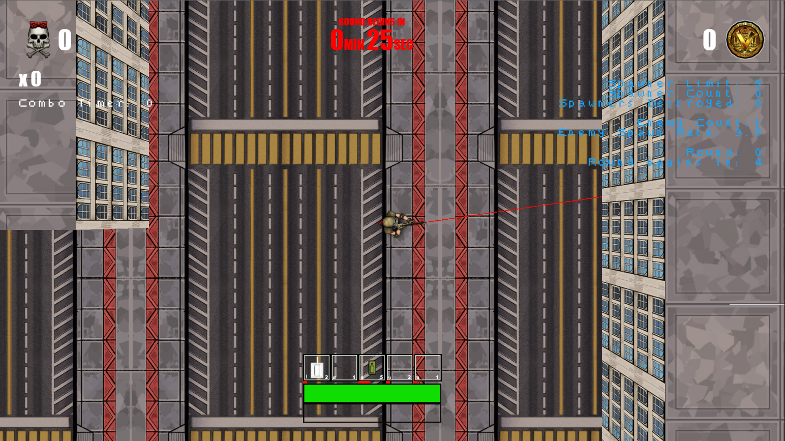
The solution was to reserve a small section at the bottom of the screen to be the player's HUD zone. Then, I split that zone up into 4 equally sized sections, each representing the HUD for players 1 through 4 in that order. Most of the information the player needs to know about their status and ability inventory is displayed there.
Information that's not related to the player goes in other areas of the screen. At this point in development, with what had been designed so far, the only other information that needed to be displayed was the match timer.
Character portrait expressions demo
Art Style
On Project Tank, the art direction was to make the UI resemble the mechanisms of military machinery, such as tanks. To achieve that, all UI elements were illustrated by hand in Adobe Photoshop. To reflect that theme, I used colours related to the military, such as navy greens, browns, and some dark shades of grey. I also designed the UI to incorporate mechanical elements, such as metal plates, bolts, and meters, which I imagine would be fitting for a military vehicle.
Project Tank had a comic book art style, characterized by its bold black lines. That direction is reflected in the illustration.
As mentioned previously, to create a connection between the player and the characters inside the tanks they're controlling, I reserved a spot in the HUD to display the characters' portraits. The idea was (and still is) to display the characters as much as possible in the UI to compensate for the fact that the player might never see them in-game.
(Note to self: Get better-looking examples of the old UI, either a Motion Graphic animation or a better mock-up.)
Change in Direction
After a few months in development, Project Tank was scrapped, and a new, more single-player-oriented experience started to be developed. The original project proved to be unfeasible in the long run, supporting only gamepads and local multiplayer content, which made it not only difficult to test but also not marketable due to the lack of online functionality, which was beyond the scope.
Project Tank became G.I.R.L.S vs Aliens, which reuses most of Project Tank's assets in a single-player oriented, top-down shooter gameplay. With the new direction, however, there are new needs that need to be met by the UI, and that was the perfect cue for a change in style, too.
Project Tank's military-themed UI designs, although consistent with the theme, were somewhat dull, particularly due to the colours, and too generic compared to other military-themed games available in the market. Besides, the new lore about a squad of female super soldiers fighting against aliens in a world that's "experiencing the 5th apocalyptic event of the month" called for a more fun aesthetic.
Hence, the new approach was to ditch the military theme and stick to the comic book art style the game already has. That created opportunities to design more impactful UI elements and use more vibrant colours while perfectly fitting the art direction.
Early prototype of G.I.R.L.S. vs Aliens, with a very rough version of the UI.
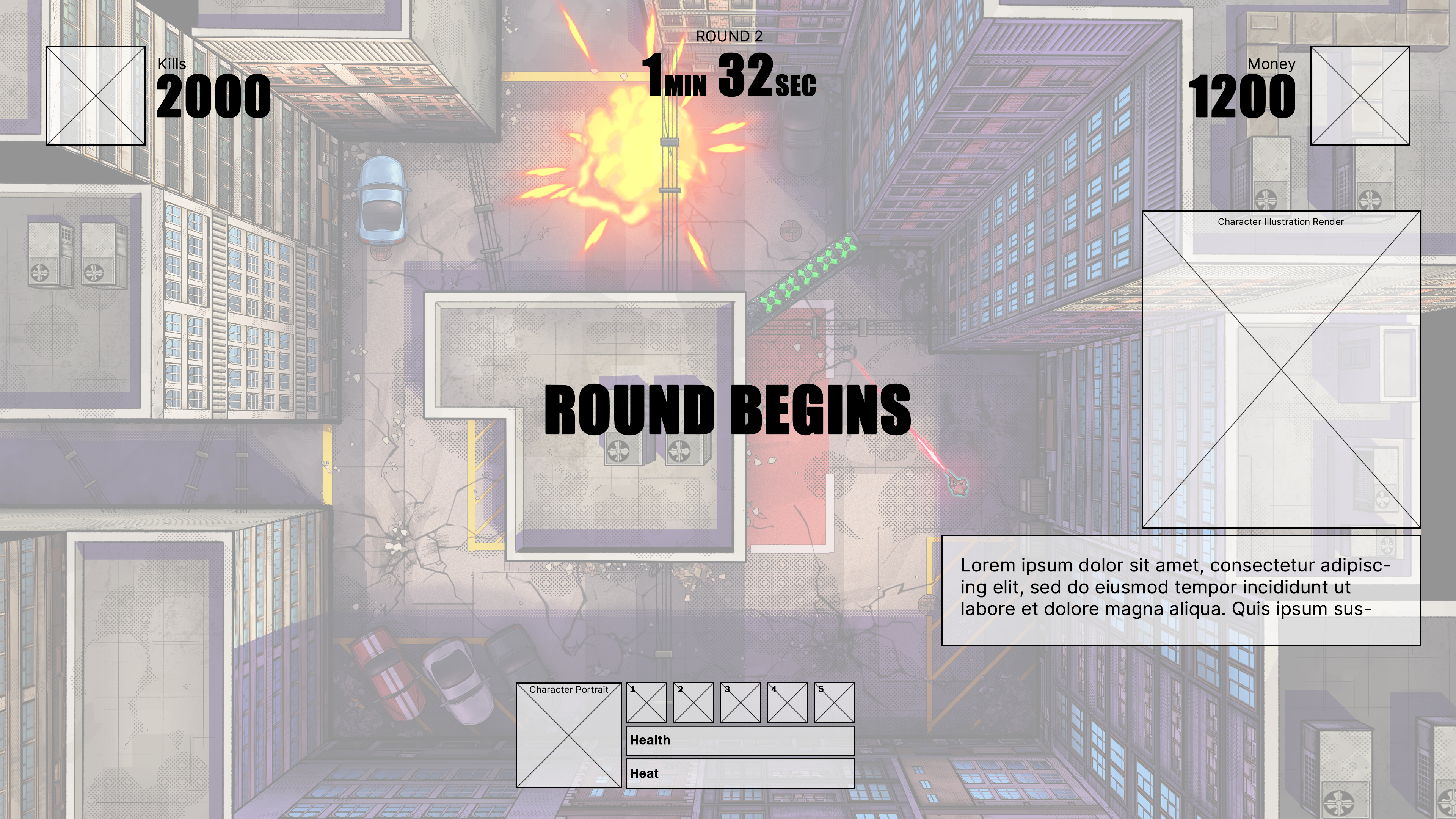
Low-fidelity wireframe done after the prototype.
What stayed the same?
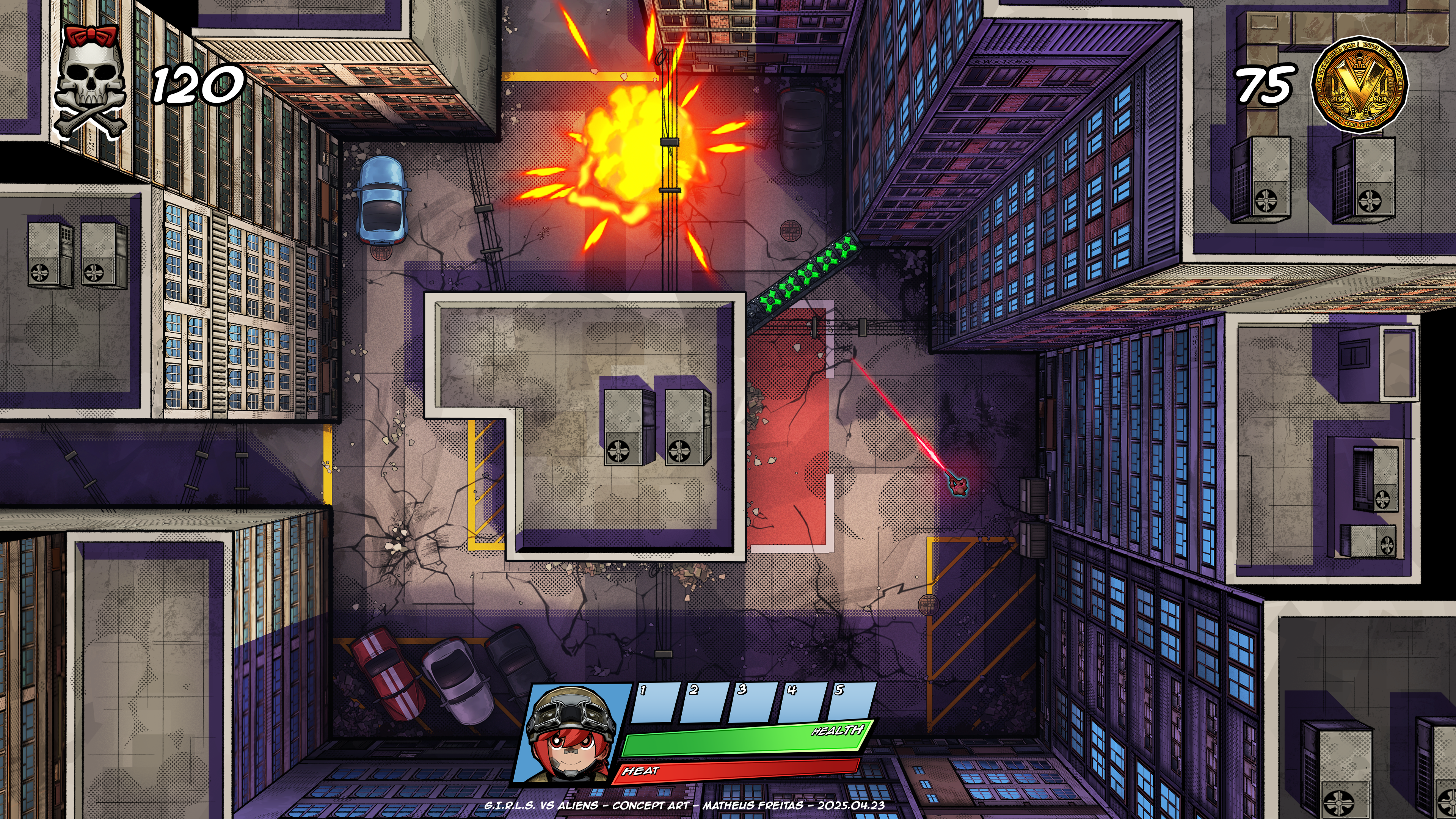
Although most UI assets from Project TANK have been scrapped, some elements survived. A coin had already been designed to represent the Victory Token, so that was repurposed into a money icon for G.I.R.L.S. vs Aliens. The skull and crossbones icon was repurposed from a sticker design used on a gun.
The most important element that survived was the character portraits in the HUD. Although players can now control the actual characters in G.I.R.L.S. vs Aliens, the camera angle allows them to only see the top of their heads and shoulders. That gives very little information on how the character looks or how it reacts to what happens in the game, meaning that the need to have character art in the UI to improve a player-character connection was still present.
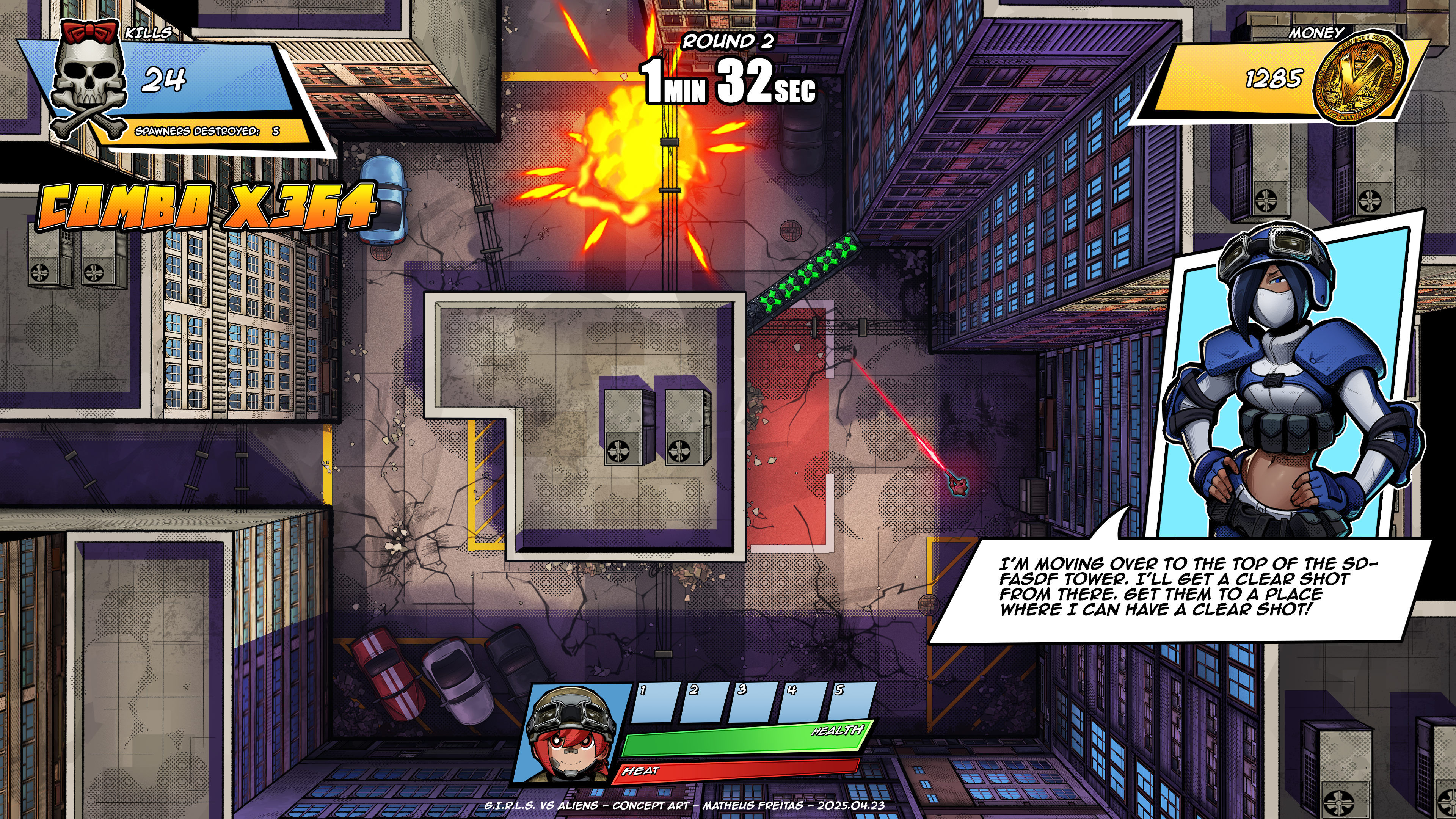
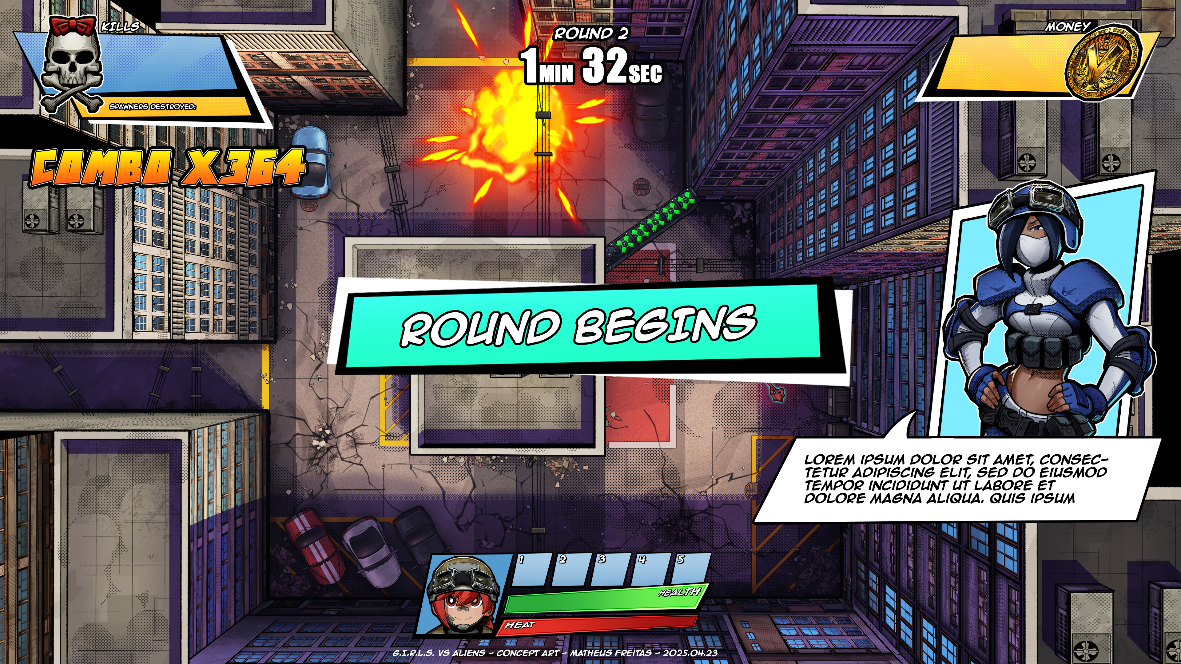
The video below demonstrates how the main elements of the HUD work and how the character's portrait reacts to the events of the world.
G.I.R.L.S vs Aliens HUD demonstration
Playtesting
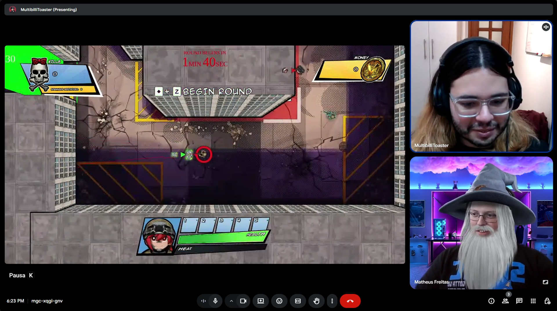
Throughout the development of G.I.R.L.S. vs Aliens, several testing sessions have been performed with a few different testers. Those were valuable experiences to assess what's working and what needs extra attention.
Based on the observations made and notes taken during these test sessions, several changes to the UI have happened since the early stages of this project. Certain issues were recurring and required some back and forth, along with some fine-tuning to increase the effectiveness of its communication, and there's still work to be done!
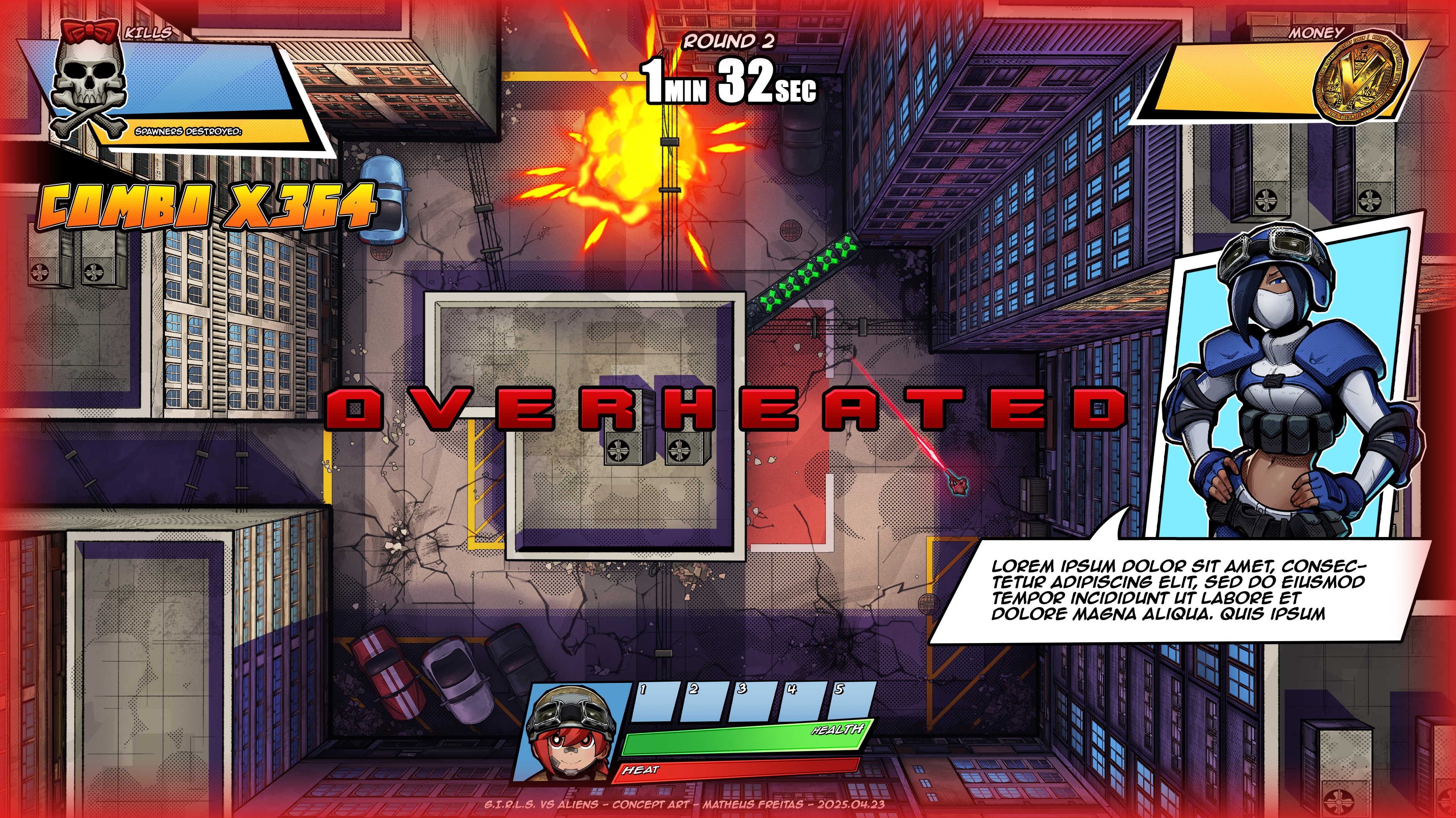
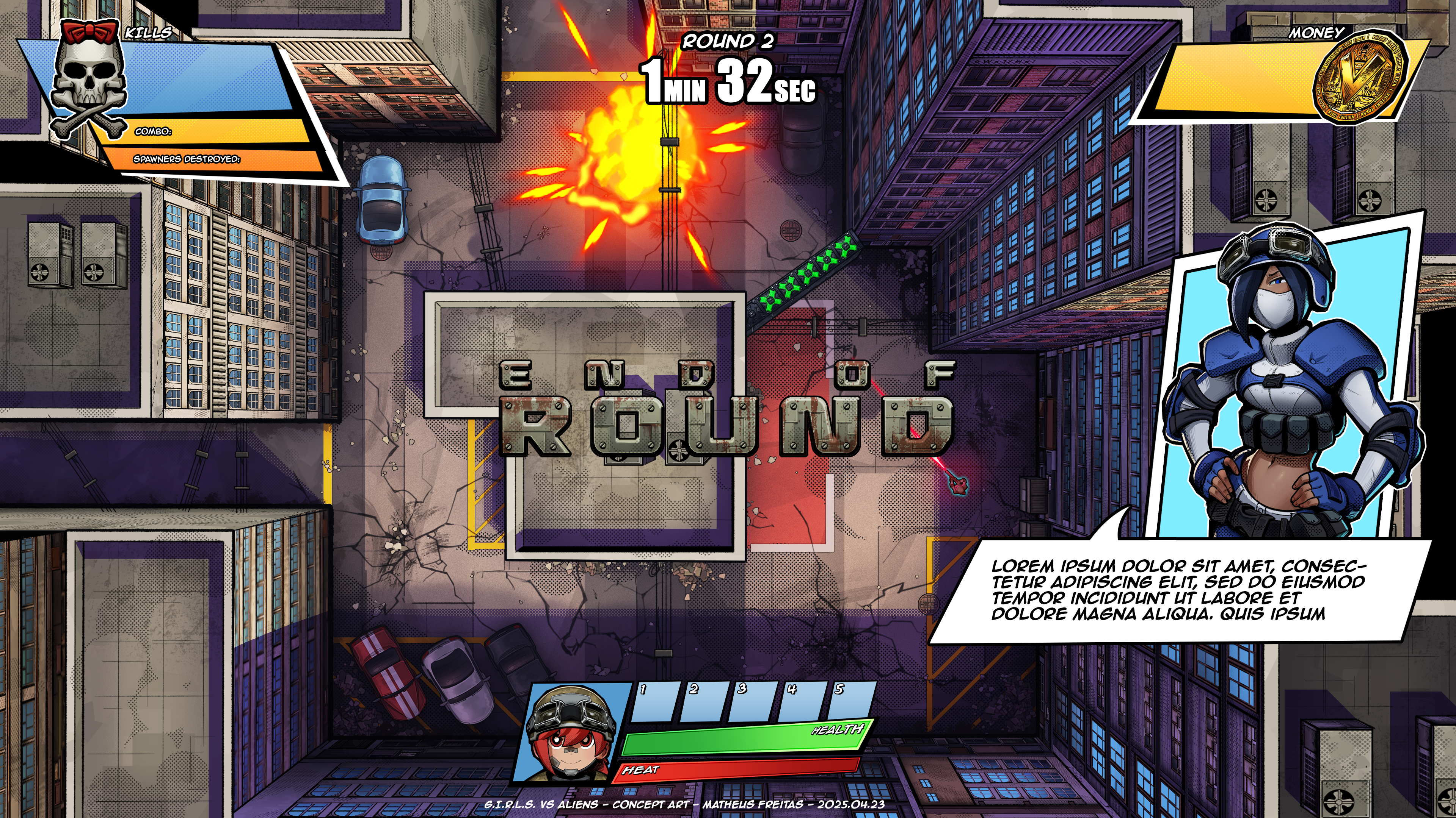
Some of the issues observed were how some information displayed on the HUD was not obvious or readable enough. Testers would often ignore important HUD indicators, visual feedback, and input prompts, among other UI elements.
One good example of this was the combo counter. In older versions, the counter was very small, stacked underneath the kill counter on the top-left corner of the screen. Many testers weren't even aware of the combo system when playing!
V001
V002

V003
The Shop Menu
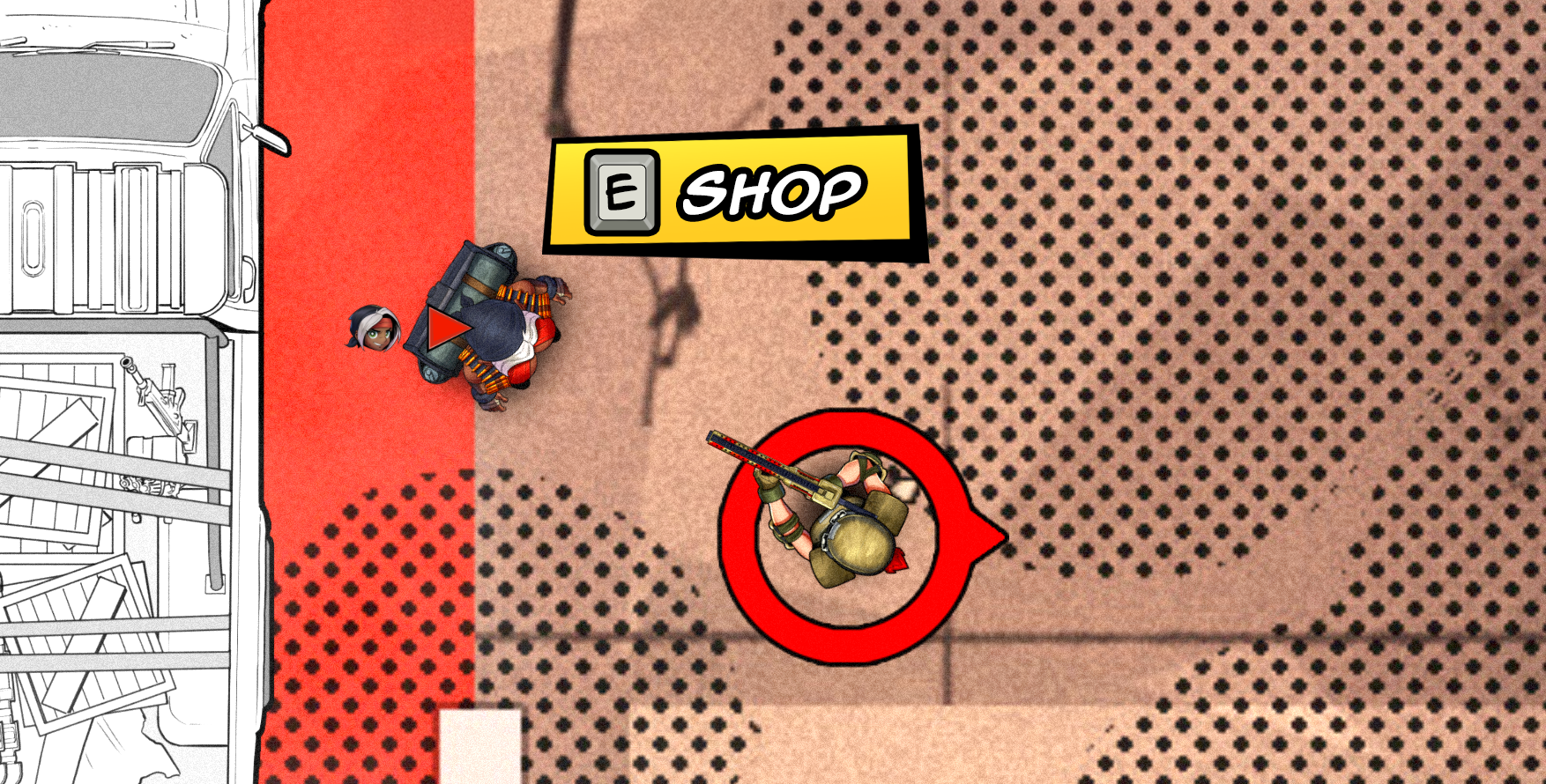
One of the new features of G.I.R.L.S. vs Aliens, in comparison to Project Tank, is the existence of a shop. There, the player can purchase abilities and upgrades to improve their effectiveness in combat.
The shop can be accessed by interacting with the merchant in the game's world. Since the merchant is a character, it also deals with the player-character connection issue, so a character render has also been included in the shop menu. It's appealing and adds flavour to the game by letting the player know that they're doing more than just interacting with a menu.
UI-wise, the shop is broken down into two categories: Abilities and Upgrades. Abilities are bought by unit, being placed into the player's inventory upon doing so. Upgrades can be purchased to level up the stats of players and abilities. Each one of them will require unique icons to be designed (currently, there are no icon designs).
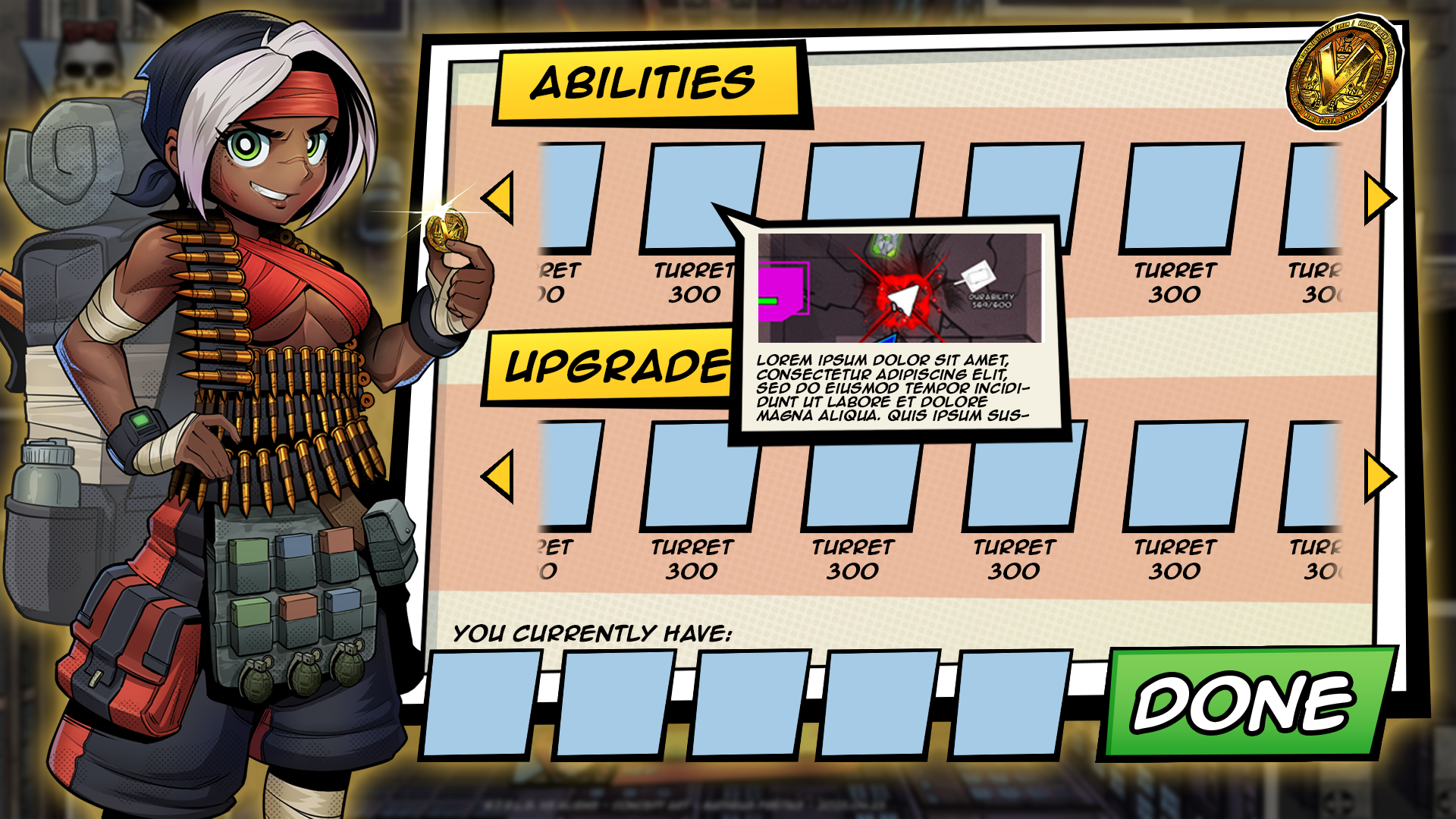
Shop Menu mock-up
A little dialogue box appears when the mouse hovers over an icon in the shop, explaining what that item does. It was designed to resemble a speech bubble from comic books, and it includes both a description of the item as well as an image that illustrates what it does. This information will help the players to have an idea of how an ability works or what is being upgraded. It's particularly useful when the player is experiencing the game for the first time.
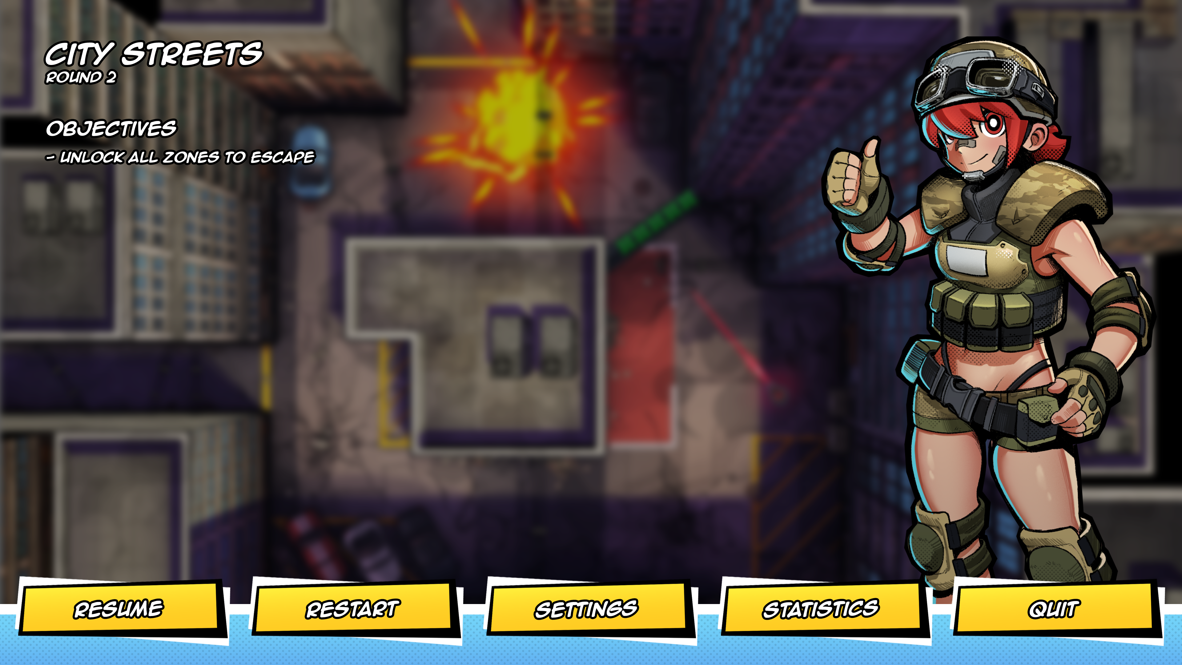
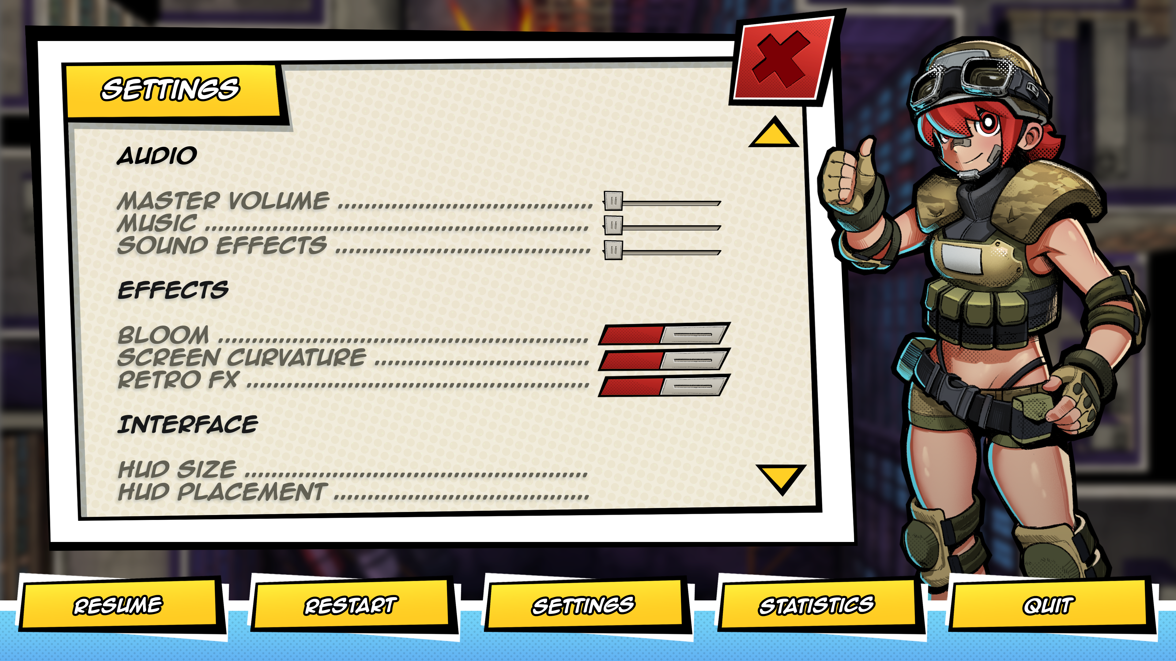
The Pause Menu
The use of character art in the interface extends to the pause menu as well. It is designed to have a render of the character the player is playing as displayed on the right side. Ideally, the character illustration would be animated, but that's currently a wishlist item due to scope concerns.
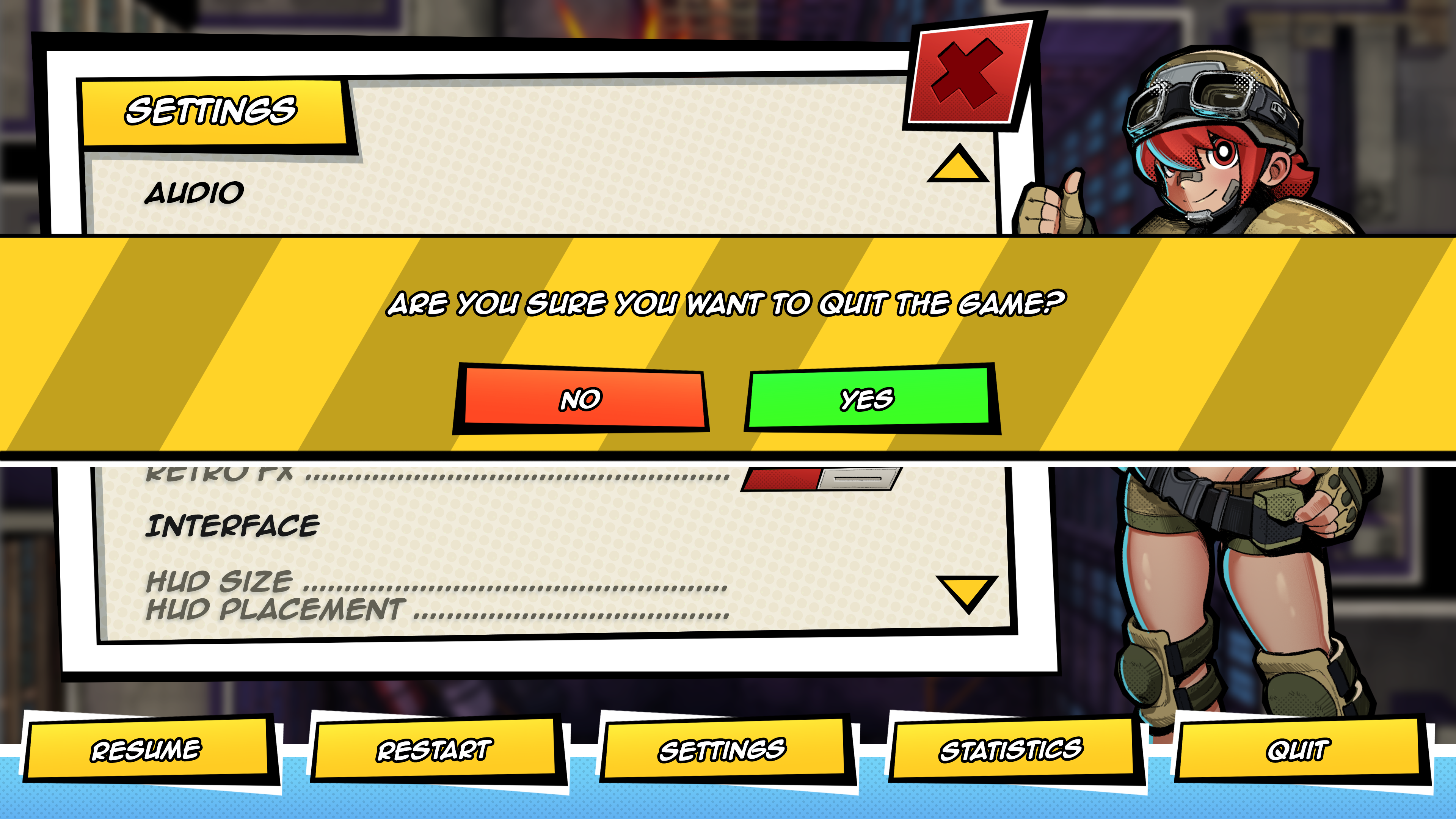
There are only a limited number of options in the pause menu. Most of them lead to simple tasks that involve only a couple of steps, such as quitting or restarting the game (which prompts the player with a modal window asking if they're sure about their action).
However, "Settings" and "Statistics" open a new window around the middle of the screen, giving the player more information and options to control. Under settings, players can change the configuration of the game to fit their needs, whereas under Statistics, players can see the stats of their matches (how many enemies killed, how much damage was dealt, etc).
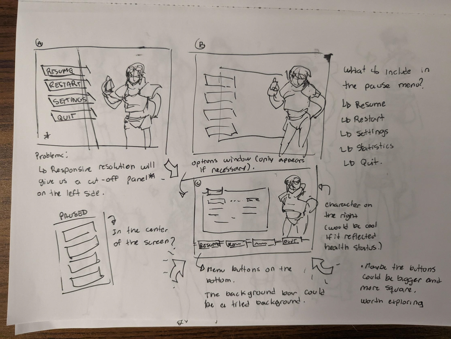
Pause Menu paper sketches
Takeaways
G.I.R.L.S vs Aliens has been a very insightful project and a valuable learning experience. Through iterations and testing, I've come to realize how players behave and interact with the interface, as well as how much information they have to juggle and end up missing completely.
Throughout the project, I found myself reiterating UI elements many times so they can be more noticeable and visible during intense, fast-paced combat. I found that the use of bright, contrasting colours combined with motion is the way to go for HUD elements that communicate information to the player during action moments, and while there's some wiggle room to make more discrete components for calmer moments, players will still ignore elements that are too small or subtle.
Positioning of UI elements is also key for players to perceive them. Input prompts, for instance, will be completely ignored if they're not naturally mapped, even with enough contrast and visual appeal. Input prompts should be positioned near the center of the player's view, and as players are often looking at the objects they want to interact with, that means those UI prompts need to be placed near those objects. That is especially the case for top-down games such as G.I.R.L.S. vs Aliens, where players pay more attention to areas closer the the edge of the screen rather than the center, where their character is.
Additionally, the GUI on its own is not 100% effective, and often needs the aid of other sensorial elements to drive its point home. For example, a giant, flashing red text saying "overheated" in the middle of the screen, while obvious, will not be fully effective without a supporting sound effect. The game's UI is a lot more effective when multiple different senses are triggered.
The implementation of these observations has demonstrated clear improvements in players' performance and reduced the likelihood of them getting lost or being unsure about what something does or what button to press, even without an onboarding process in place. There is still work to be done, and many things can still be improved.