UI/UX Redesign of the game Atlyss
~2 months
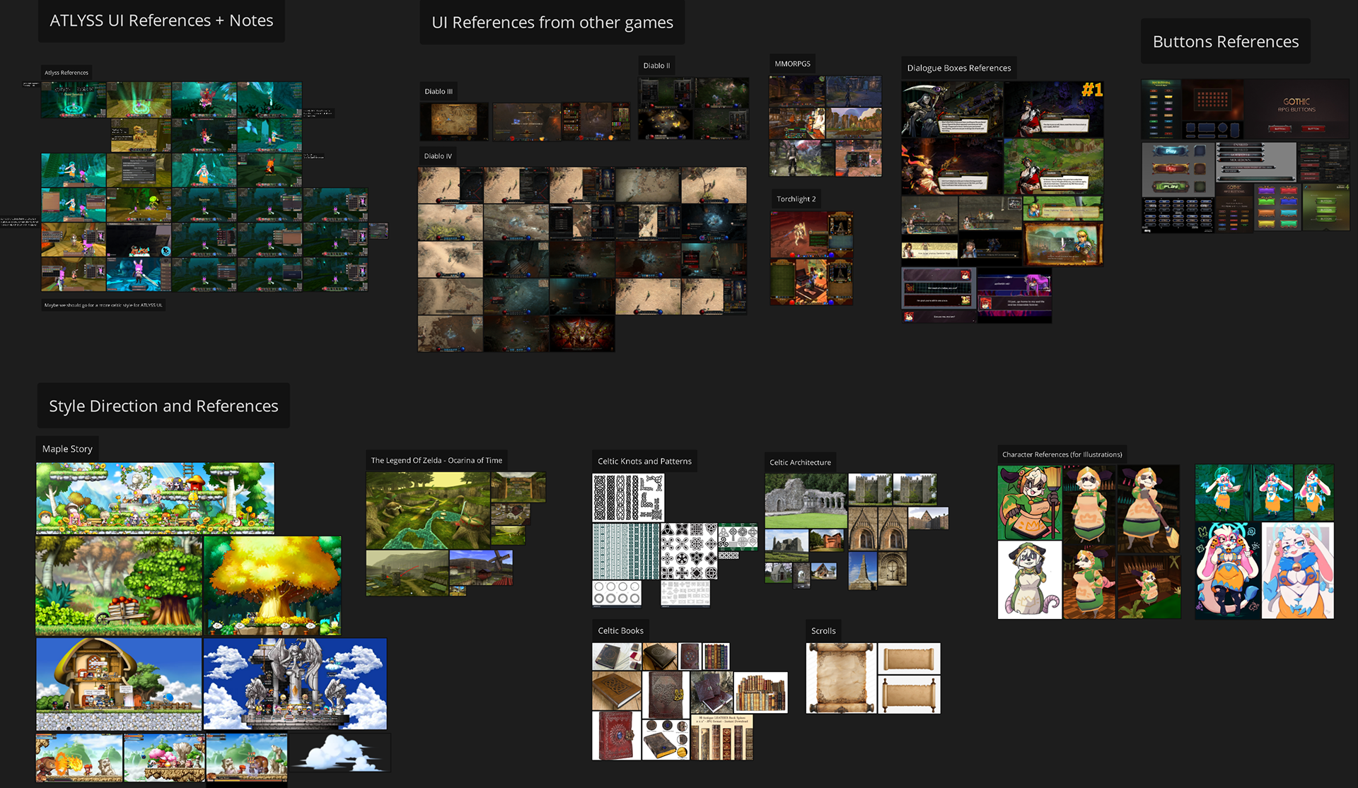
- Adobe Photoshop (Creation of Assets, Drawing and Painting)
- Adobe Illustrator (Specific Vector Work)
- Figma (Sitemap, User Flow, Wireframing, UI Design, Prototyping)
Atlyss is an indie action role-playing game developed by Kiseff and published under the name KisSoft. It's a game I particularly enjoy playing due to its fun and responsive combat mechanics, as well as its nostalgic aesthetics, which resemble an MMO from the 2000s.
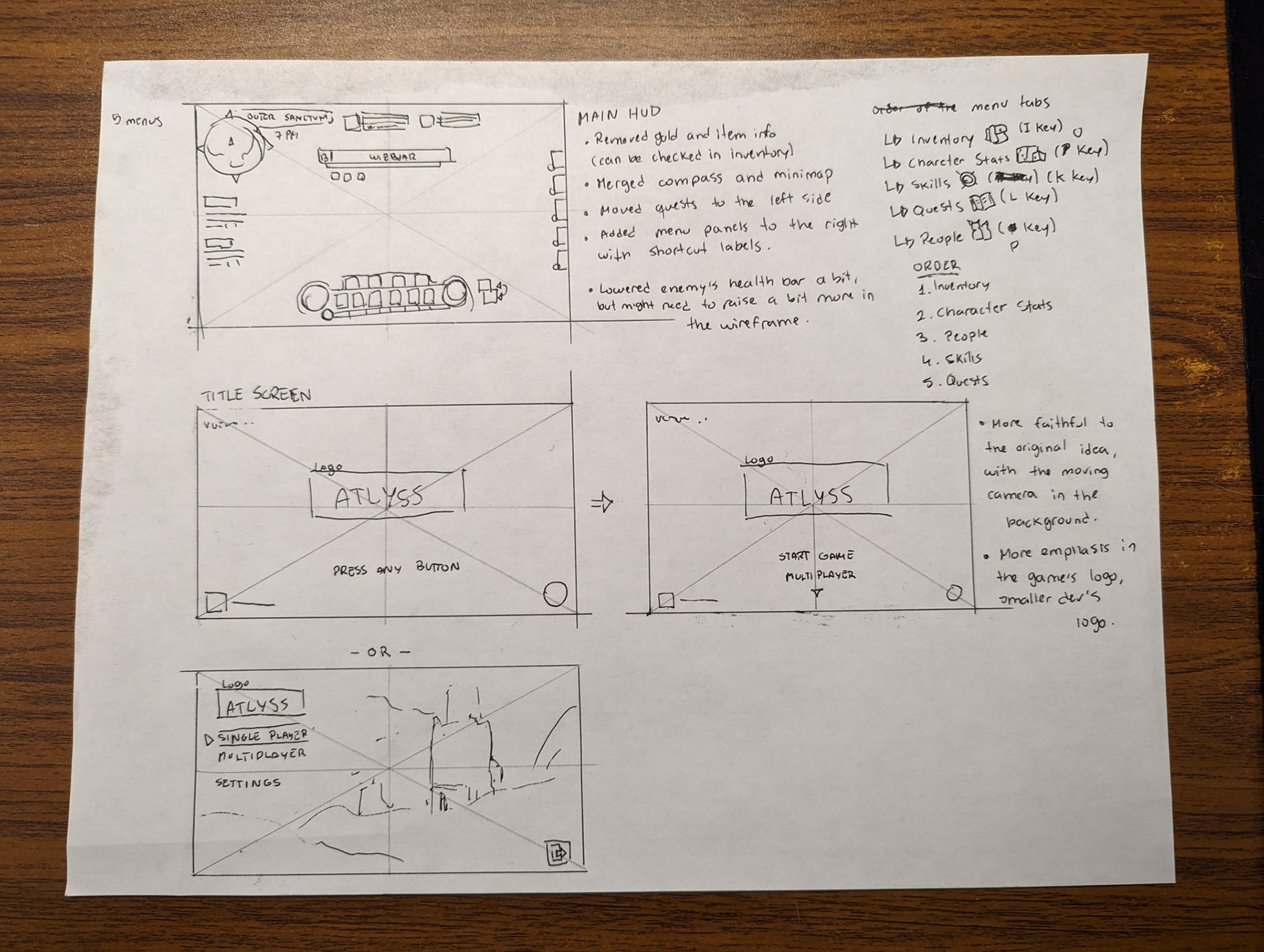
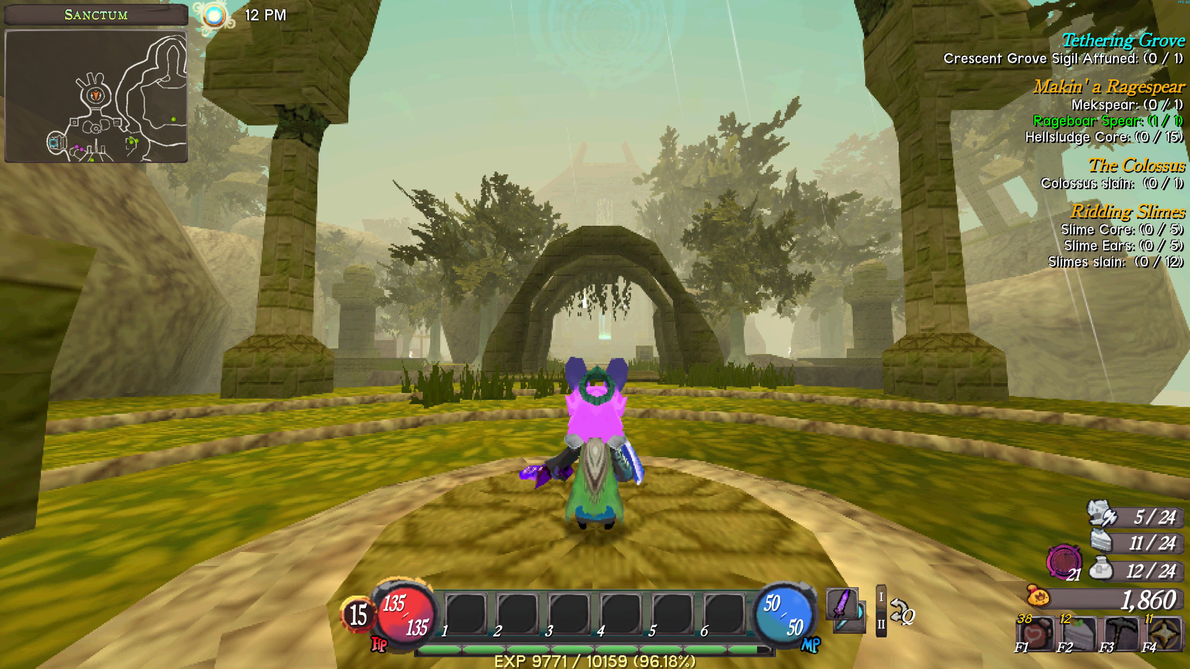
- Lack of clarity ON HOW TO ACCESS MENUS (no shortcut labels anywhere, and navigating from one menu to the next felt very unintuitive).
- Critical elements are too close to the edges of the screen, far from the focal area of the gameplay (quick slots with important items are too far from the focus area on the screen to be easily checked during combat).
- Unnecessary information cluttering the screen (we don't need to see how many items we have in our inventory at all times).
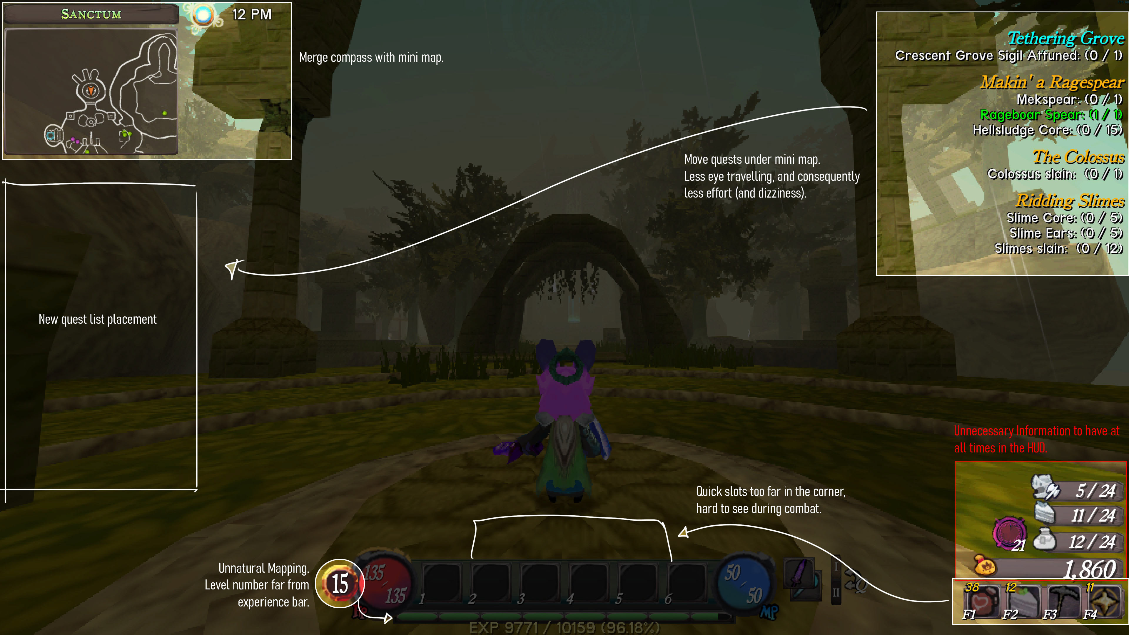
NOTES MADE ON TOP OF ORIGINAL HUD.
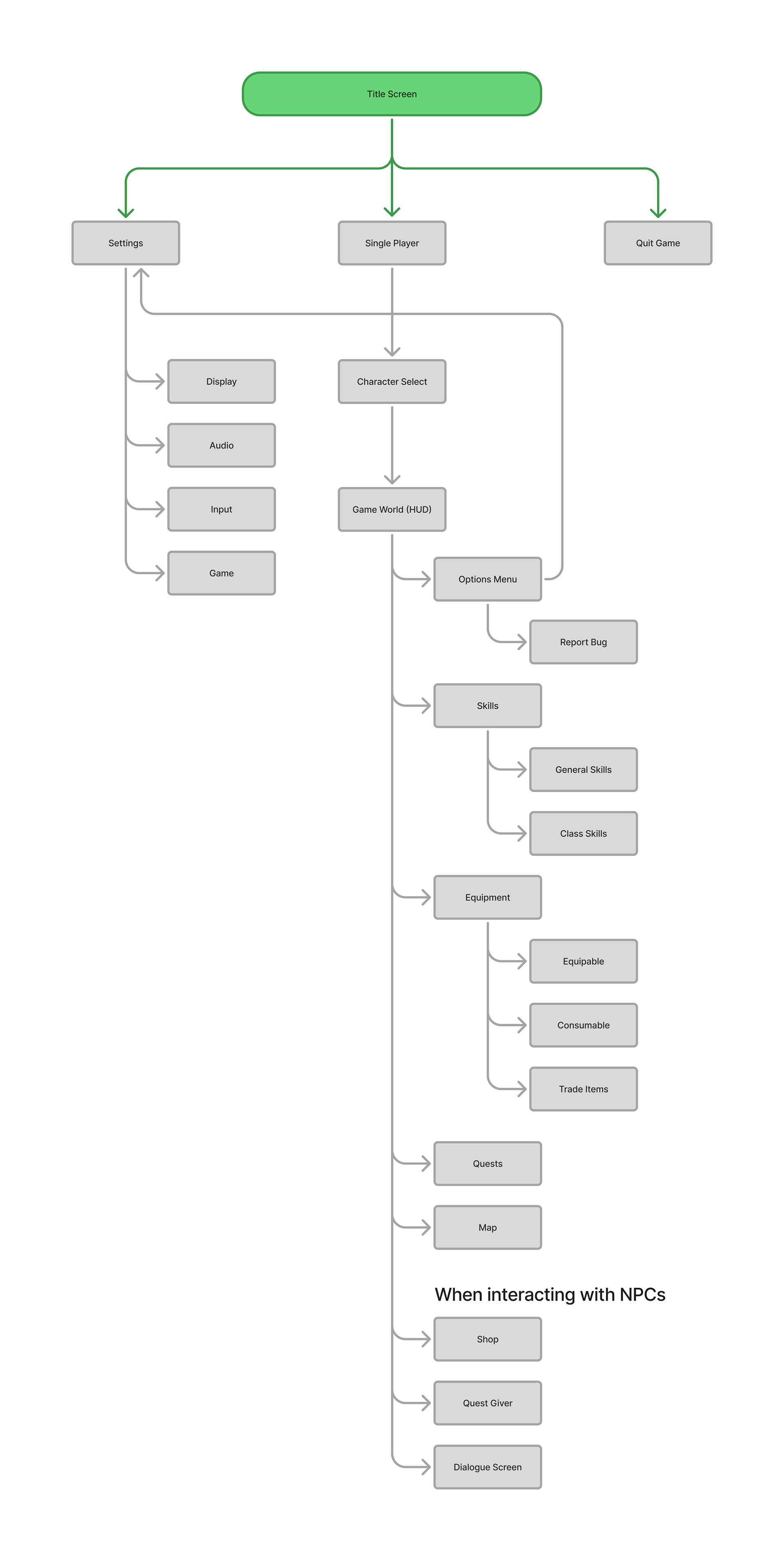
Atlyss's sitemap for this project
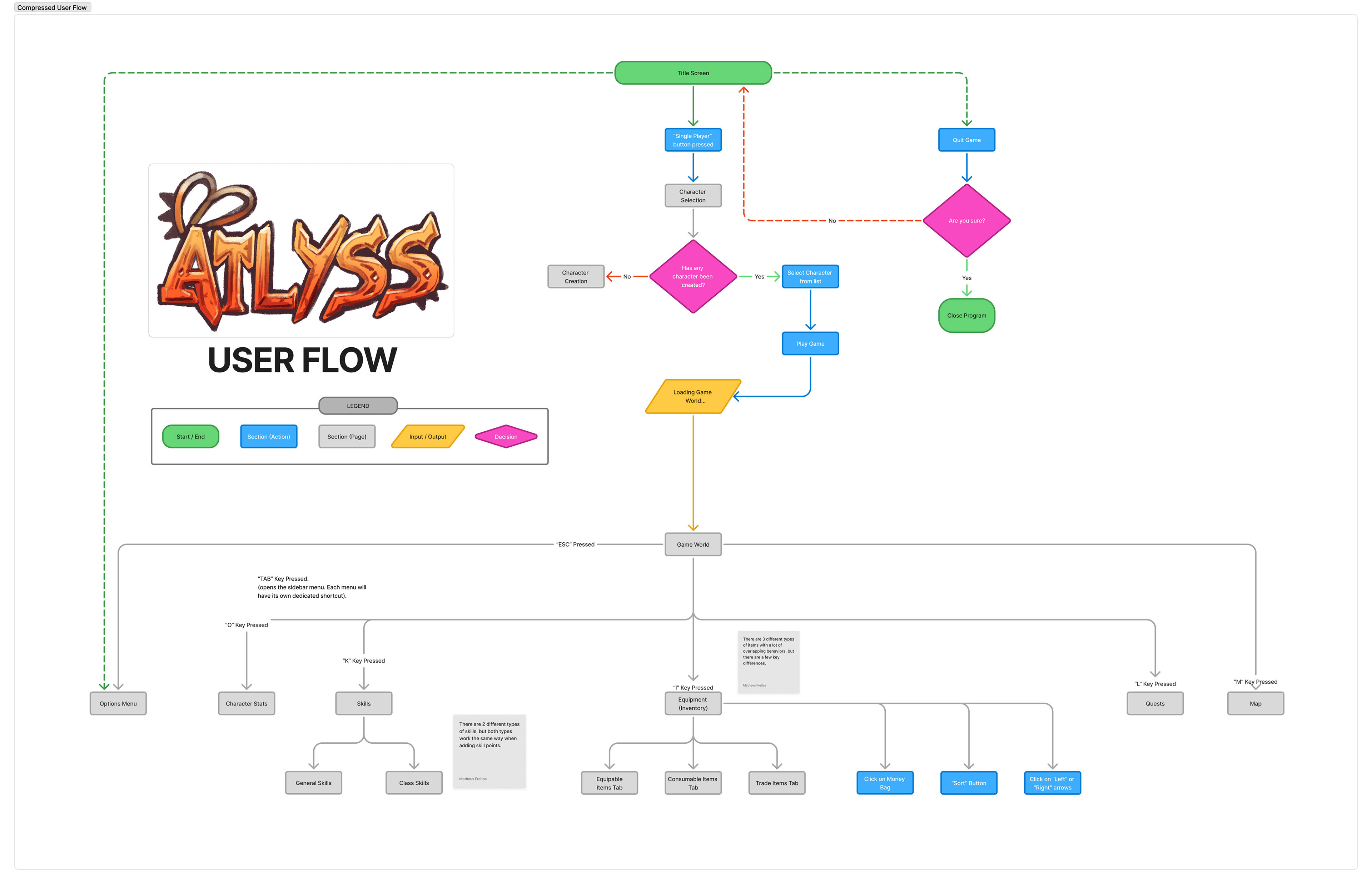
Compressed view of this project's user flow.
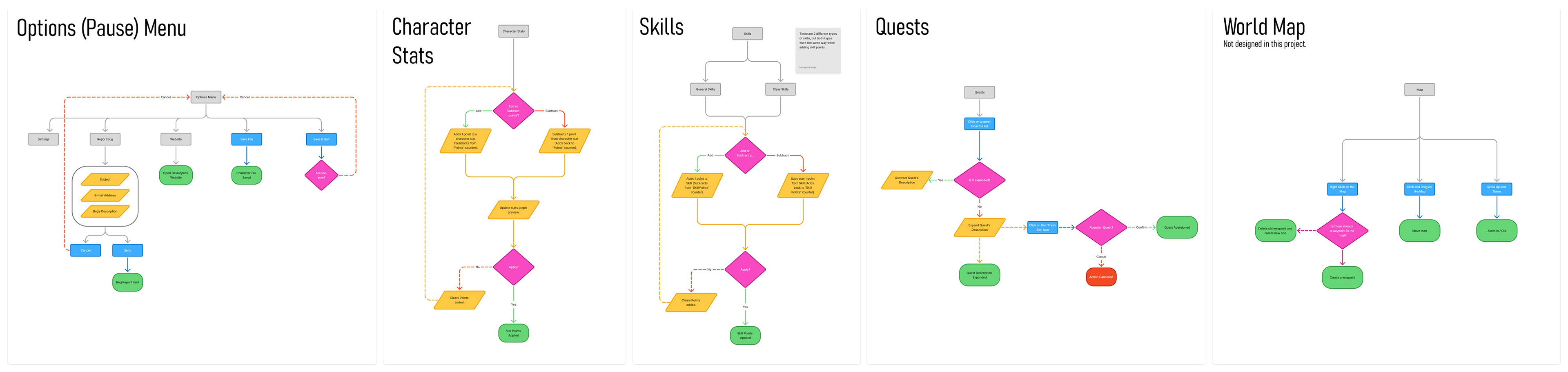
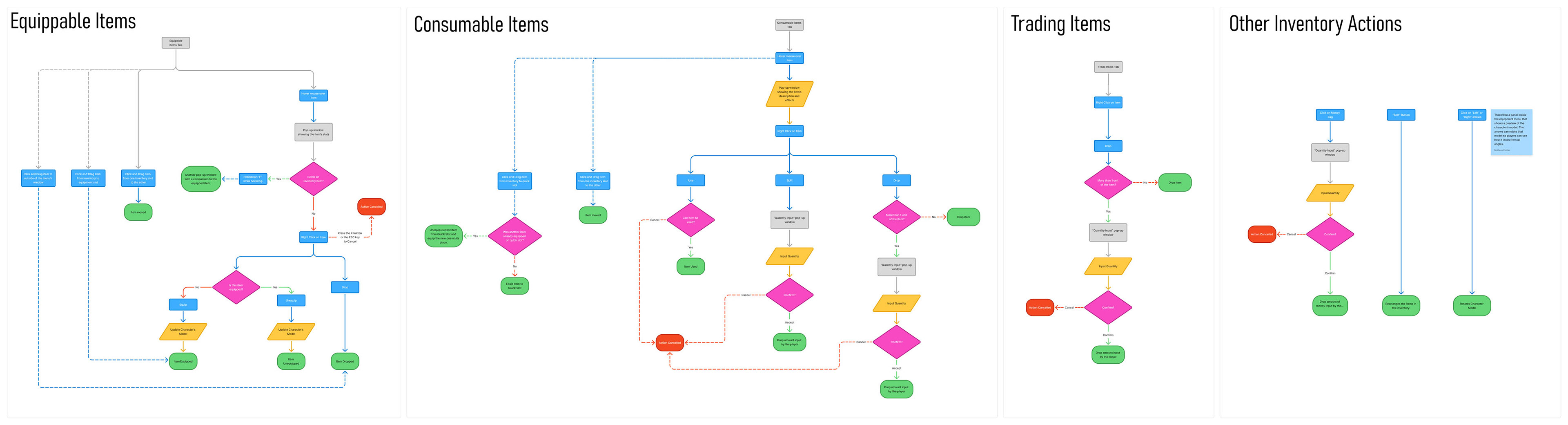
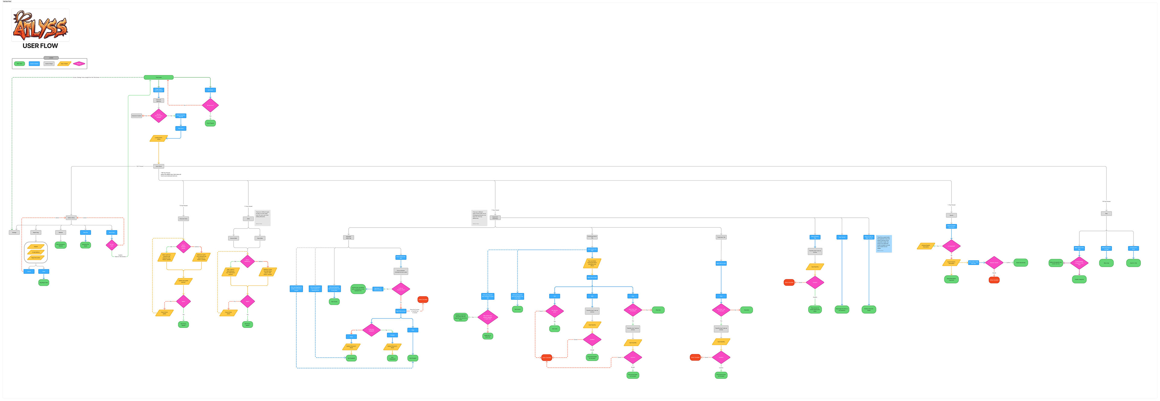
Overview of the entire user flow for this project.
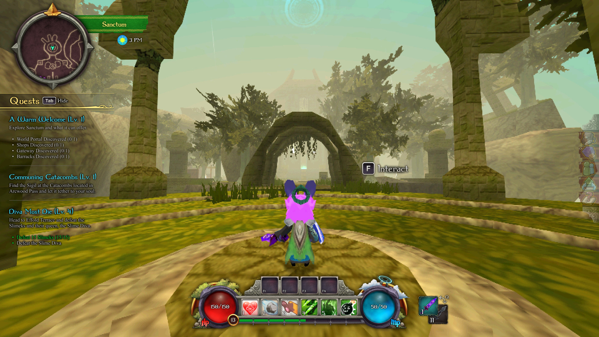
HUD Low-Fidelity wIREFRAME
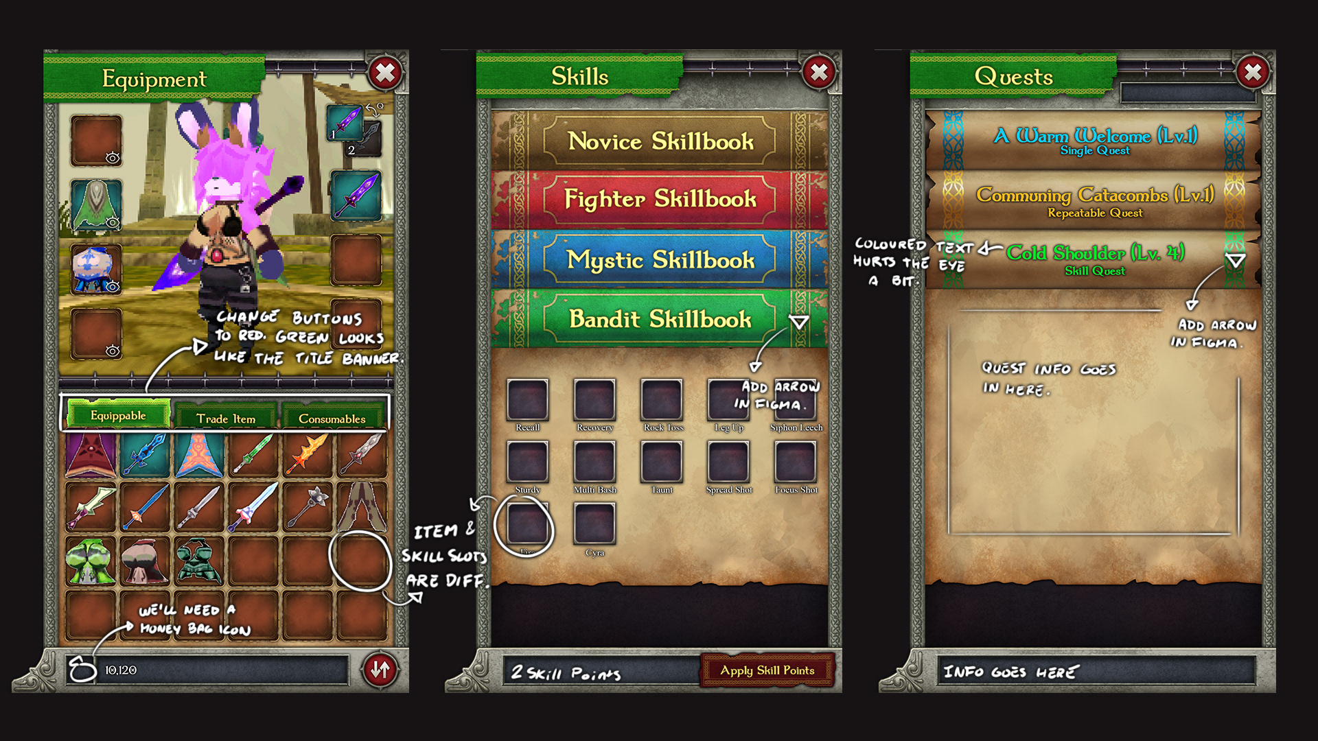
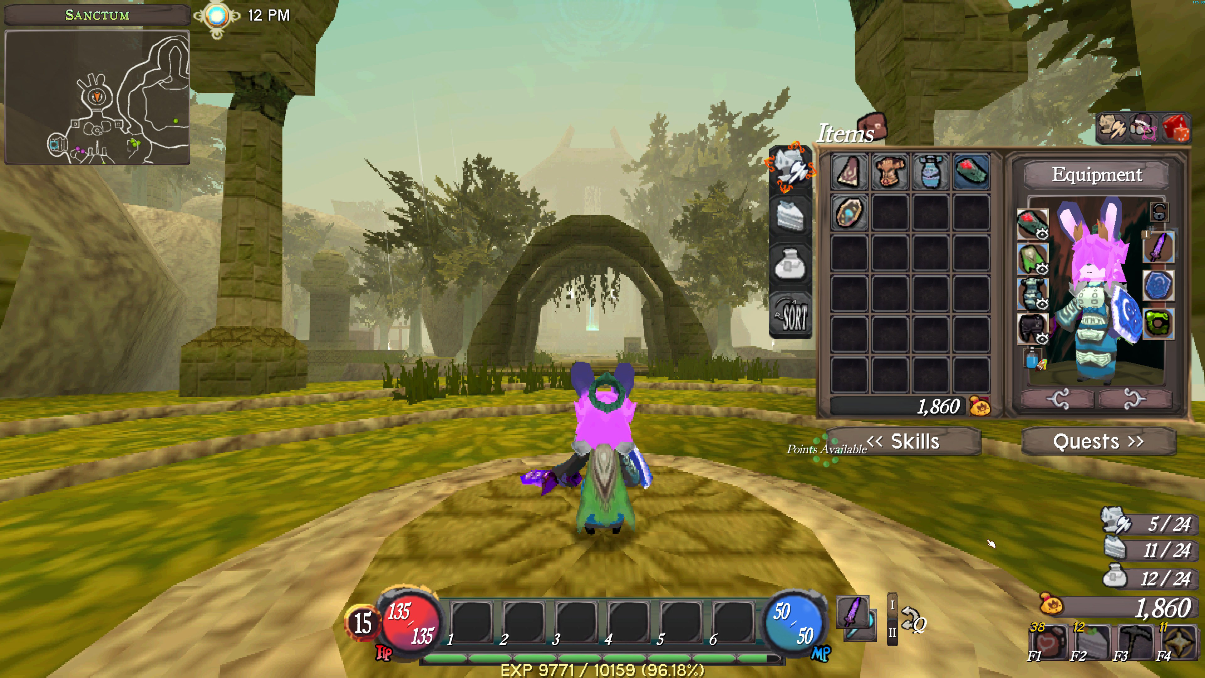
Inventory
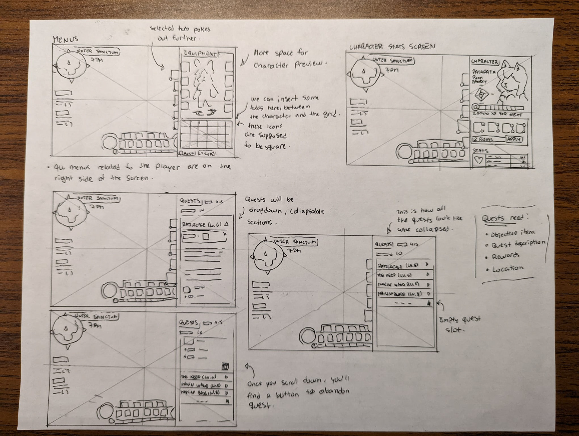
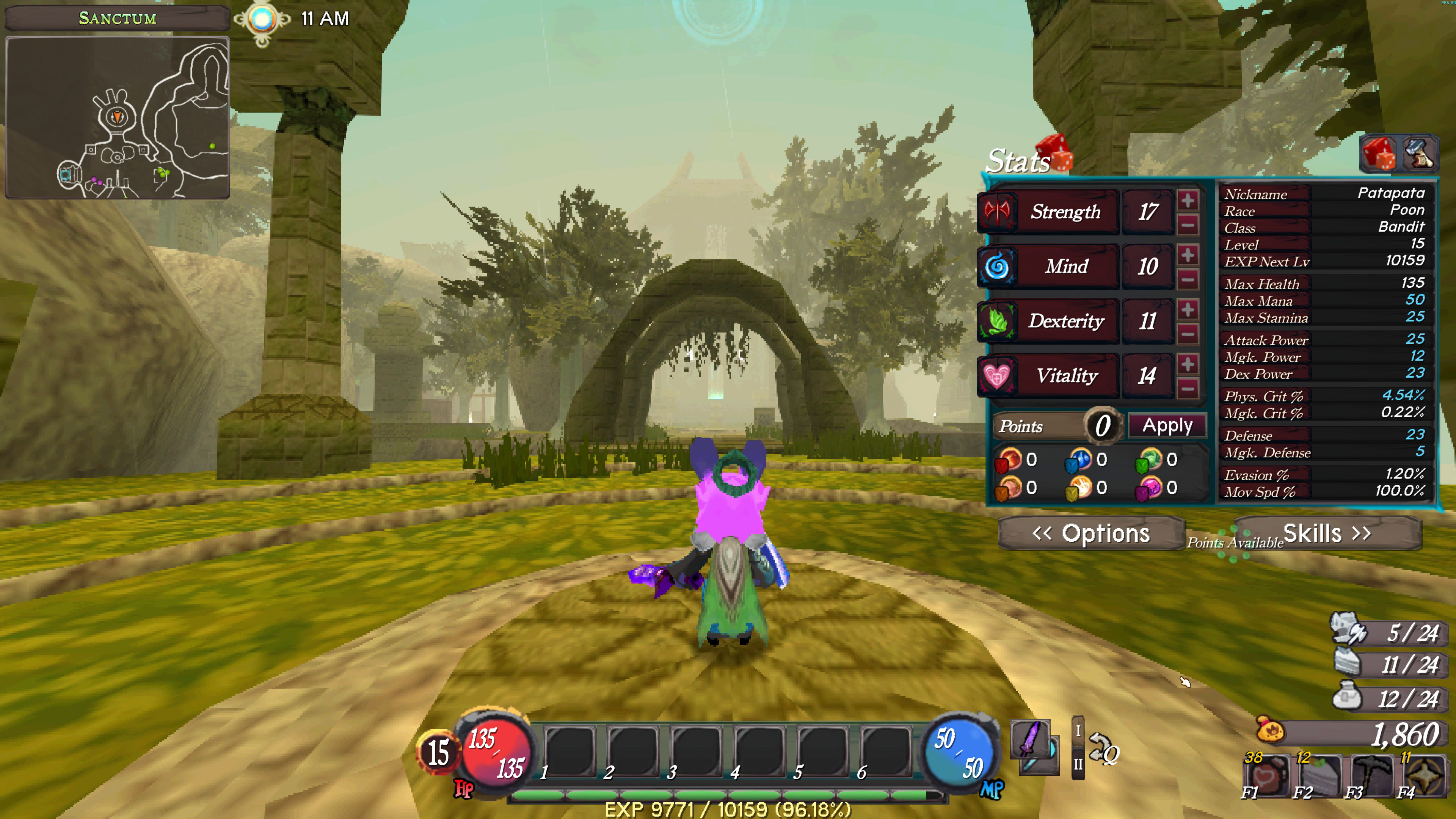
Character Stats
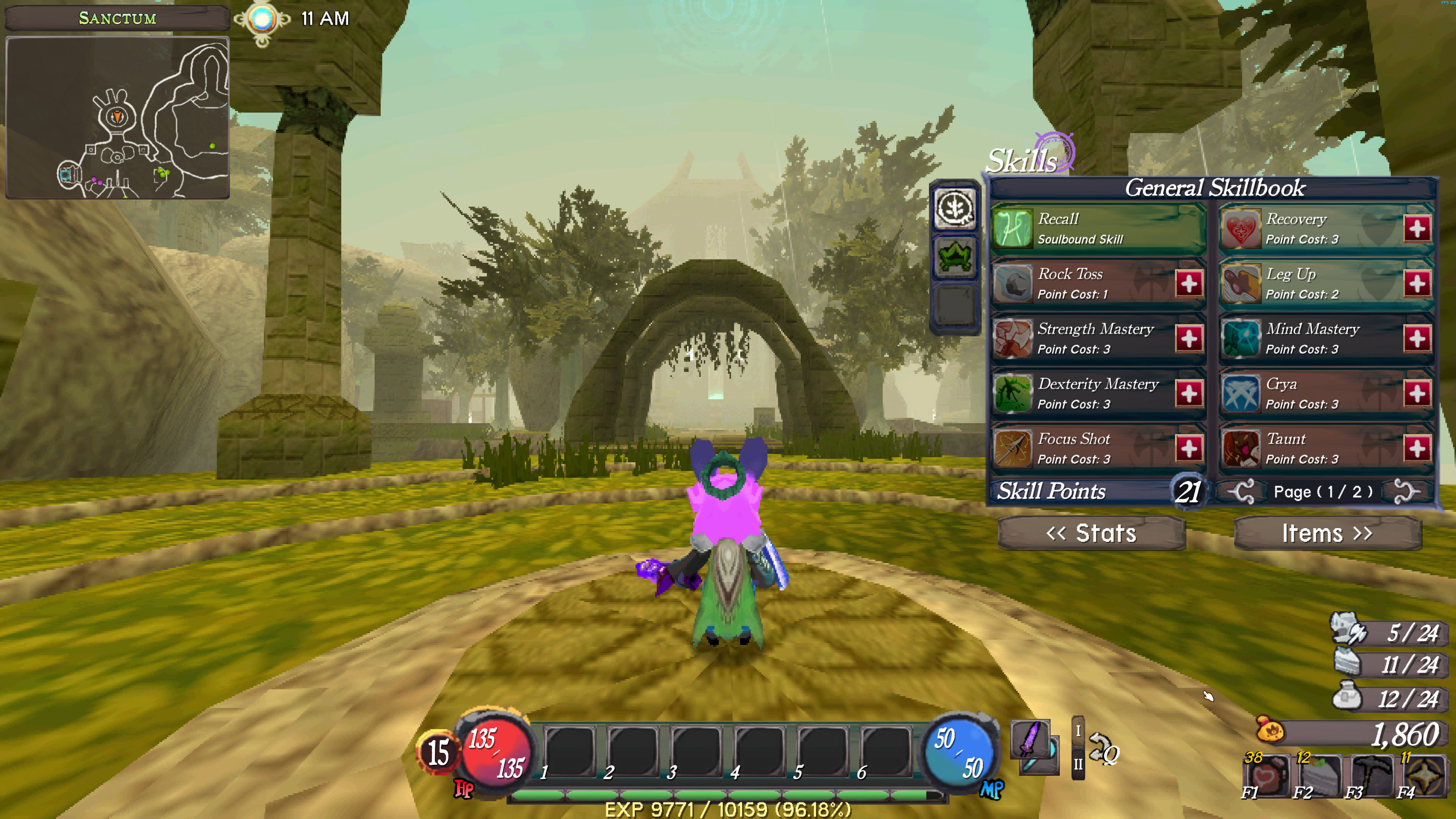
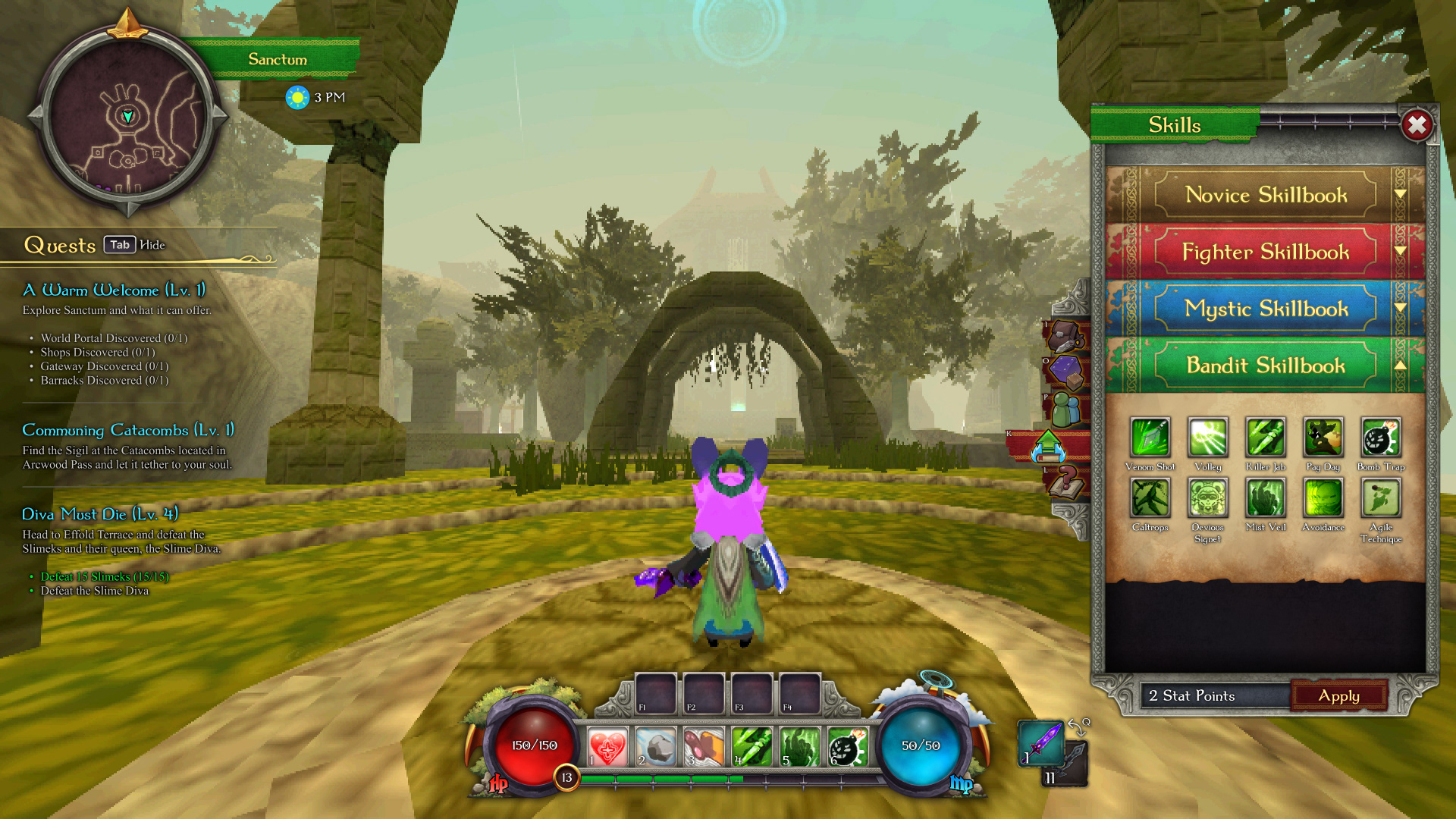
Skills
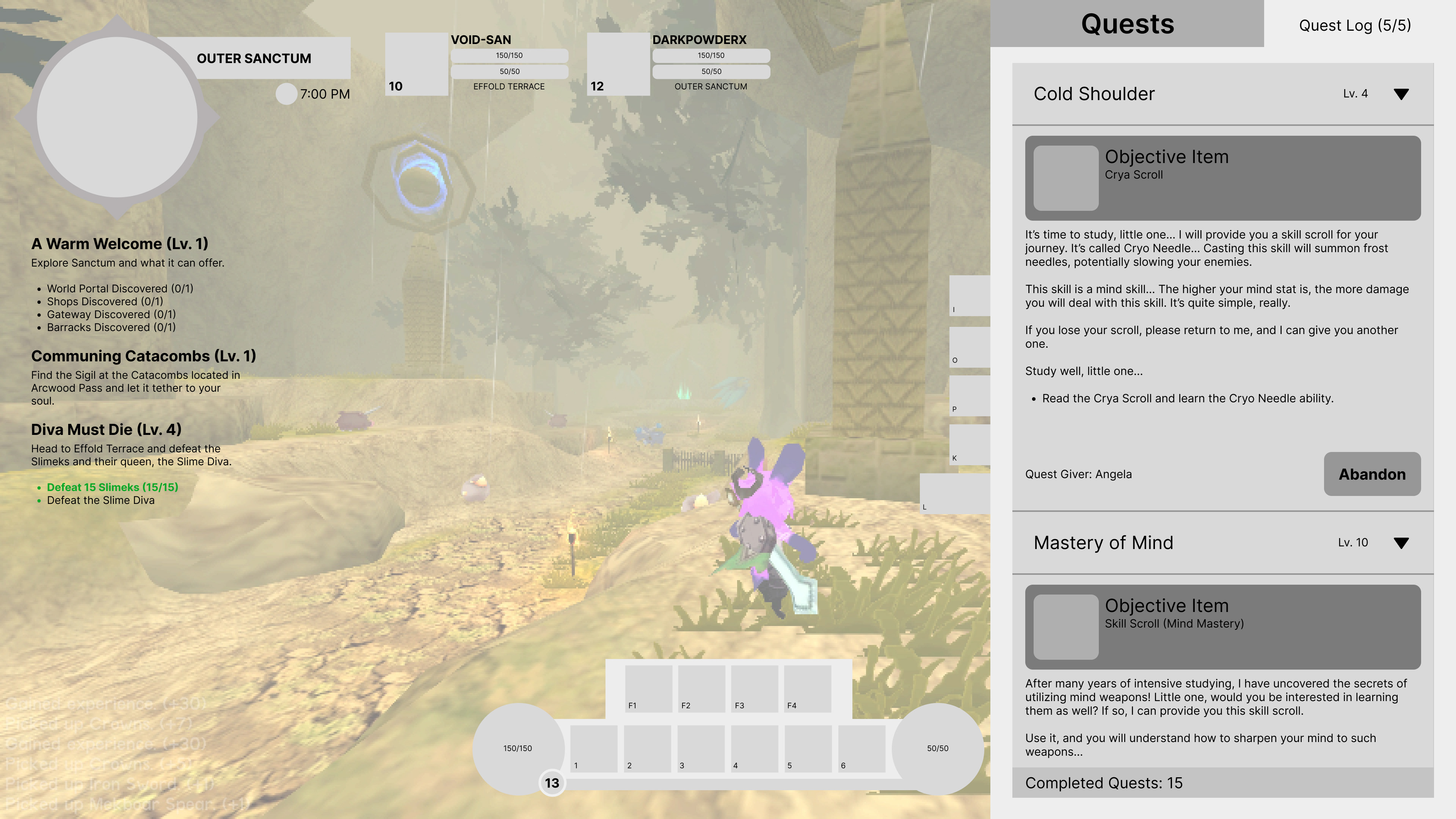
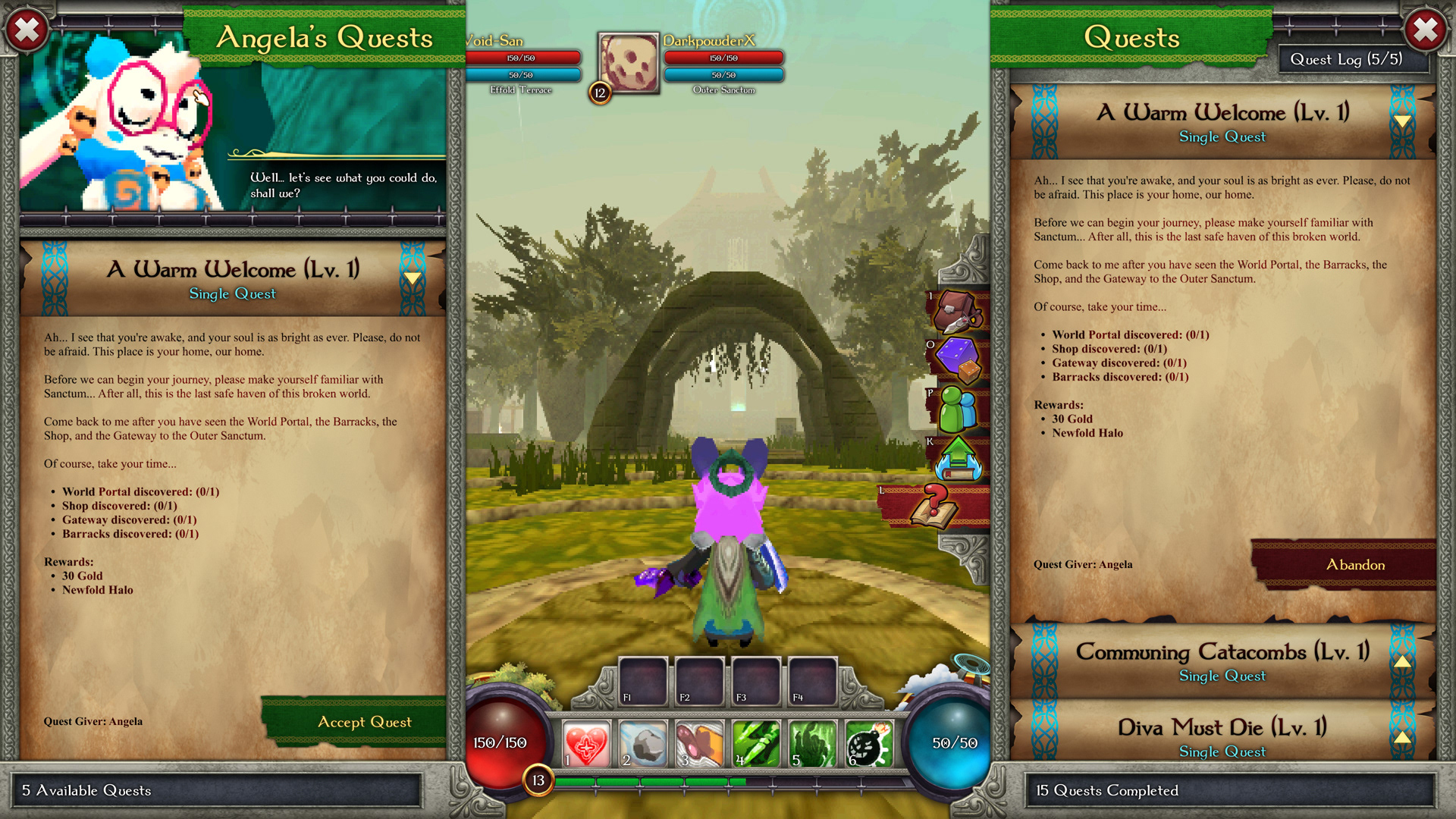
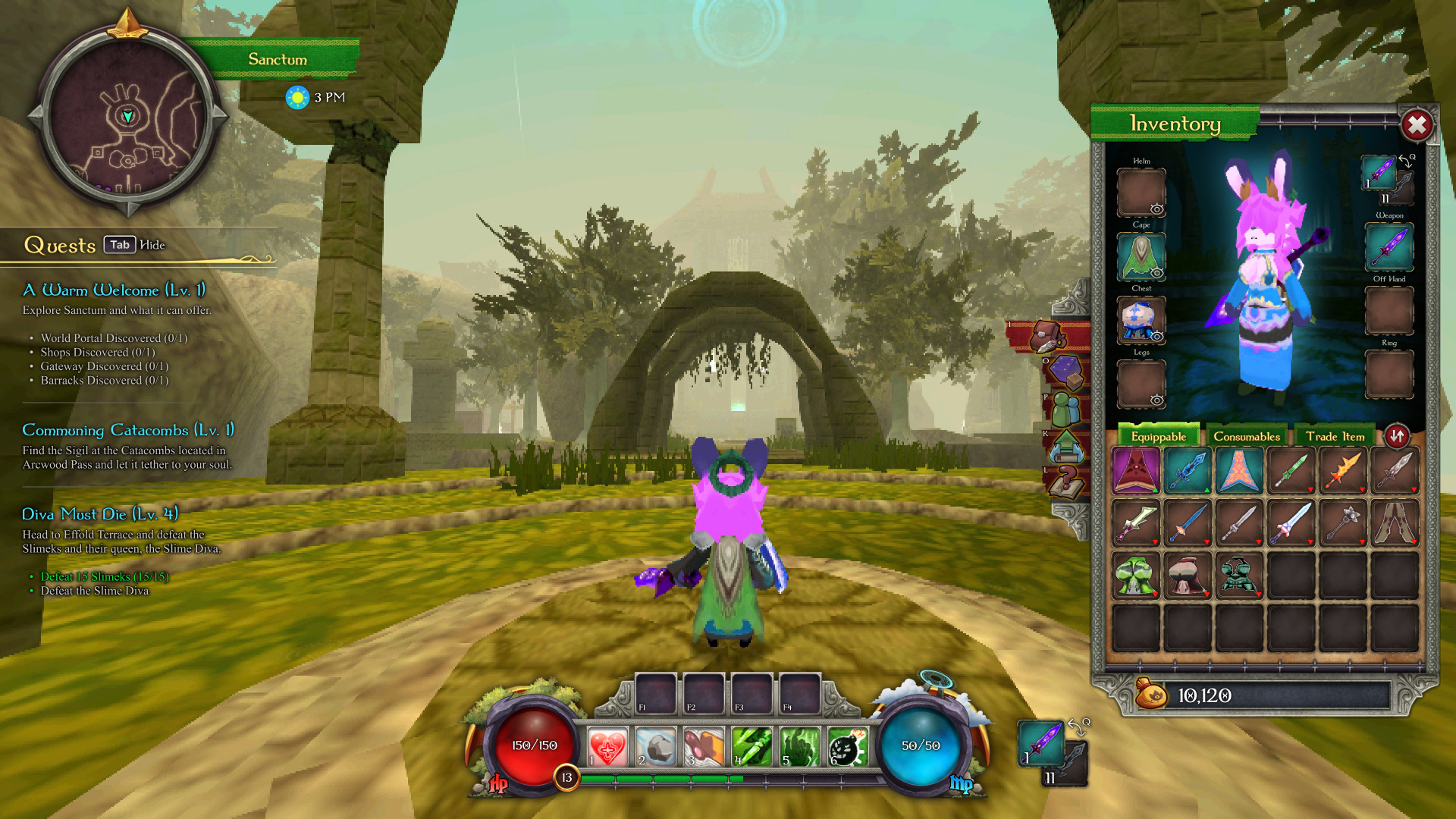
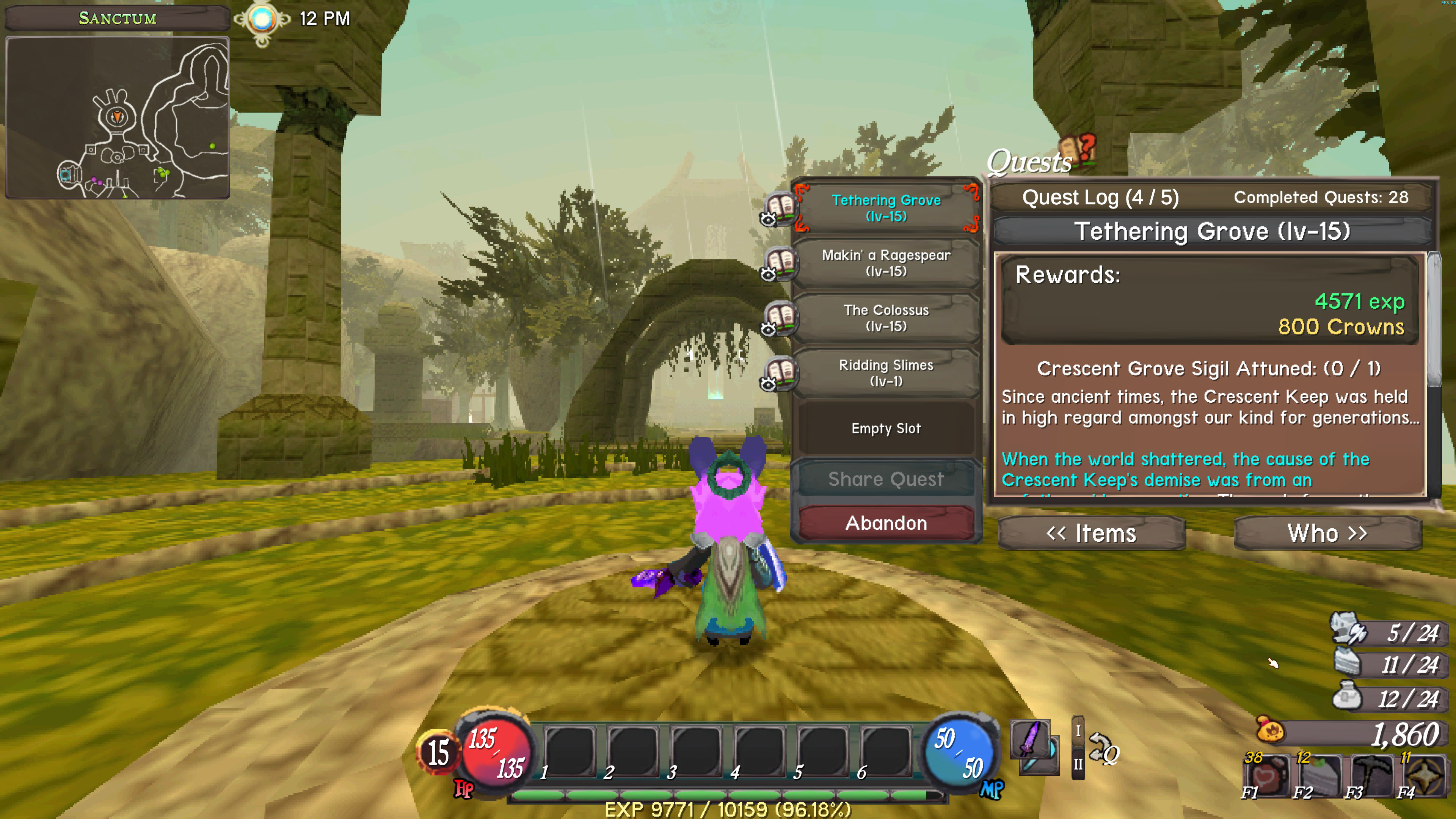
Quests
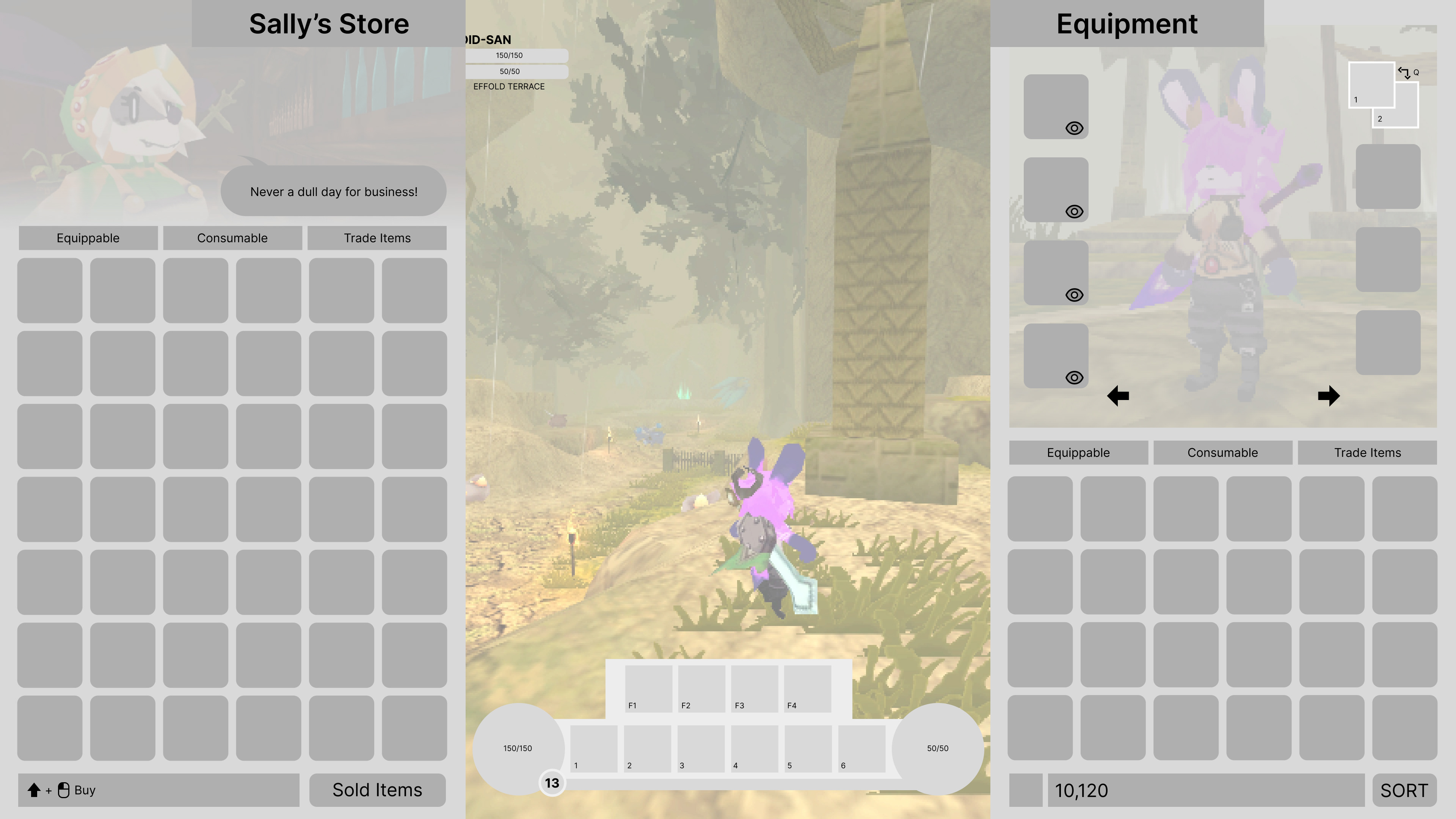
Shop
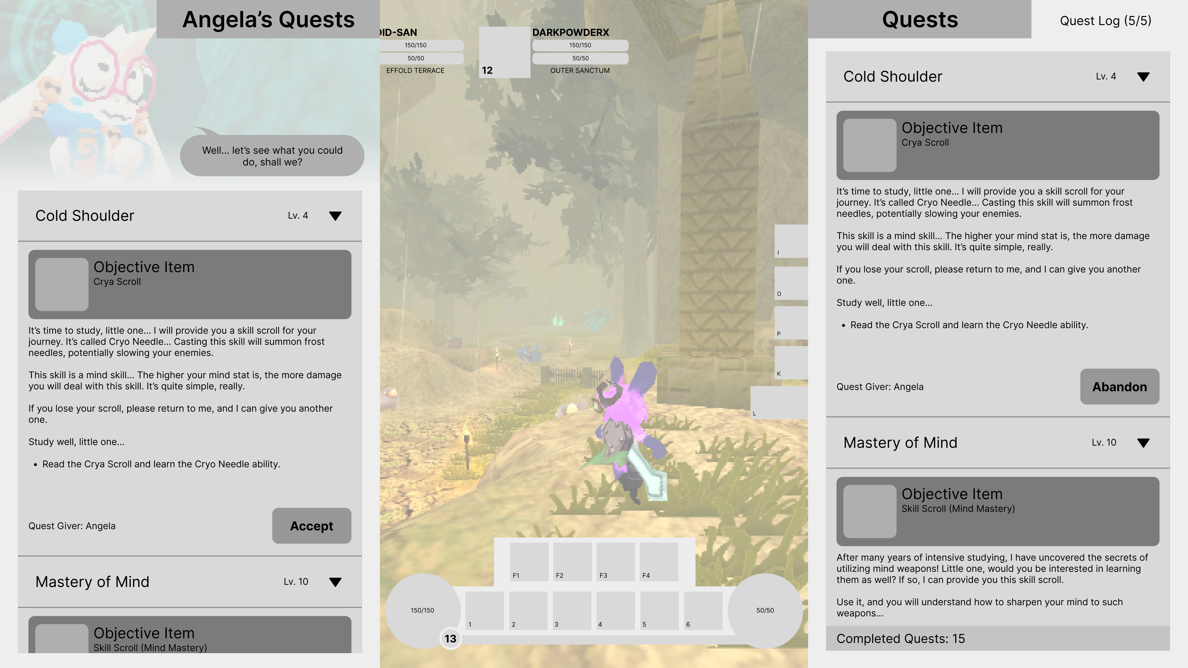
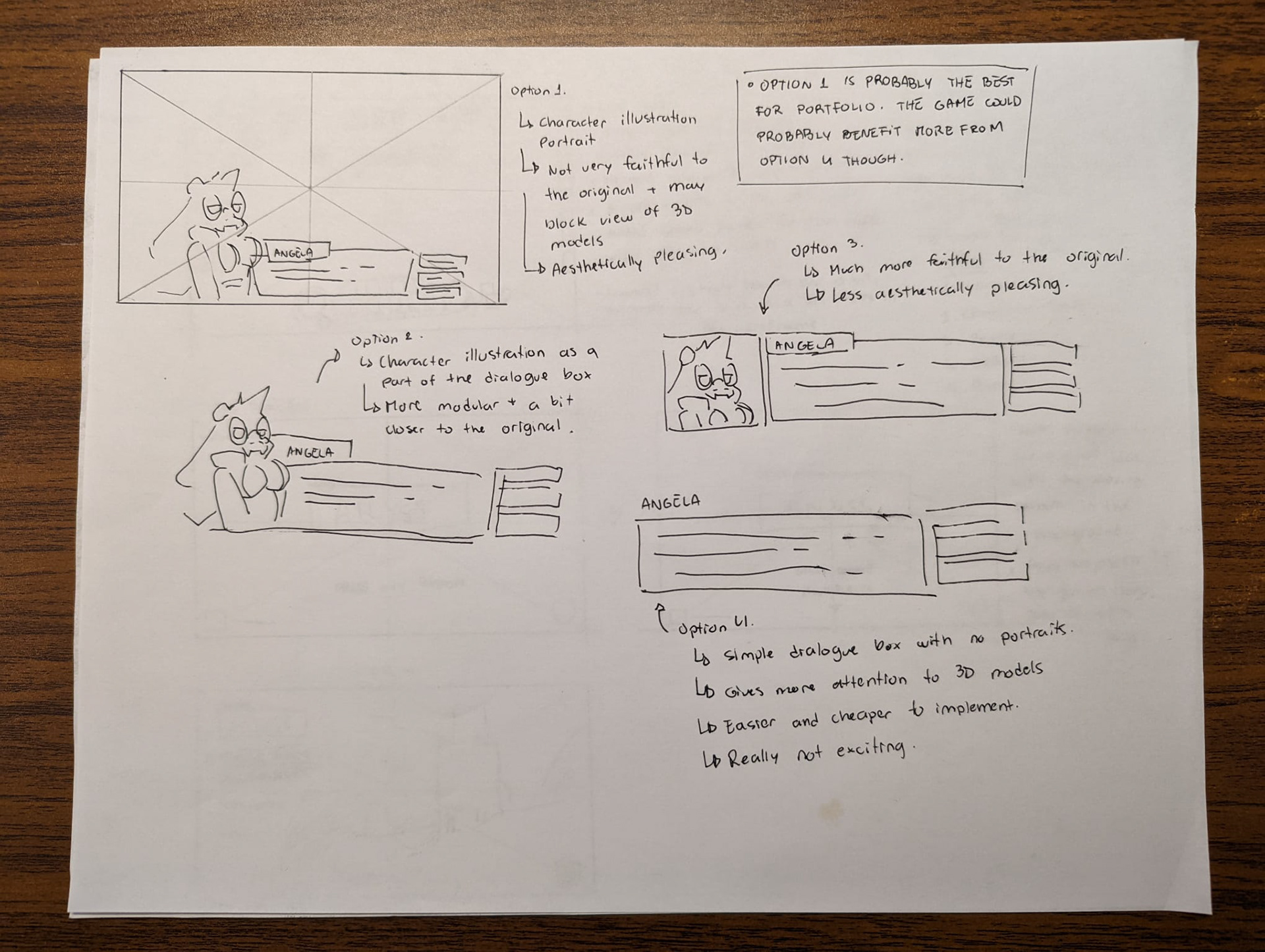
Quest Giver
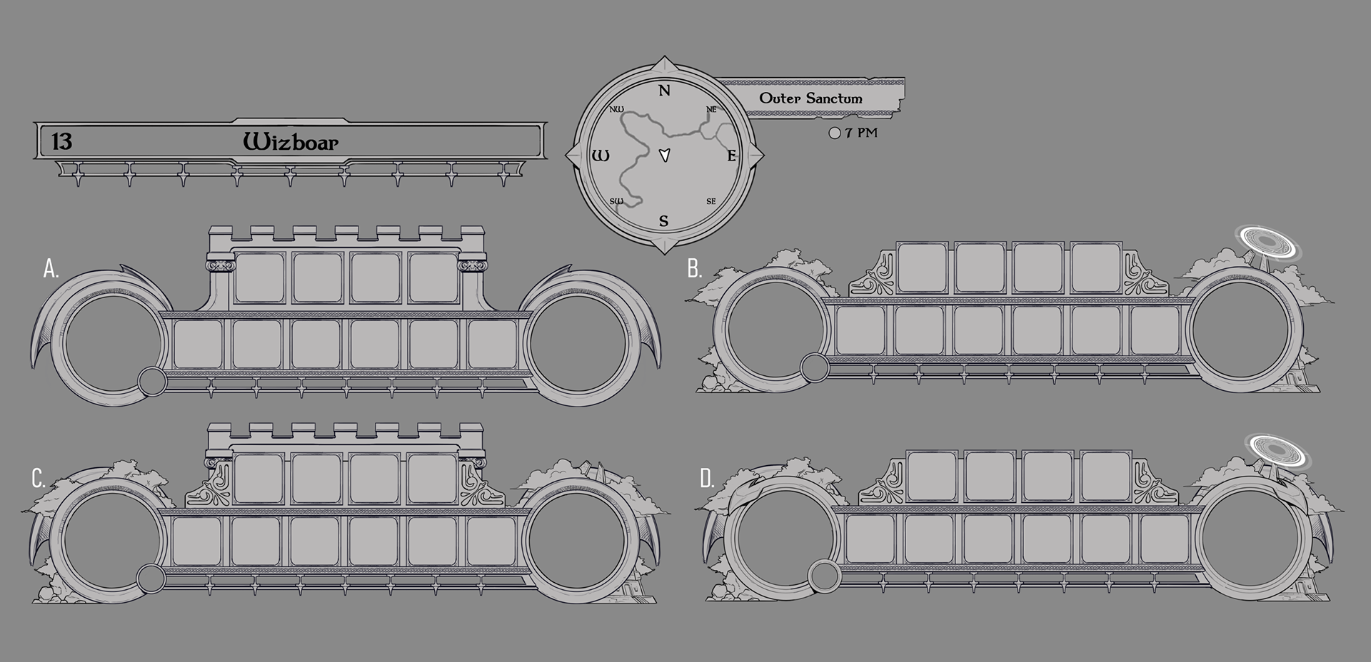
Rough concepts for HUD elements
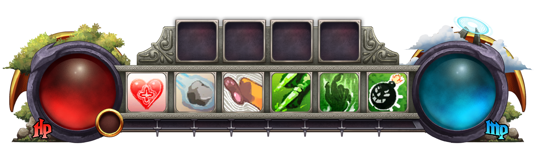
Final concept for central HUD element
(The HP and MP text was created through the modification of the "Nightmare Hero" typeface).
(Skill icons taken from the game's wiki page)
First Concept of the HUD done in Photoshop.
Initial Menu Concepts
New HUD icons created by me. Most of them were redesigned from scratch, except the money bag, which was redrawn in higher resolution.
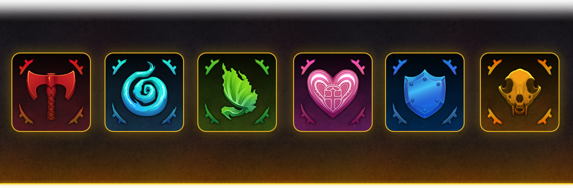
Stats icons. Most of them were existing icons redrawn from scratch in a higher resolution. The axe icon was completely redesigned, and the shield and skull icons were designed by me from scratch.
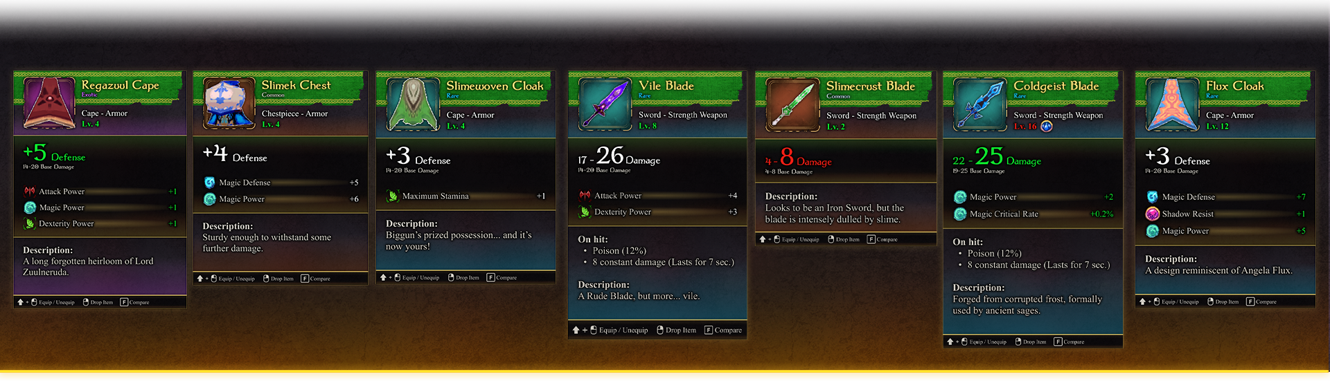
Attribute cards that appear when the player hovers the mouse over an item in their inventory.
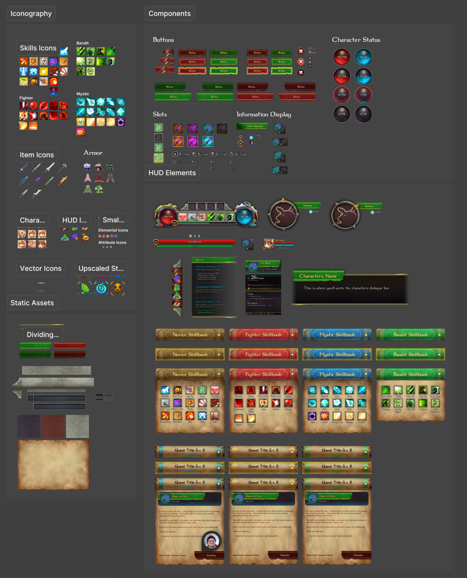
UI Kit created in Figma to easily assemble UI elements and menus.
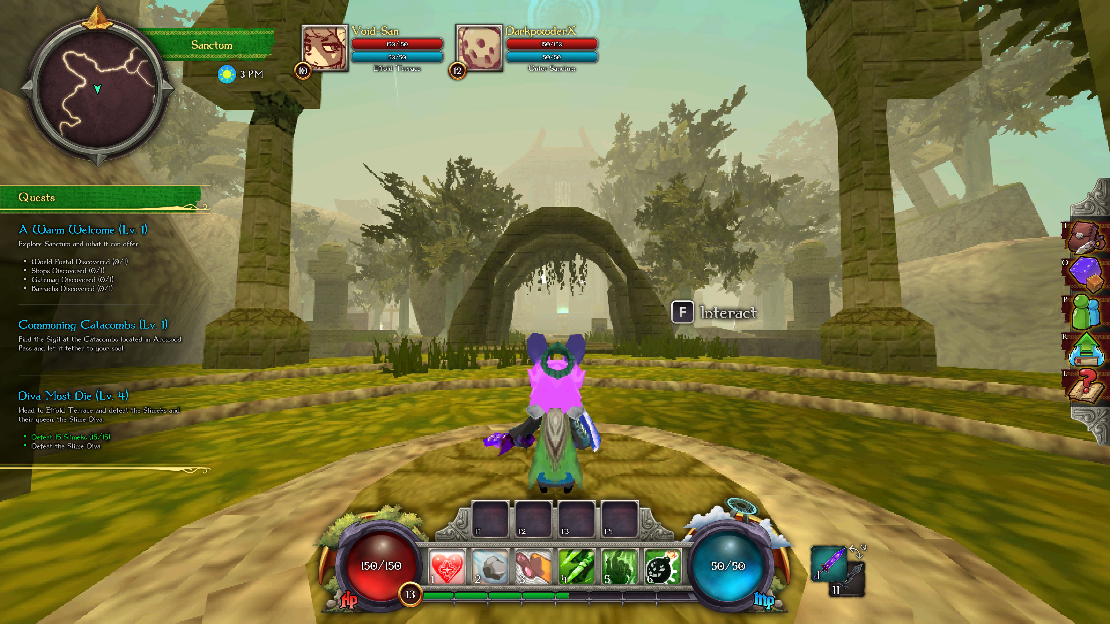
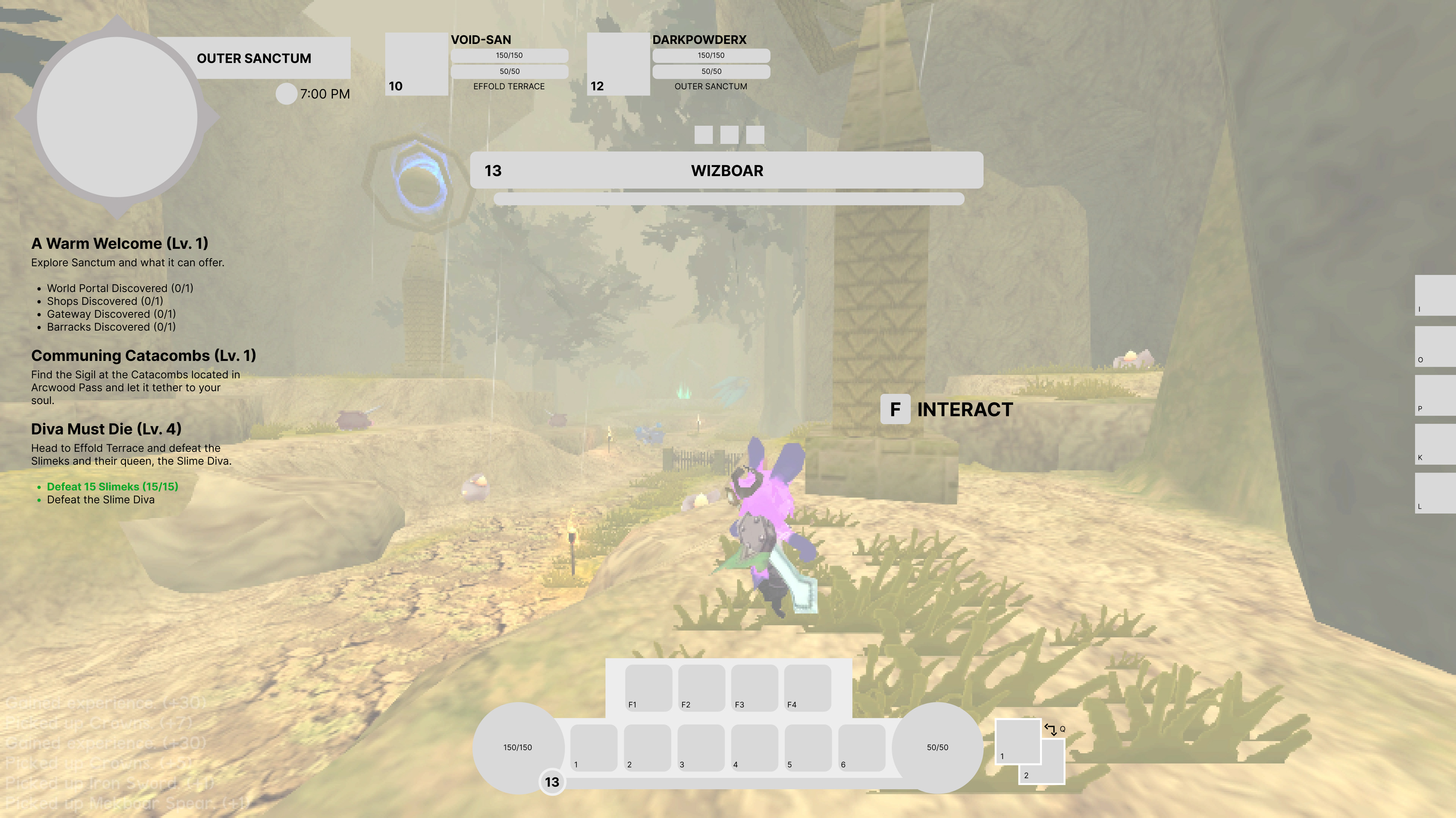
First version of the new HUD
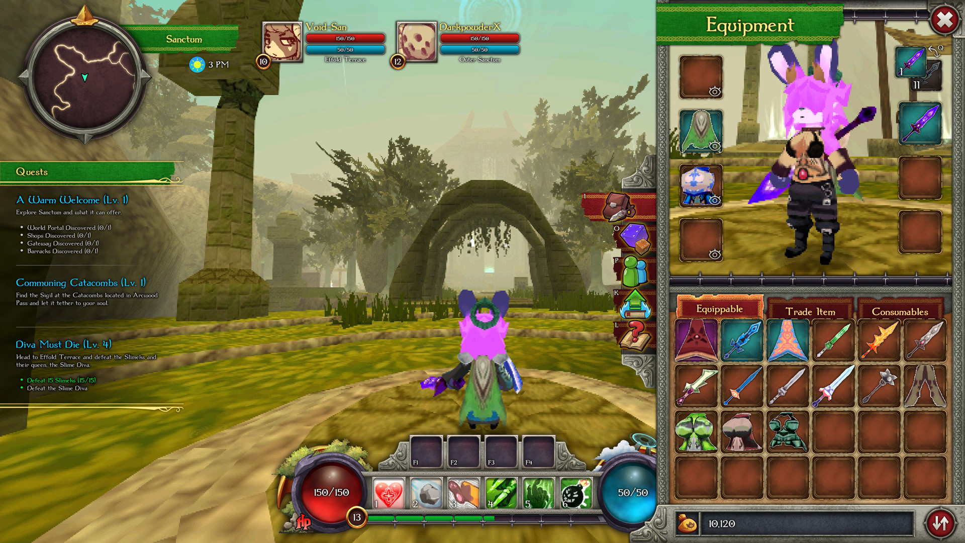
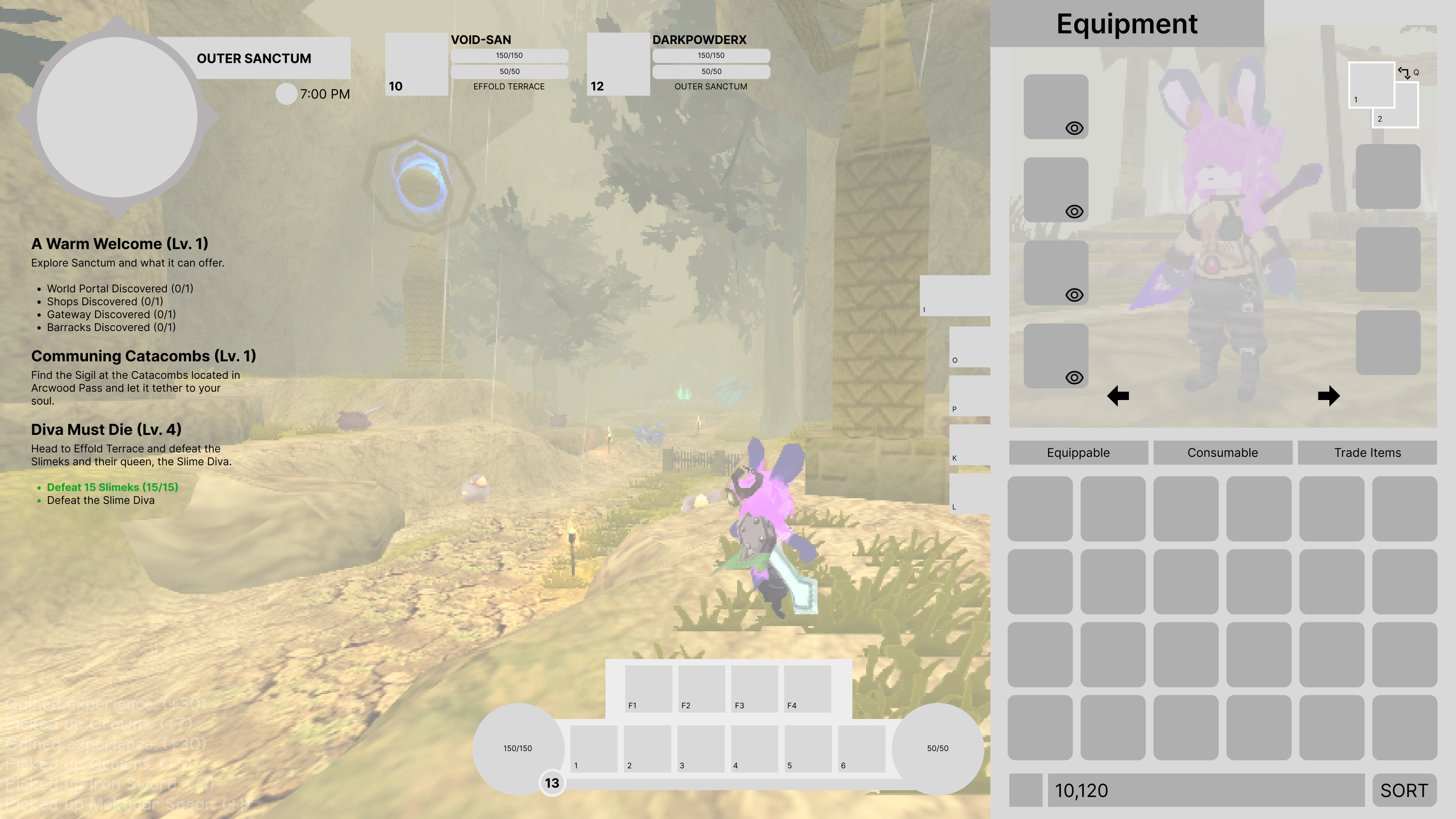
Inventory
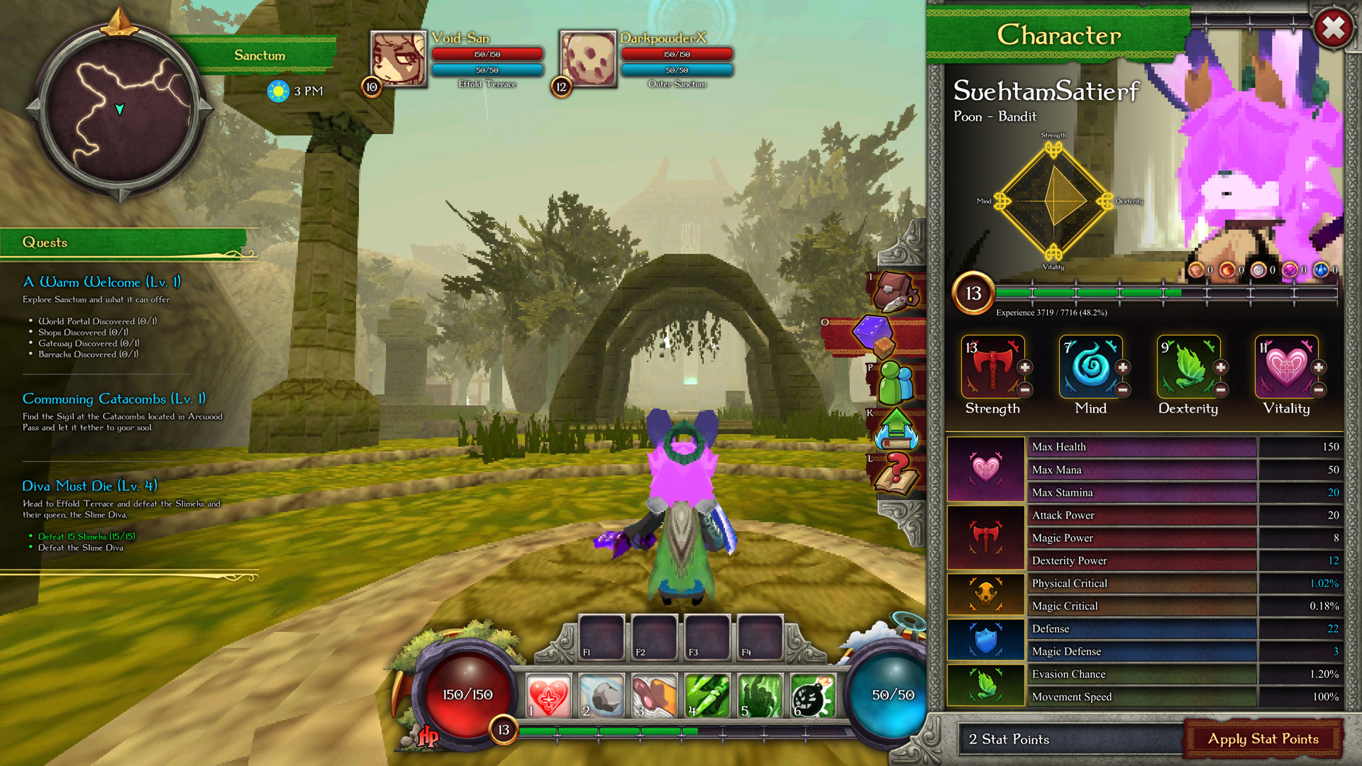
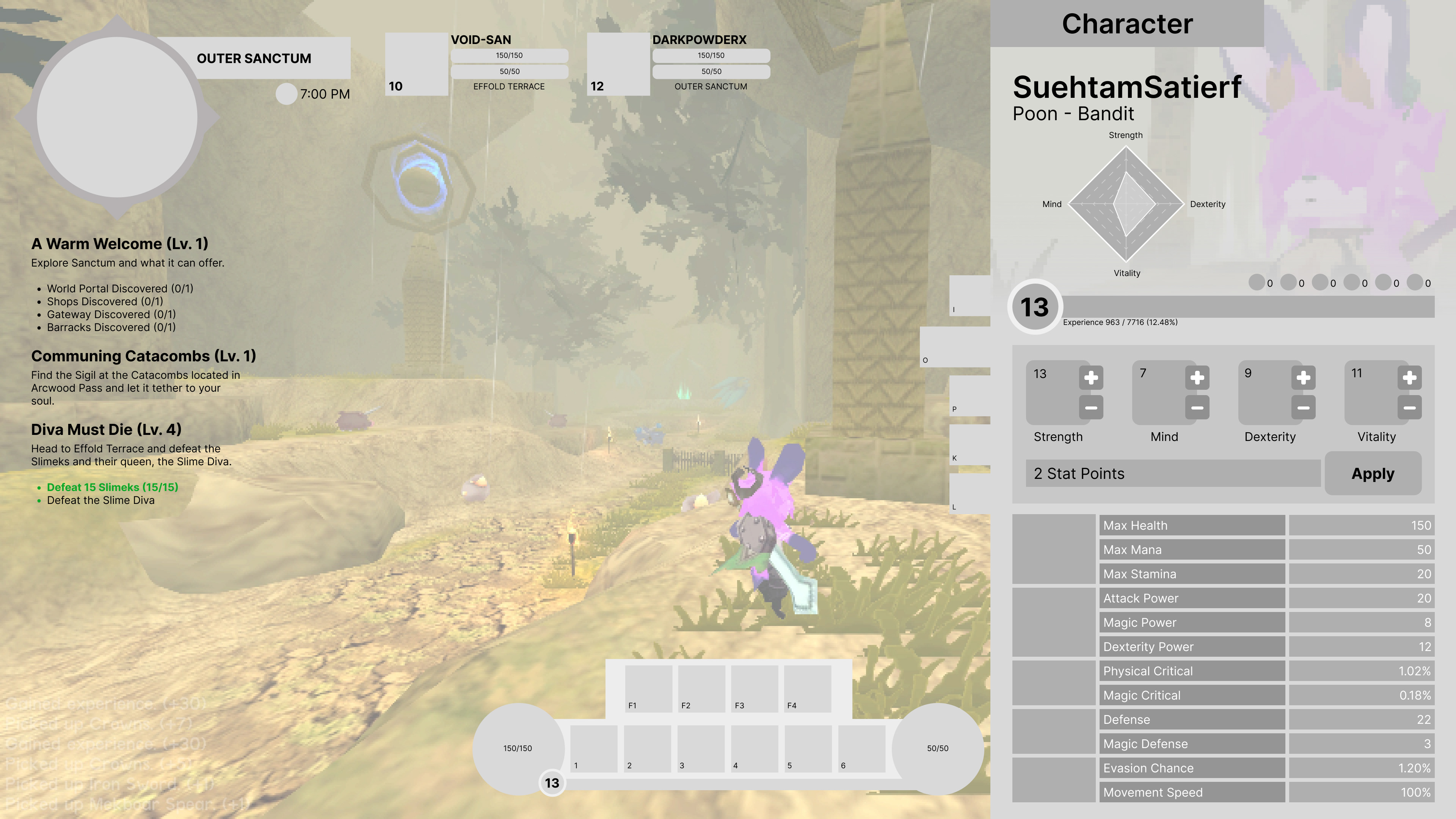
Character Stats
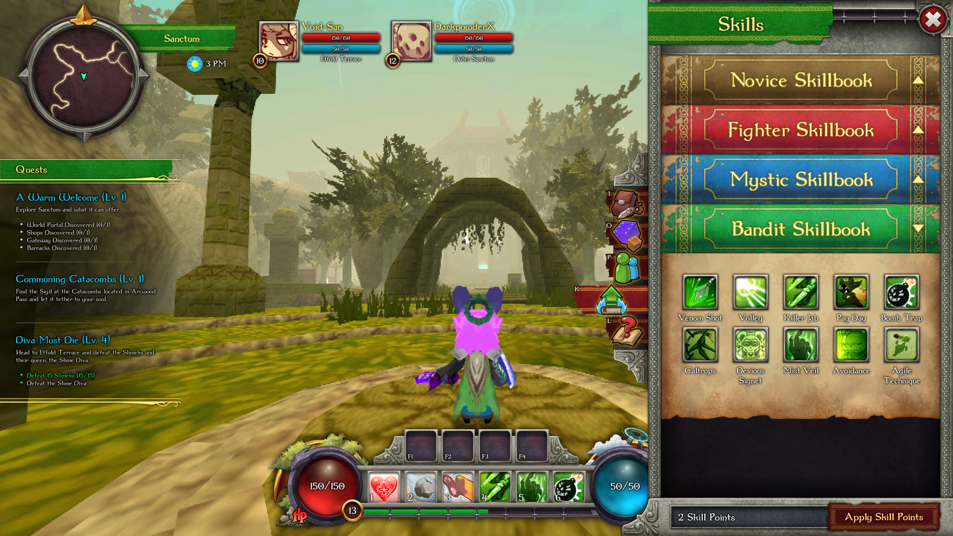
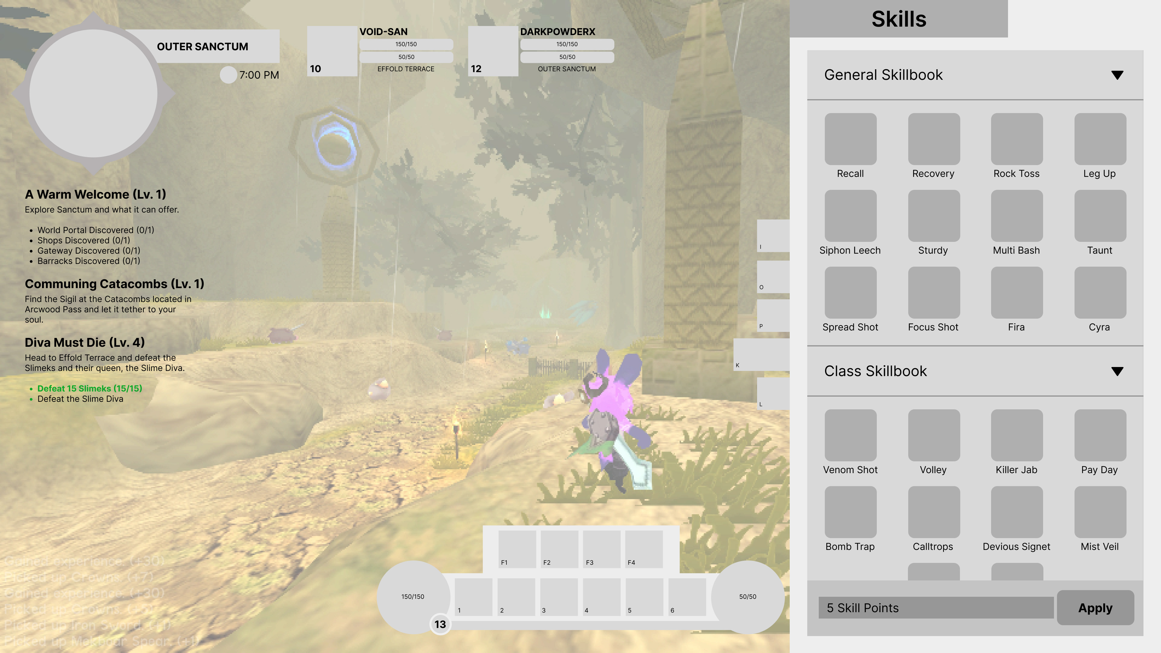
Skills
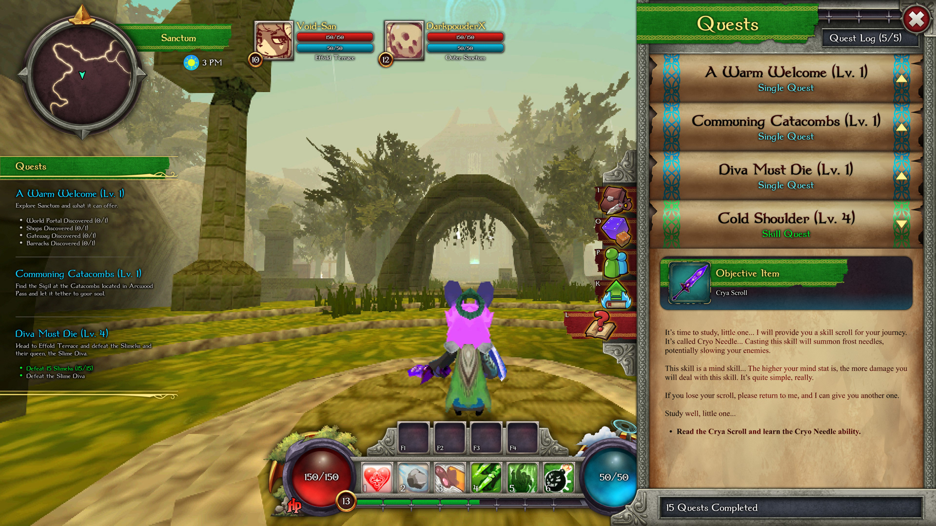
Quests
Quest Giver
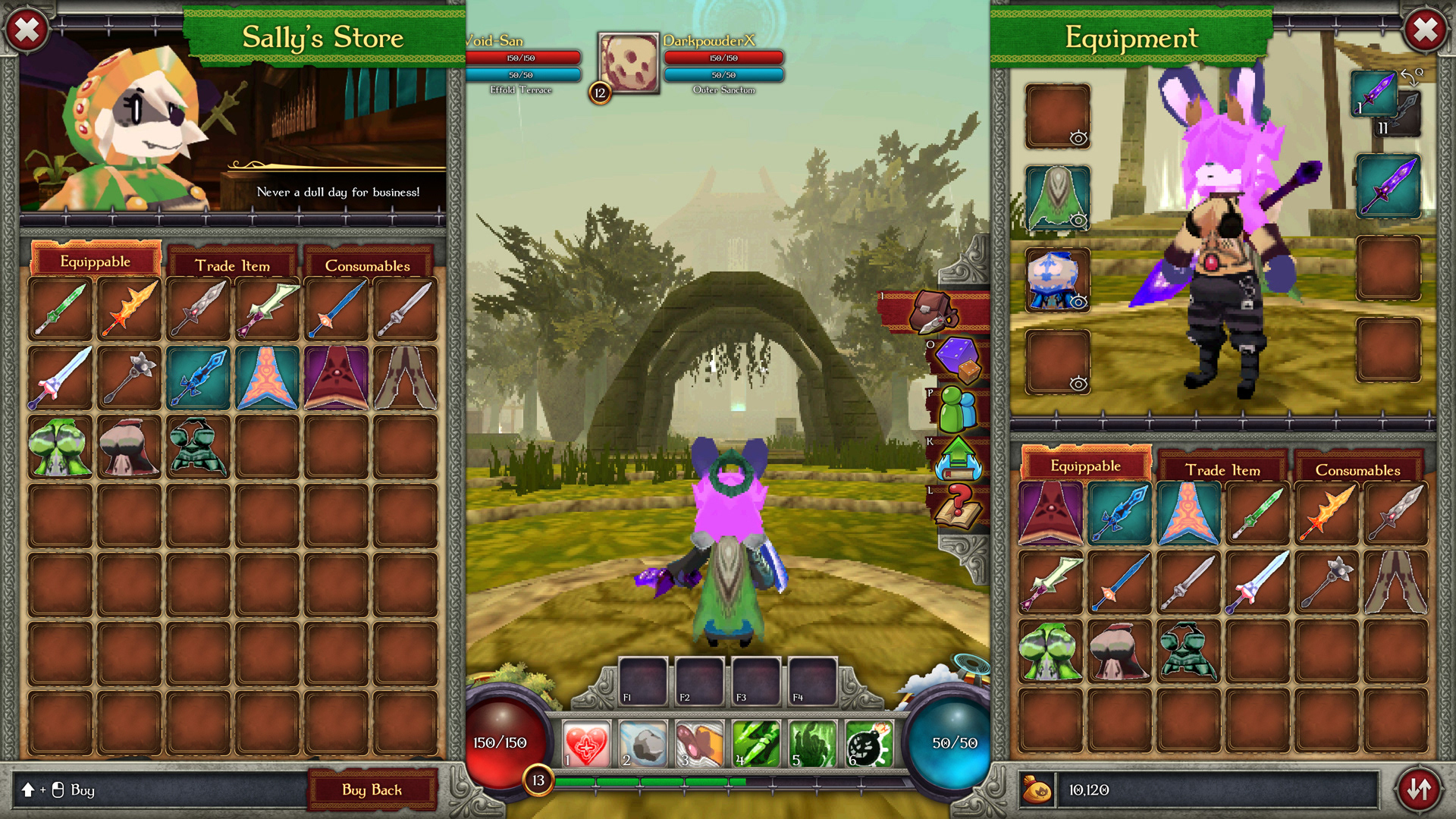
Store
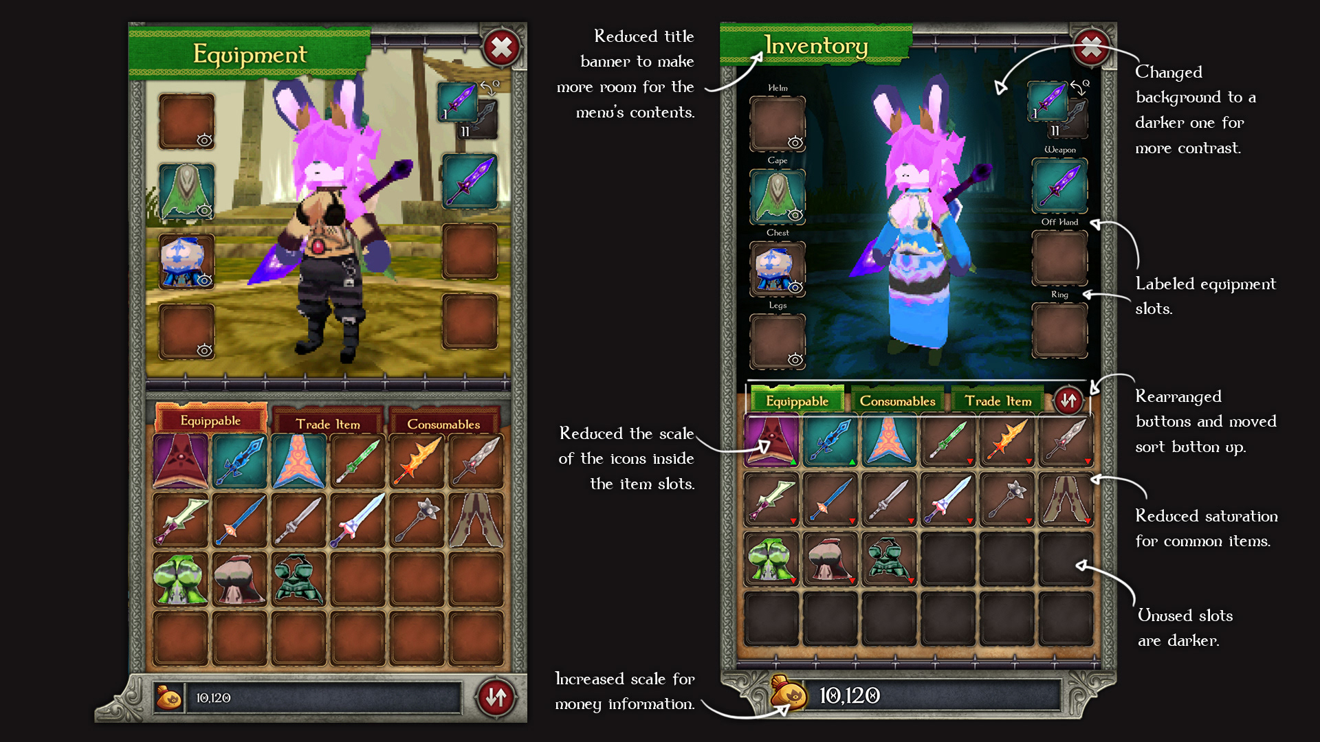
Changes to the inventory menu design. Based on user feedback.
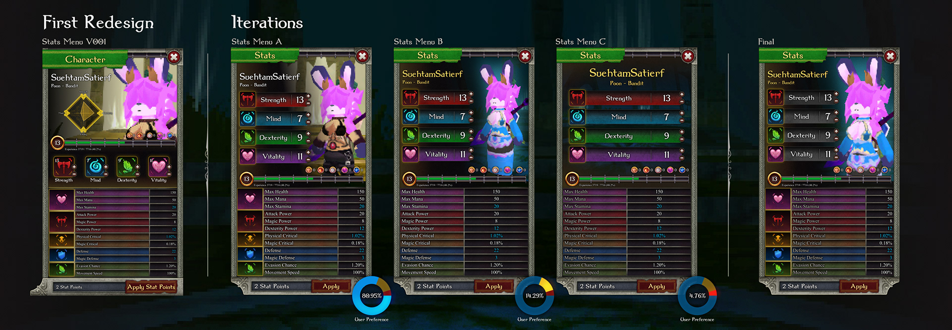
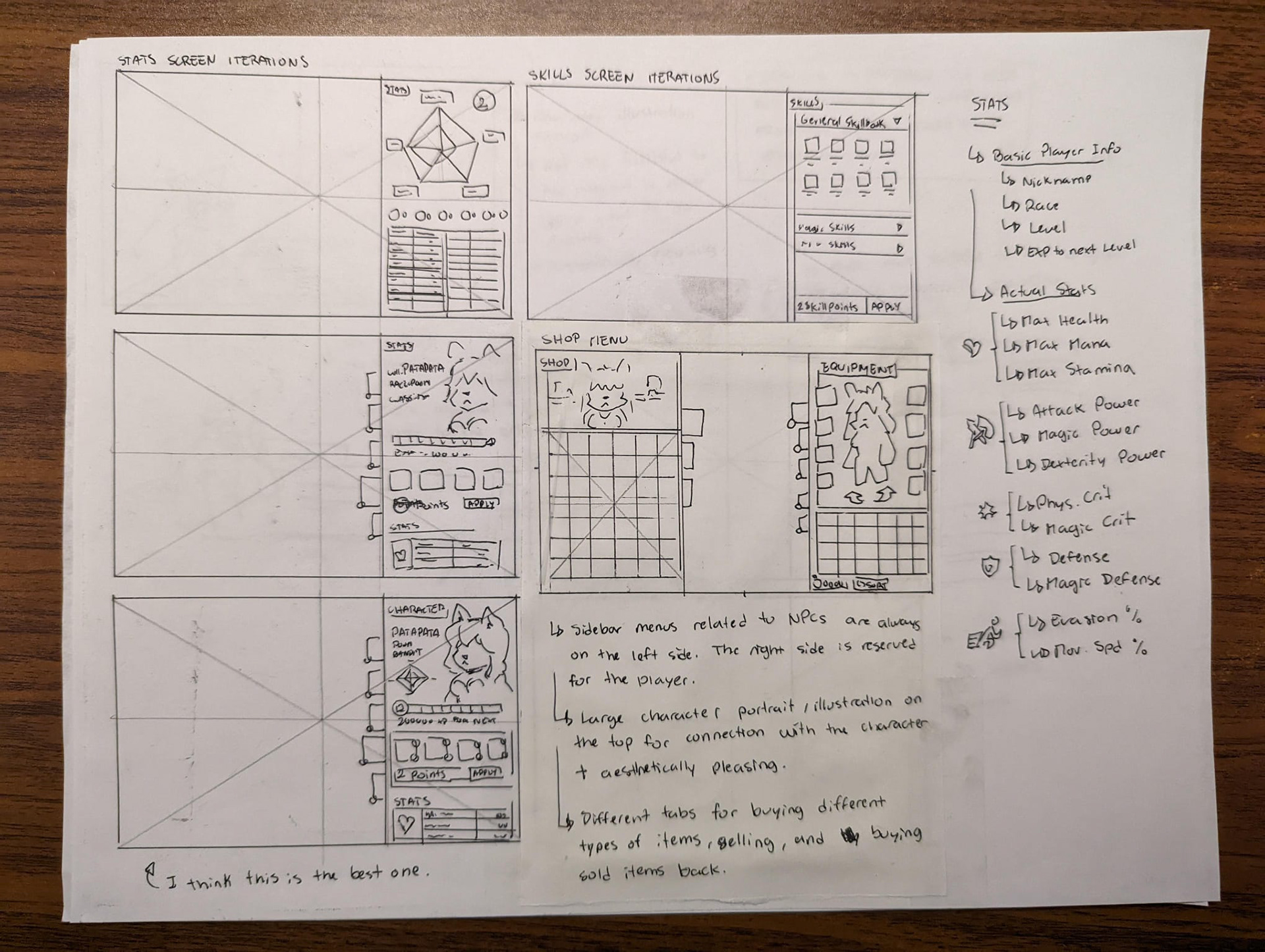
Redesign process of the character stats menu based on user feedback.
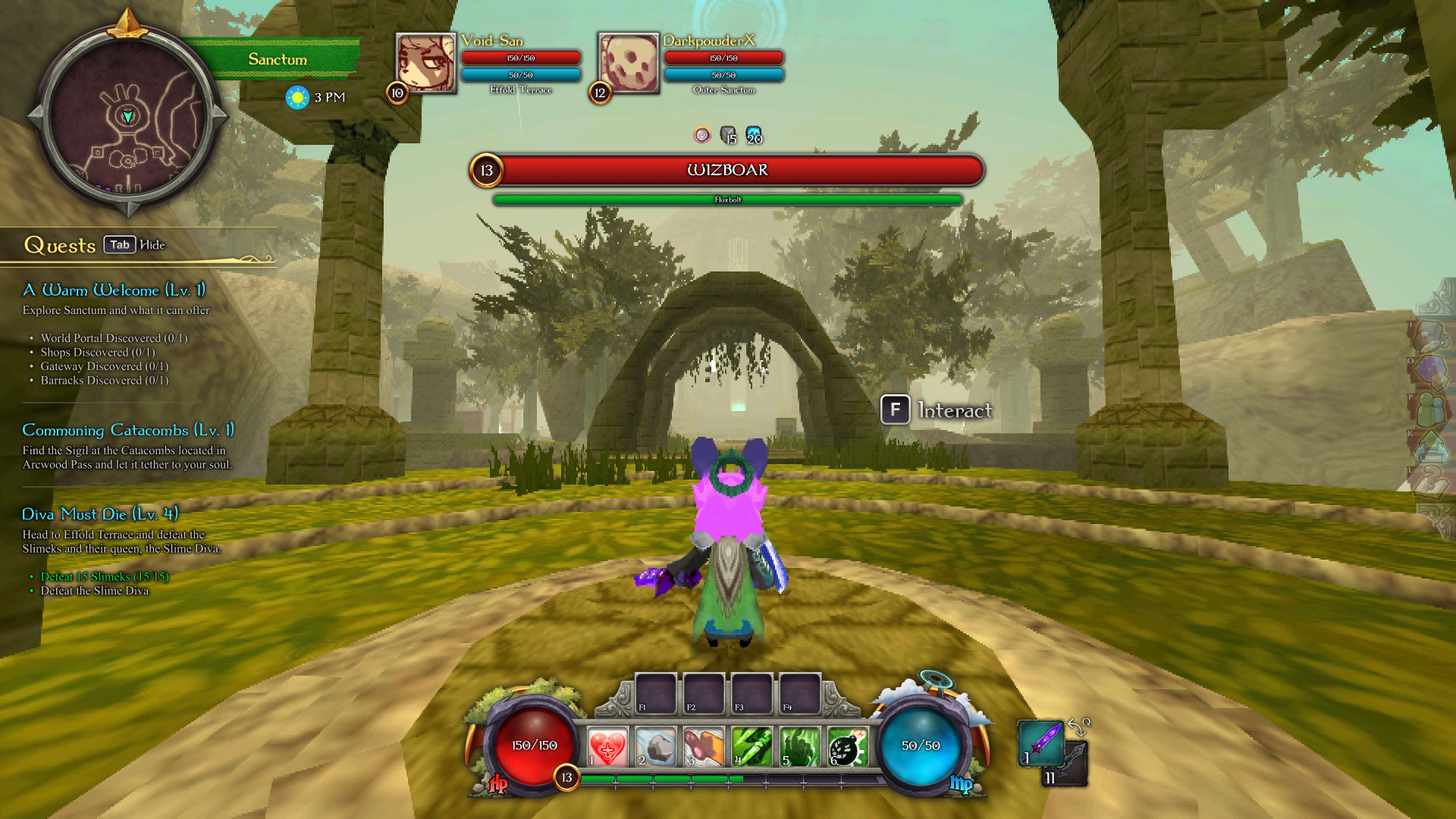
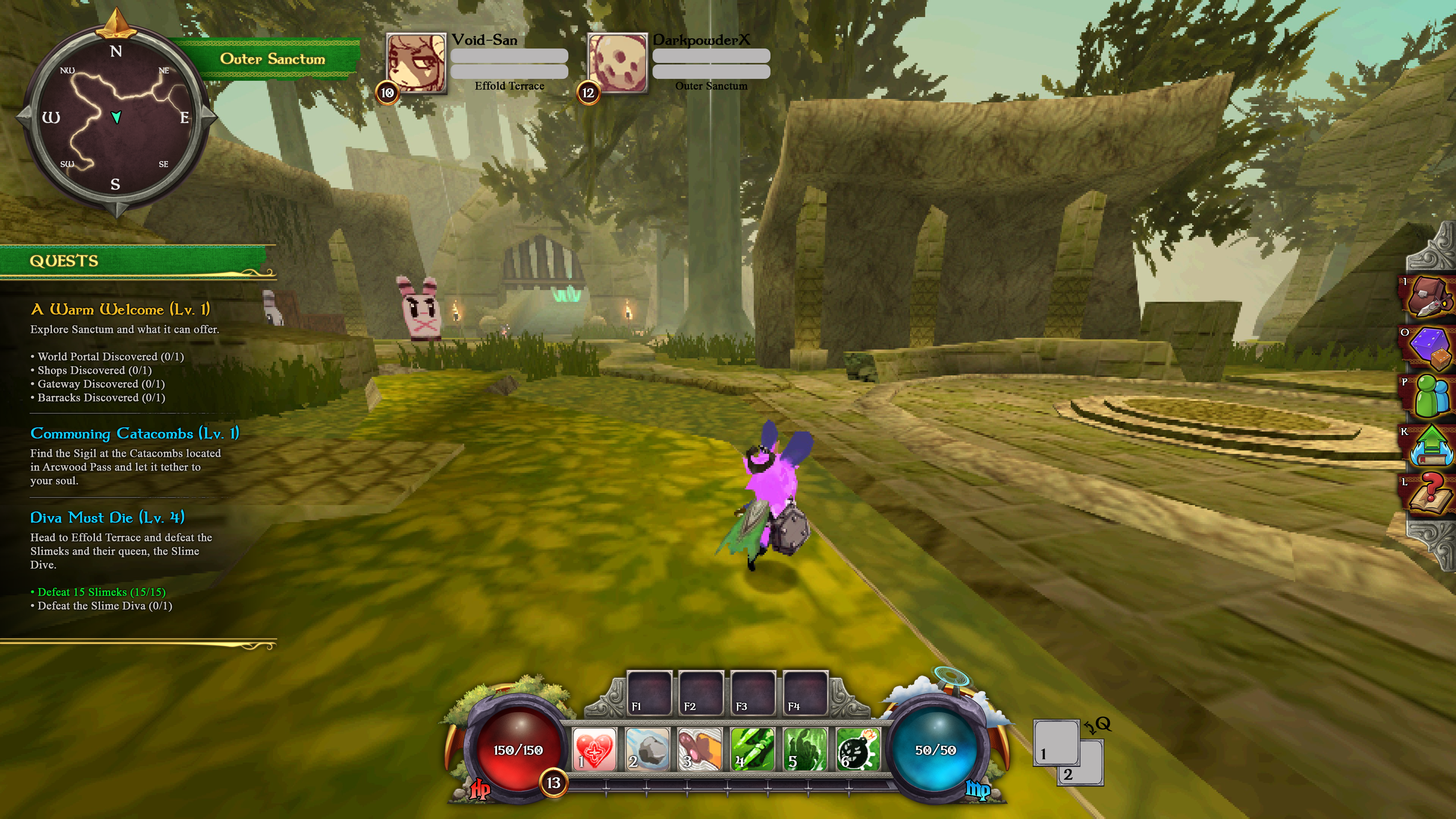
New HUD with all elements on (minimal examples at the top of this page)

New Inventory Menu
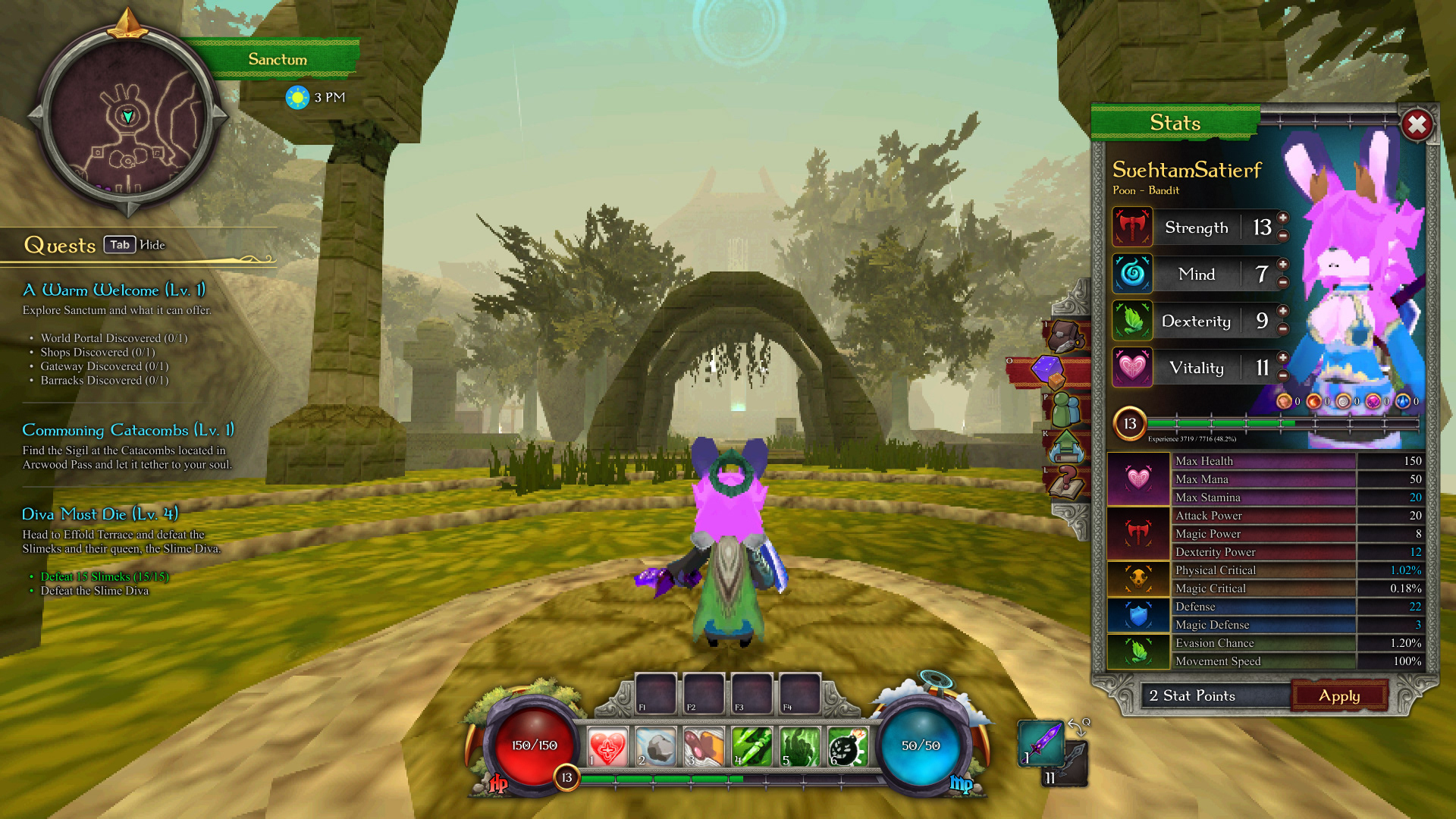
New Character Stats Menu (each stat gets coloured while hovering the cursor on top of it).

Skills menu
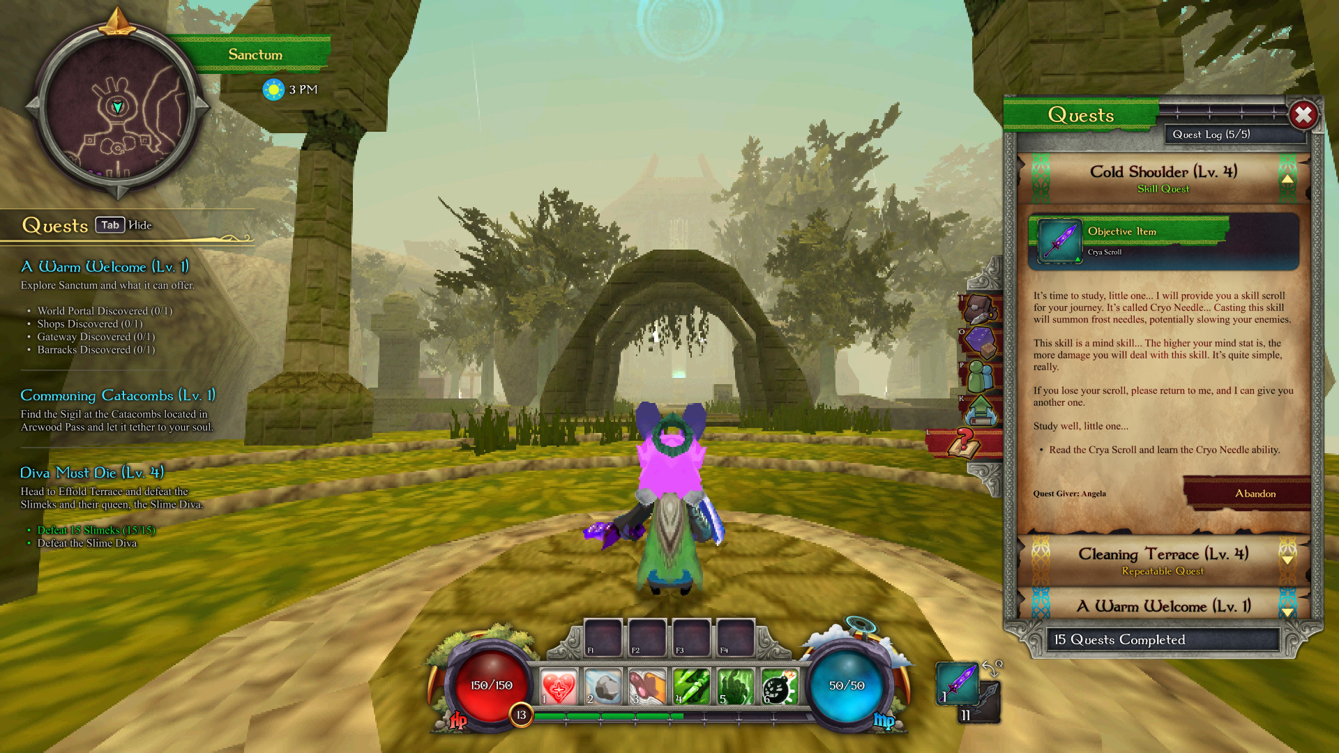
Quests Menu
Shop
Quest Giver
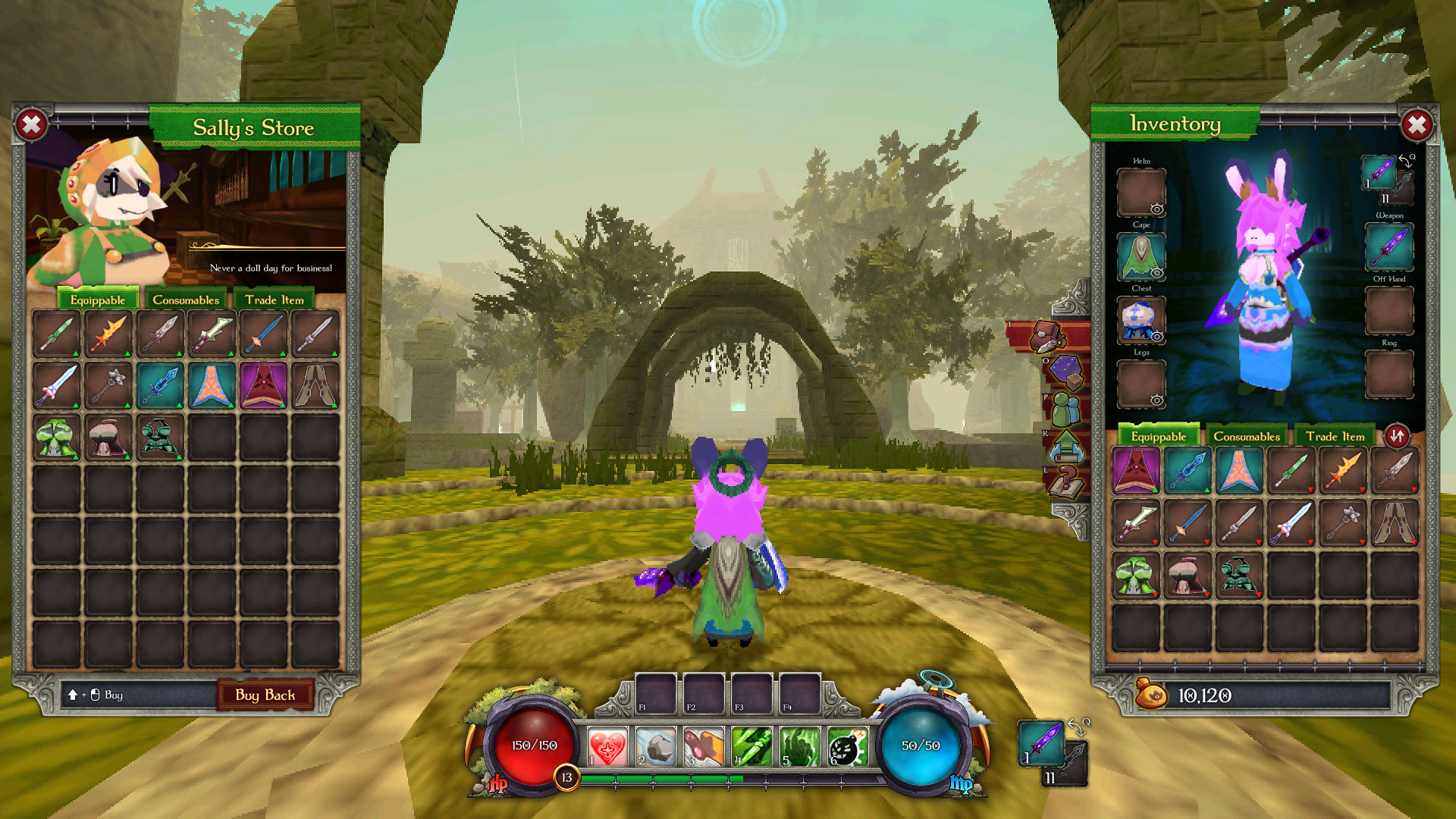
Original UI
Redesigned UI
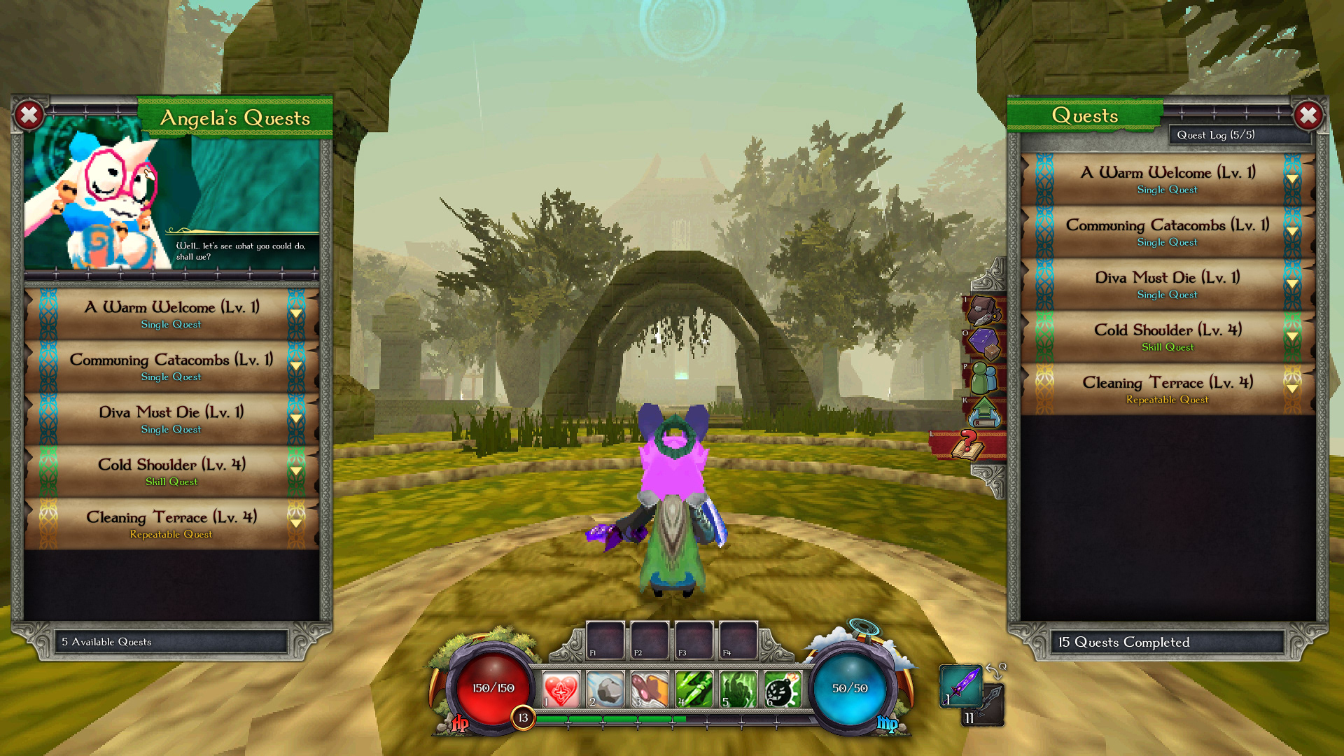
Original UI
Redesigned UI
Original UI

Redesigned UI
Original UI
Redesigned UI
Original UI

Redesigned UI
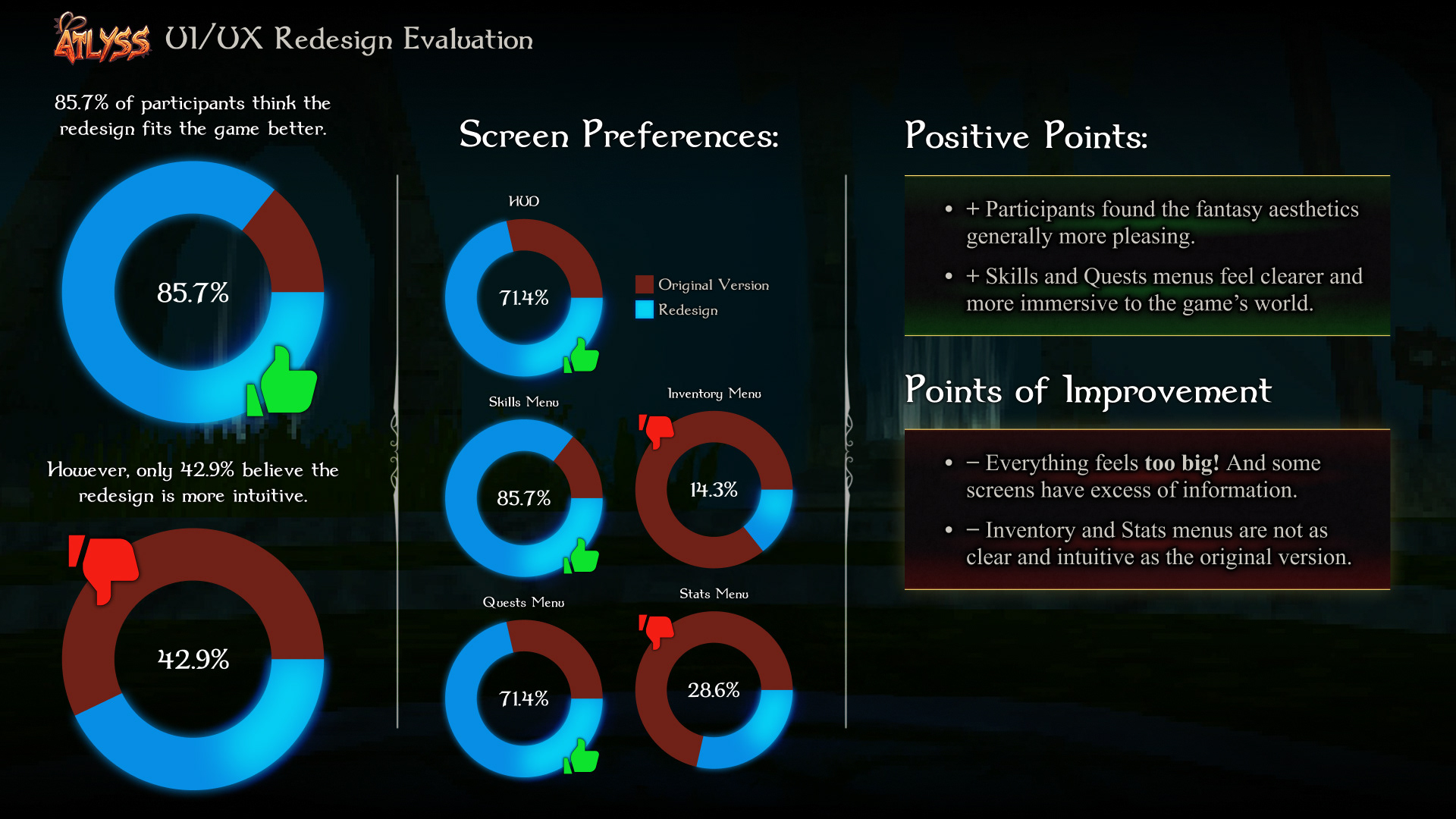
In this project, I have confirmed that starting by figuring out the information architecture of the game helps to determine the scope of the project, takes less effort than starting to design UI elements, and saves tons of time later on. This is not the first project that I started by figuring out a sitemap and a user flow before moving on to the visuals, yet it confirms this feeling I've been having.